Interior Design Trends for 2019 and What It Means to You
Well, it’s that time of year again where design trends for the new year are being revealed by major media outlets. I always find their predictions so interesting - and to be taken with a grain of salt. After all, who are they to tell us how to live in our homes? I do have some thoughts on said trends and I’ll share those with you today.
Terrazzo is predicted to make a strong comeback, which makes you wonder if there really is anything new under the sun. Terrazzo enjoyed tremendous popularity in the midcentury era because of it’s low cost and low maintenance qualities. It’s also an attractive material because the color and pattern are easily manipulated to create different looks.
Here terrazzo is used as a counter top in a contemporary setting, but the confetti look of it will show up in smaller home decor items, wallcoverings, and fabric.
Terrazzo rug from Burke Decor.
I don’t currently see myself embracing the Terrazzo trend in a big way, but maybe it will grown on me.
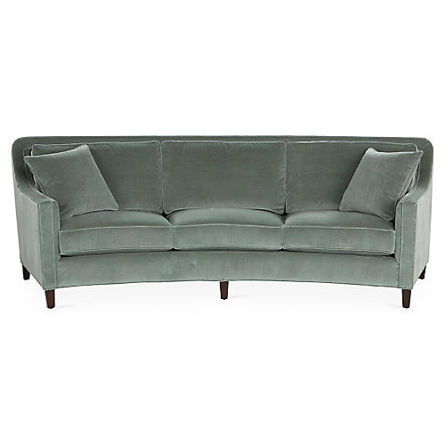
2. Curvy Furniture - Perhaps it’s a deliberate counterpoint to all of the angular, modern furniture that’s been dominating interiors over the past several years, but furniture with curves is expected to be popular in 2019.
Didn’t realize we were setting trends at the time, but we just ordered this Cayman sofa from Miles Talbott for a client a few weeks ago. She saw this sofa on the sales floor of a local furniture store and absolutely fell in love with it, rejecting all other options we had considered. Because she had such a strong reaction, I wholeheartedly supported her decision, whether it was “on trend for 2019” or not.
A word of caution - sofas that curve have a larger footprint than a standard sofa. Make sure you read the furniture specs carefully to ensure you have the depth that a curved sofa requires!
3. COLOR! Well now, here’s a trend that makes me happy! And I think we’re talking more than just “pops” of color on neutral backdrops. Ugh. Enough of that look please!!! The pallor of beiges and grays are being replaced with layers of beautiful, vibrant color.
Can you tell I’m on board with this one? Color is everything in a room! It can create mood like nothing else!
Here a calming blue was used in combination with earthy rust accents to create a comfortable master retreat for some wonderful clients in Chattanooga.
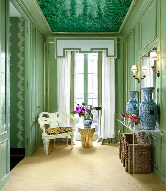
In this Showhouse room by Atlanta’s Gordon Dunning, green is used to create a sophisticated, nature inspired retreat.
And speaking of green, look for green to challenge blue as the most favored color of 2019. Green has been my favorite color for decades and I don’t see that changing anytime soon! I’m still so enamored with these fabulous green velvet sofas seen below we used on a recent living room project in Chattanooga!
4. Kitchens - more classic, less industrial. Is this really a trend? Classic kitchens will always be stylish and in demand. The end.
This will never be wrong or “out”. A white kitchen with timeless finishes is forever stylish. Ditto on the white subway tile splash and polished nickel hardware. Kitchens are too expensive to replace to get sucked in by fleeting trends and wonky lighting - keep it Classic for timeless appeal!
I got one more for ya.
5. Murals and Scenic Wallpaper - This trend is already off and running and shows no signs of slowing down. Here’s a sneak peek of a dining room project in Chattanooga that I’ve been working on. It’s nearing completion and this amazing mural is the star of the show. It’s a one of a kind piece created exclusively for this dining room and it ‘s beauty and timeless appeal are undeniable!
So that’s my take on trends for 2019. Use what you love and it will bring you joy for years to come - regardless of what’s trending!
If you’re ready to create fresh and family friendly interiors that will stand the test of time, give Kim a call at 423.653.3186 to schedule a consultation!
The Most Timeless Print of Them All!
Floral. Ikat. Geometric. Paisley. Block Print. Plaid. Toile. There are so many wonderful prints to work with when it comes to decorating your home! I’ve found that people can be a little reluctant to incorporate prints into their homes - mostly because they’re afraid that whatever print they select will be “out” in a short period of time. I get it - decorating is expensive so we want to select design elements with real staying power!
What if I told you there was one category of print you should never fear?
It’s true and it’s a personal favorite of mine.
It’s the fresh and fabulous stripe!
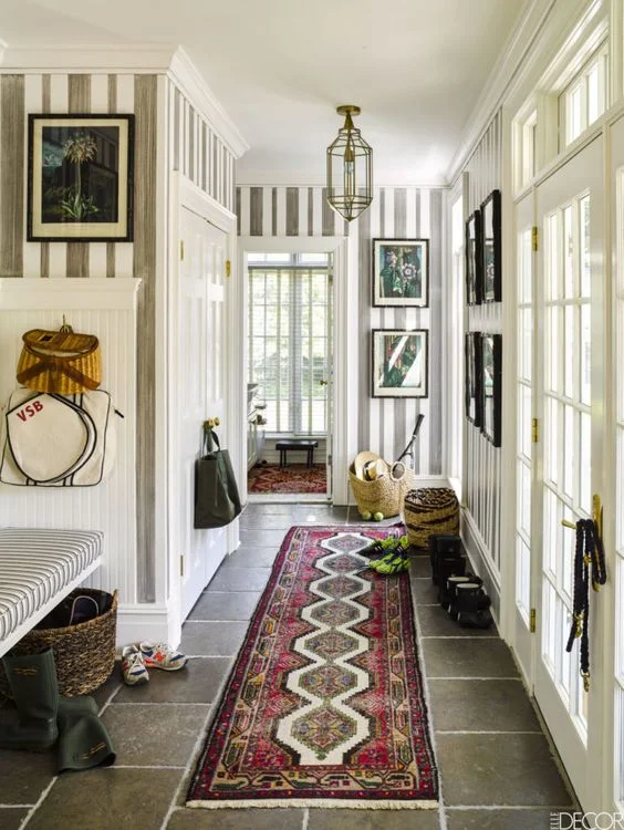
Here are striped walls in a mud room in Veronica Beard’s weekend home as seen in Elle Decor. If I’m not mistaken, the stripes were hand painted.
I can’t get enough of this dramatic Shelley Johnstone designed dining room. The walls are upholstered in a Schumacher stripe. It’s so chic and so pretty - and completely timeless!
But don’t think decorating with stripes is limited to wall treatments.
These fresh blue and white striped chairs are in the home of Nashville designer Sarah Bartholomew. Stripes just never get old!
It’s also hard (for me) to resist a striped rug.
Did you even know you can have more than one stripe in a room? Here Mark D. Sikes fearlessly placed a striped sofa right on top of a striped rug! I love this room!!
Love these striped roman shades (below) in Harlem based designer Sheila Bridges’ chic and colorful kitchen.
For the timid decorator, striped pillows are a great way to interject the fresh, timeless feel of stripes to your room, ala Suzanne Kasler (seen below).
Here are a few more striped goodies to inspire. Enjoy!
If you’re feeling overwhelmed about decorating your home, give Kim at a call at 423.653.3186 and let’s work together to create place you’ll be thrilled to come home to!
Creating a Restful Master Bedroom Retreat in Signal Mountain, TN
Today I’m sharing a recently completed interior design project for some wonderful Chattanooga clients I’ve worked with for years!
For a frame of reference, here are a few other rooms in their home we’ve had the pleasure of transforming with them.
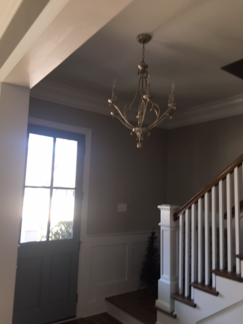
The foyer, seen below, was recently updated with architectural moldings, fresh white paint, a new light fixture and new furnishings.
Another fun project was this breakfast nook in the kitchen. We designed and custom built the window seat, updated the light fixture and furniture, and finished it off with custom window shades and pillows.
We then moved on to their living room seen above. New moldings, window treatments, a fireplace makeover and new furnishings all came together to create a welcoming space that’s comfortable enough for family but fancy enough for guests.
Our most recent project with this family was a makeover of the master bedroom. The homeowners were craving something light and simple. They were so pleased with the previous projects we had worked on together that they wanted to continue in that same vein.
Here’s quick photo of the room as it appeared before any work started.
We agreed that we would lighten the walls, add some interest to the bed wall with architectural moldings, and keep the palette light and simple.
Our clients also had a few pieces that were particularly meaningful to them and requested that we incorporate those pieces into the design of the room. And they love blue.
Here’s a mockup of the space I created to help them visualize how the finished room would look and feel. We were definitely going in a lighter, simpler direction with some textural elements. The mostly neutral bedroom would include accents of their favorite color too!
And here’s the finished product!
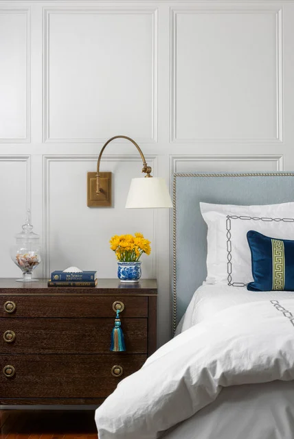
The moldings add interest and importance to the bed wall. We went with a custom upholstered bed in a soft shade of blue accented with silver nail heads. Gorgeous and restful! Our clients opted for these stylish wall sconces instead of lamps. I love a dash of the unexpected!
Did you notice the ceiling color? We brought a little more blue into the space by painting the ceiling a lovely sky blue.
We were also able to incorporate their painting for another shot of nature inspired color.
The turquoise pottery vase was another special piece they wanted to incorporate. It was a found on a recent vacation and brings those memories back whenever they see it.
We also went a little bold on our fabric selection for the curtains. They’re silk dupioni and really create a feeling of luxury in their bedroom. The curtains are lined with blackout and are mounted on a traverse rod for greater ease of use. These little details really go a long way to create an exceptional space!
We’re so pleased with how this bedroom came together and I can’t wait to work with these wonderful folks on their next project.
Thanks for stopping by!
Chattanooga Interior Design Project Reveal - Living Room
Today I'm sharing the final photos of a recently completed project here in Chattanooga for some lovely clients who trusted me to create a home that was both sophisticated and relaxed. In my last few posts I shared the dining room, foyer and breakfast room makeovers. Here's a shot of the breakfast room:
Could this space be any more inviting? Fireside dining accented with nature inspired accessories is pretty hard to beat! My client's love of Chinoiserie inspired decor guided most of our choices - and those whimsical roman shades provide the right amount of color and interest.
I shared the photo above so you could see how the attached family room ties into the color palette and the feel of the breakfast nook.
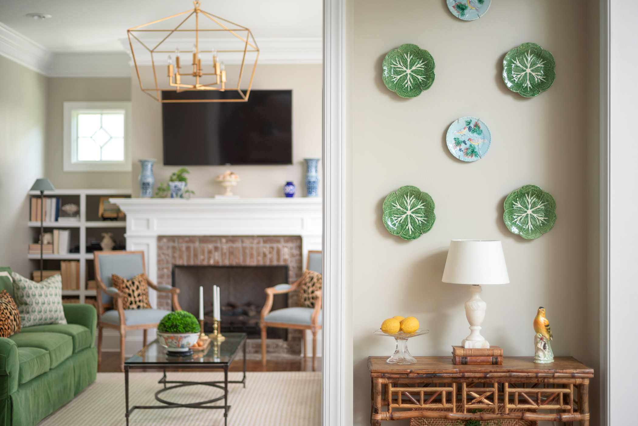
Here's a little peak from the kitchen into the family room.
The blues and greens found throughout the home's main level are repeated in the living room, along with nature inspired accessories and some textural rattan pieces. The alabaster lamp was part of my client's personal collection, and it works beautifully in here.
Before we move on, I want to share a "before" photo of the living room
It's a fantastic space with great bones and more beautiful symmetry! We were missing color, texture, and some personality to match my clients' vibrant personality.
Here again we took advantage of the wonderful symmetry offered by the fireplace wall and added some color and personality with vibrant furnishings and art. We kept the symmetry going with these fabulous opposing green velvet sofas and Louis armchairs.
Colorful books and accessories could have made this area too busy, so we kept the rug and everything in the bookcases neutral. Their texture provides plenty of interest.
Did you notice we changed out the chandelier too? The gold lantern fixture is a much better fit scale-wise and the open design keeps it from feeling too heavy.
These framed Chinoiserie wallpaper panels are the star of the show, and they are completely gorgeous and timeless. We had them mounted on foam board and custom framed in very simple gold leaf frames. Since they are casual in style, my client's existing rattan side table and the natural fiber rug are perfect counterpoints to the dressy sofa and art. Using a mix of casual and sophisticated design elements creates elegance that is comfortable and livable!
This was such a fun project and I'm a little sad to see it end, but it's fulfilling to know how much my clients are enjoying living in these new spaces and how much joy it brings them every day!
If you're in the Chattanooga area and are ready to experience more joyful living at home, call Kim at 423.653.3186 and book your consultation!
Interior Design Project Reveal of a Chattanooga Living Room and Breakfast Nook
In my last post, I shared photos of a fun dining room project I recently wrapped up that really represents the type of work I love to do! Here's the finished dining room:
We're so pleased with how it turned out and the rest of the home has a similar feel.
My clients and I share a love of classic design elements, antiques, and color mixed in with a few Chinoiserie accents. As I mentioned in my previous post, Robin's Egg Blue is my client's favorite color, and since this dining room is right off of the foyer, we carried the Robin's Egg blue and red accents into the foyer's design - but in a more understated way.
Here's the foyer as it looked before:
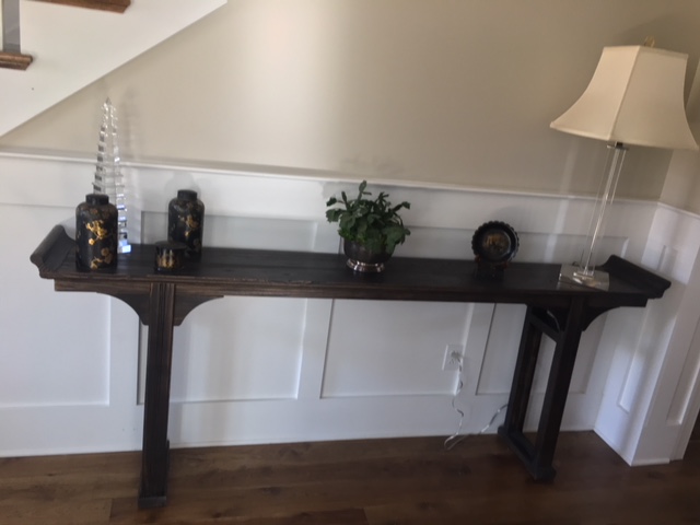
So, I had a few things to work with when I started. This altar table would remain as well as some of the small accessories.
What was missing was color, and some personality. Here's where we ended up:
I was able to re use my client's Chinoiserie inspired mirror that used to be in the dining room. I think it looks great in the foyer over the Altar table. And here's the blue and red from the dining room. We used them as accent colors against the existing neutral wall color.
We swapped out the chandelier for something more whimsical, and I just love the textural interest provided by those grasscloth chandelier shades.
The hand knotted, highly patterned runner is so forgiving - any little spots that are bound to happen just fade into the pattern. I also like this type of rug because it brings a sense of history and tradition. Don't you love it when form and function come together in such a beautiful way?
Finishing touches include a new lamp in my client's favorite color, the ceramic umbrella stand filled with a few of the their croquet mallets, and a lush fern to bring life and movement to the space. It's quite a dramatic change that was realized with a few simple changes!
Shall we move on to the breakfast nook?
Could this area be any more charming? It's kind of hard to beat a fireside dining situation.
Again, we worked with the existing paint color and brought in tons of personality, beginning with these custom Roman shades. A vibrant and whimsical print could have easily become overwhelming, but the simple tailored style of the shades keeps it in check.
And let's talk about the symmetry for a sec. When you have a perfectly symmetrical backdrop like this, I say you embrace it and keep the symmetry going as we did here. Symmetry provides a feeling of calm and order - which is a good thing at the end of a busy day!
I have one more post of this home to share with you - the living room - and you'll definitely want to stop by and see it. It's one of my favorite rooms to date, so please stop by again!
If you're in the Chattanooga area and in need of some help with your interiors, contact Kim at 423.653.3186 to schedule your consultation today!
Chattanooga Interior Design Project Reveal
I'm so excited to share these images today! This is a very recently completed project for some lovely Clients in the Chattanooga area who knew what they wanted style-wise, and completely trusted me to carry out the vision.
The client and I share a similar design aesthetic - we both love color, classic design elements, and a little bit of whimsy!
When I was called in to help, my client shared that she had been working away at the dining room, and as you can see from the "before" photo below, the room was lovely!
Quite frankly, I wondered why she called me because she was already off to such a strong start! It turns out she has an quite eye for great pieces, but she struggled with an overall "Big Picture" concept.
My interview with her gave me lots of clues into her personal style and how to create the "wow" factor that was missing. I found out her favorite color was Robin's egg blue, and that when it was all said in done, she wanted the space to feel timeless but fresh.
She also wanted to retain the furnishings she had purchased up to this point, and I was happy to accommodate her request. Her antiques are beautiful!
Take a look at the finished space!
As you can see, we managed to completely transform the space while working with the existing furniture - and a majority of her accessories!
We took a risk by painting her previously white woodwork in her favorite color - Robin's Egg blue. We then took that color another step further by installing a fabulous sisal wallcovering in the same shade of blue. The contrast between the satin paint finish and the nubby grasscloth provides just enough tension to keep things interesting - and it's such a gorgeous backdrop for her antiques!
Keeping her desired light and fresh aesthetic in mind, I had custom window treatments made up in a simple cream linen blend fabric with accents of cheery red. The red is a little unexpected and adds a "happy" factor to the collected, layered look we were going for.
OK, extra points if you noticed that the mirror has been swapped out for this antique showstopper! I spotted it at a local Chattanooga antique mall and knew it would be perfect in this space. My client agreed wholeheartedly and it really makes quite a statement.
Did you notice the light fixture was replaced with an antique crystal chandelier? It's definitely an upgrade from the previous builder basic chandelier and adds some well pedigreed sophistication.
One thing I keep in mind with any space I'm working on is that a well decorated room is all about balance. Crystal chandeliers and ornate mirrors create a feeling of formality, so we had the dining chair seats reupholstered in a playful animal print fabric to keep the mood fresh and youthful.
The spotted fabric is another unexpected selection that really updates these formal antique dining chairs. Couldn't love it more!
I'll be sharing photos of the other rooms in this beautiful home, so be sure and check back in soon!
If you're in the Chattanooga area and looking for a designer to take your interiors to the next level, call Kim at 423.653.3186 to schedule your consultation!
Five Fabulous Foyers
Isn't that a clever name for this post?
Today I want to share five foyers that are from completed projects. Two of them are from a few years ago, and I'm happy to report that they're still looking as fresh as they were the day we installed them.
Foyers are some of my favorite spaces to decorate. They're like a calling card to the rest of your home. Foyers provide a little introduction about what is to come, and since they're "pass through" spaces that you don't spend much time in, risk taking is encouraged - by me! You're welcome.
Ready?
What do you think this foyer seen above and below says about the people who live here?
It's edited, collected, and proudly displays some personal items.
Obviously the risk we took with the overscale abstract art paired up with the rustic bench was well worth the reward. This grand foyer is timeless and chic - just like the people who live here!
Let's take a look at another
Can you gather a few any clues about my clients from the design of this foyer? They moved to Chattanooga from the Charleston area, and they wanted to bring some of their coastal roots to their new home. Bleached woods, organic materials and a soft color palette create a relaxed, breezy feel to their newly made over foyer. We love it!
What do you think this foyer has to say about my clients? Their home is in a mountain setting and they wanted their home to reflect its surroundings. They're friendly, down to earth folks and this foyer sets the tone for the mood of their house - which is a mix of rustic, casual elegance!
Side note: that painting above the console table was done by my clients' son -we had it reframed and it's the perfect personal statement!
Here's another favorite project. It's a foyer from an historic Colonial Revival home in Chattanooga. We took a risk with the antelope print carpet on the staircase but it's one of our favorite design elements in the entire house! Antiques , botanical prints, touches of a cheery red and a few modern touches reflect my client's happy, playful nature.
I got one more for ya. This is a very recently completed project.
My client loves Chinoiserie (Asian inspired) decor. It's timeless and little whimsical, which allows this foyer to perfectly represent this fun and family friendly home.
I'll leave you with a of my best tips for creating a welcoming foyer:
A table or chest of drawers with a basket or tray provides a great place to drop keys and mail.
A mirror in the foyer allows you to check your appearance before heading out the door, and it allows visitors to check themselves as they arrive.
Whatever your aesthetic, nothing beats a statement light fixture . Don't settle for builder basic!
Take a risk! A bold wallpaper or color choice is a great way to infuse your home with personality and wow your guests!
Ready to take your Chattanooga area home to the next level? The Green Room Interiors is now accepting new clients for fall 2018. Call Kim to reserve your space now before the holiday rush! 423.653.3186 or email thegreenroominteriors@gmail.com
The Fifth Wall
I'm sure you've heard the expression "the fifth wall" before, but in case you haven't, we're talking about ceilings - typically the most underutilized parcel of real estate in our homes.
Have you heard? They don't have to be painted "ceiling white".
As a passionate professional decorator, it's pretty exciting to think about the possibilities that exist for ceiling decoration. And they don't all have to be overly complex or dramatic.
It can be as simple as using your favorite color on the ceiling, as seen in this collected living room by Tilton Fenwick. The pink ceiling is unexpected but really warms up the space and makes it feel intimate.
You could even push the envelope a little further by wallpapering the ceiling, as Shelley Johnstone did below with this amazing Fornasetti malachite wallpaper.
Gorgeous!
A strong architectural statement can be created on the ceiling by combining beefy moldings over a lacquered watery blue finish. Stunning dining room below is by Atlanta designer Suzanne Kasler.
Finally, if you want to go all out and really create a memorable environment, consider a tented ceiling. It's not for the faint of heart, but it's my favorite of all of the ceiling treatments!
This room (above) was part of the Southern Living idea house a few years ago. It was designed by architect and designer Bill Ingram, and it's unforgettably beautiful. I love how it's a little over the top but still incorporates simple, nature inspired design elements. Good stuff!
I hope I've inspired you to explore all of the possibilities with the fifth walls in your home!


