Project Reveal - Chattanooga Master Suite - The Sunroom

First of all, happy 2023!

As usual, the holidays were a flurry of preparation and celebration! We’re grateful for the time we spent with family , the great food we indulged in, and our amazing team and clients who make us excited to get up in the morning to get to work!

Now that we’re in the throes of 2023, I want to share more of this favorite project from 2022. In this post, we’ll look at the sunroom makeover. The sunroom is attached to the master bedroom, and it’s a cozy room where the family unwinds at the end of the day.

From a functionality standpoint, the clients needed a desk for work-from-home evenings, a sofa/seating for relaxing, and a whole new look. Here’s why:

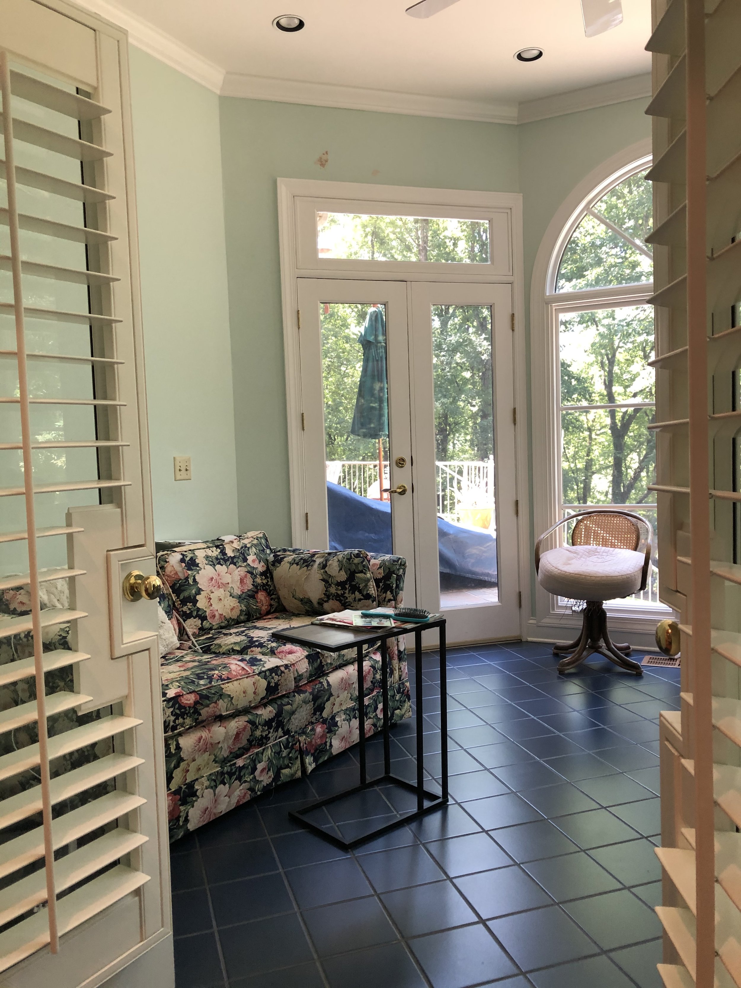
The blue tile floors aren’t what you would call cozy and restful.

But oh, the views out of those big, beautiful windows!

The bones of the sunroom are wonderful - it’s always a plus when you have classic architectural elements as a backdrop!

The plan we came up with was to lose the tile flooring and replace it with wood that matched the the master bedroom hardwoods. With a twist. It’s hard to tell from the photos but the sunroom is octagonal, and we decided to create an octagon on the floor with the placement of the wood flooring.

Other needs: A new desk that offered some storage and was properly scaled for the room, a comfy sofa for relaxing after long and stressful days, and of course, a “wow” factor (my personal favorite).

I can’t imagine a lovelier workspace, but I have to admit - it might be hard to get any work done with those beautiful mountain views!

We used the same charcoal brown on the walls that we used in the master bedroom. Dark colors feel so calming and enveloping - I particularly love them in a bedroom, den, or dining room.

And the floors! You can’t see the full octagon in this image, but you can see how the planks follow the angles of each wall. So rich and warm!

The gold and glass lantern has a masculine feel to it and was at the top of my client’s wish list. I was happy to accommodate becauseiIt works perfectly in here and I love that it doesn’t obstruct the view of the wallpaper - or the view outside the windows.

The colors of nature will never fail you!

Crypton fabric on the new loveseat will resist the inevitable spots and mishaps along the way. I adore the Louis child’s chair - it’s a family piece. The leather ottoman was pulled in from another room - it’s durable and can be used for additional seating if needed.

The wool rug is textural and casual - which supports the whole relaxed/cozy vibe of the space.

Sigh… the end of a wonderful project leaves me with the happy/sad feels. Super happy to have had the opportunity to work on this project with some wonderful people, but a little sad that it’s over too!

Oh, and thank you for visiting today and reading about this project. I’ll be sharing the master bath next!

Are you ready to live more joyfully in your home? We’re currently accepting new work for late spring of 2023. We’d love to hear about your project!


Project Reveal - Chattanooga Master Suite - The Bedroom

This post has been in the works for quite a while, and I’m so happy to finally share it with all of you.

Here’s a synopsis of the project:

The Challenge: Take a 1990’s master suite and bring it into today while retaining the home’s character and honoring the homeowners’ style preferences.

Pain Points: 1. The clients are busy with careers, classes, and a new baby on the way. They simply didn’t have the time to make a new plan for these spaces and do all of the leg work involved. 2. Although they have style preferences, they weren’t sure how to pull it all together to create a master suite they could enjoy for this phase of their lives.

Style Preferences: The clients were smart in that the highest priority was to blend the new design with the architectural style of the home and their mountaintop location. They love the outdoors and kayaking and wanted some nature inspired touches in their new suite.

The Plan: We decided to work within the existing footprint of the bedroom while updating the decor and a few of the architectural features. They wanted refined but not formal, clean lines, and a few rustic touches to speak to their love of nature.

The Before: Well, let’s just say the 90’s were looking a little tired in here, and definitely not a reflection of my clients preferences or lifestyle. Observe:

What we Did: My client wanted a pretty bedroom, but not necessarily girly or feminine. She wanted a handsome room that felt quiet and restful. Nothing sets the tone quite like the perfect paint color, and we landed on a rich, dark charcoal/brown for the walls. See that fireplace? It got a major makeover with some gorgeous marble slabs that make a statement in the most simple form. The brown cabinet behind the wing chair was removed and a custom built in cabinet was installed to display personal collections and cherished family photos. We kept the rice carved bed - it is such a high quality piece and will be forever stylish, so it was an easy decision.

The Result:

Hello, tall dark and handsome! The bedroom is restorative, timeless and restful for a busy couple with a new baby. To further meet the clients’ needs for functionality, we added natural linen blackout lined curtains trimmed in a luxe navy velvet to provide the perfect sleeping environment.

Mixing a few modern design elements with classic pieces always nets a curated and personalized look. Bed linens are neutral and textural, with a playful infusion of color and nature found in the bunny tapestry pillow.

Remember the old fireplace? It’s been replaced with this stunner in the most chic marble imaginable!. The simplicity of the design allows the veining to shine - and it does just that. The antique chair is a family piece that was updated with a watercolor floral fabric.

We had so much fun styling the new bookshelves. We made no new purchases for this area - everything we used was already in the client’s home!

And just for fun, here is an iphone shot from photography day. We brought in some greenery to add life to the fireplace photo.

In my next post, we’ll take a look at the attached sunroom/office space. You’ll want to be sure and check it out - it’s so good!


The Green Room Interiors is currently accepting new work for early 2023. We’d love to help you live joyfully through great design. Email us at thegreenroominteriors@gmail.com and tell us about your project!

Currently....

Today I’m sharing some photos of a project that is currently in progress. Covid has played a major role in the speed at which things are progressing (or not progressing).

But we forge ahead and we’re so grateful for the little victories/deliveries that come our way after months of anticipation.

This is a Chattanooga master bedroom, bath and sunroom project that is shaping up to be the ultimate sophisticated retreat for grownups.

Here’s the bedroom before:

A view of the wall opposite the bed.

This beautiful home is in a gorgeous mountaintop setting with incredible views of the Tennessee River gorge below. It was built in the 1990’s and the owners are updating the interiors in stages.

Here’s a progress photo showing the new marble fireplace surround and paint color. I have to say, this turned out even better than we had expected. Kudos to local stone provider Stone Source for hearing our vision and bringing it to life!

We also removed the ill fitting and dated cabinet in the little niche at the end of the fireplace wall. The clients opted to fill this area with open shelves to display family photos and cherished mementos.

We chose to paint out the cabinet in the same color as the wall paint to create quiet unity in that area and to allow the marble fireplace to be the stronger focal point.

This is what we’re working toward for the fireplace wall.

Want to see the sunroom before?

This is a favorite room of the homeowners. It offers amazing views of the property and beyond. The room has great bones and the transformation is nearly complete!

Almost there!

We installed new wood floors to match the existing wood floors in the bedroom and to follow the lines of the octagonal shape of the room. A new loveseat and work station provide a cozy spot to connect at the end of their busy days and -and work from home as needed.

The bedroom is getting a glow up too, but back orders are delaying installation. Here’s a look at where we’re going with the bedroom.

We’re keeping the poster bed - it’s timeless and heirloom quality. New night stands in a painted finish will update the room and textural pillows will help keep the feel quiet and comfortable. Linen drapery panels with blackout lining and navy velvet trim will be both functional and beautiful.

Can’t wait to share more of this stunning master suite upon completion. Bathroom photos coming too!

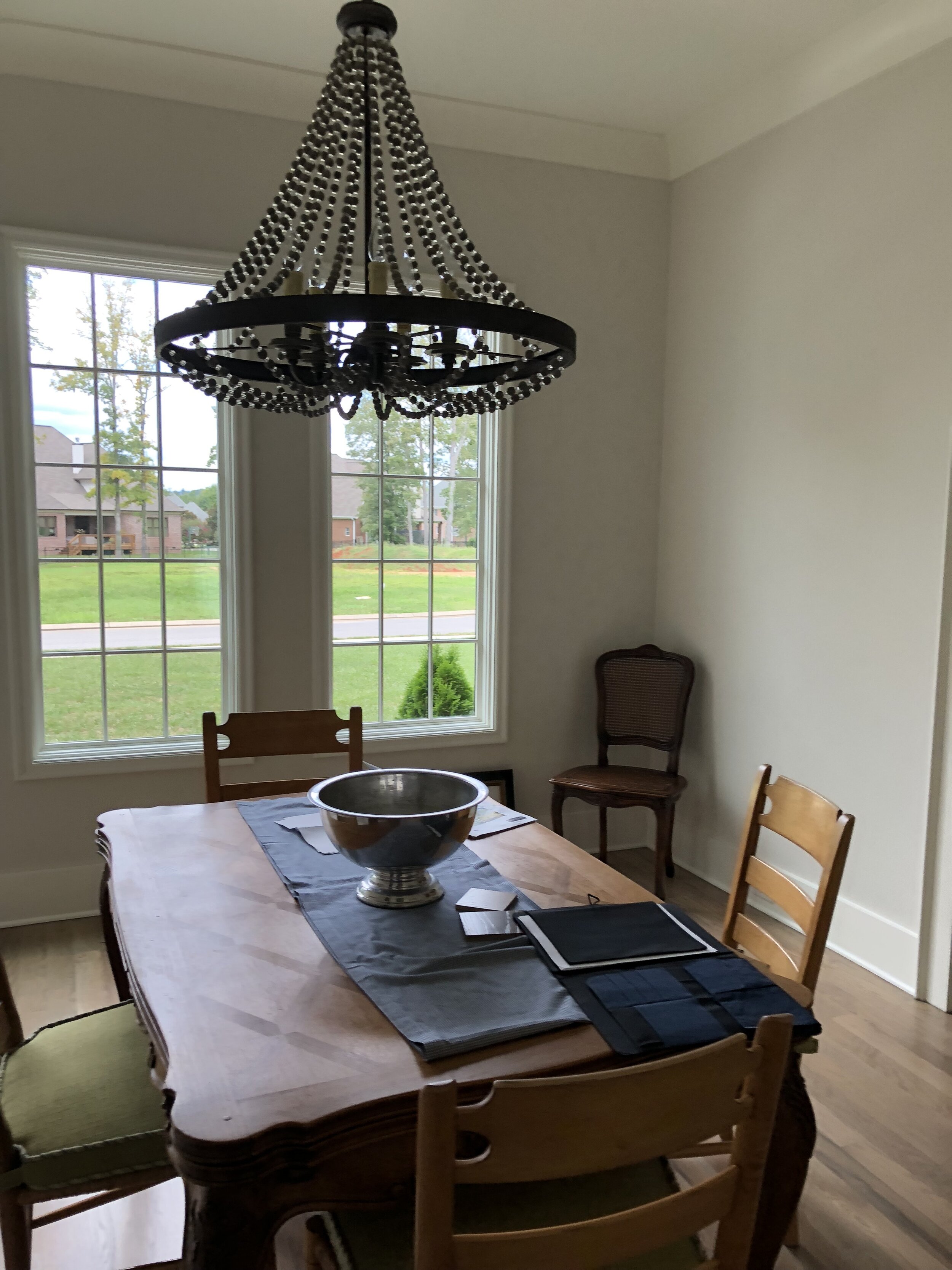
Project Reveal - Luxury interior Design in a New Construction Home in Chattanooga- dining room and foyer

Let’s continue our tour of this beautiful new construction home in Chattanooga for a wonderful family that prefers a chic hotel look for their home’s interiors.

Although these clients are not afraid of using bold strokes of color, they wanted to work with the builder’s light neutral wall color throughout the home and they wanted classic furnishings with clean lines.

PSA: I think this is a wonderful approach to selecting furniture for your home. Clean lined pieces (meaning not a lot of curls, swirls and ornamentation) are so versatile. They easily transition from one design era to another, and they’re great for mixing in with more ornate pieces you may already own.

As for working with the light, neutral walls throughout the home, I felt the dining room was the perfect opportunity to add some bold color. Here’s why:

  1. Most people don’t use their formal dining rooms daily, so you won’t tire of the bold color quickly.

  2. A bold color in a contained space is a wonderful exclamation point to a mostly neutral scheme.

  3. A bold color in an infrequently used space makes those special occasions a little more memorable, so those celebrations feel extra special.

Bring on the intimate dinners and special occasions!

Bring on the intimate dinners and special occasions!

Here’s where we started. Thanks to the builder, there are some beautiful architectural features to work with!

And here again is the finished product!

Shall we break it down? Obviously we have to start with the walls. We presented a wonderful, textural sisal grasscloth wallpaper that is at once bold and elegant. My super smart clients - who actually were a little hesitant about wallpaper in general, approved it immediately. It’s truly the star of this dining room!

Another favorite element in this space is the chandelier. The builder basic fixture was replaced by this stunning iron and gold leaf light fixture that elevates the look of the entire room.

The dining table is a timeless classic. Traditional at it’s core, the clean lines of the legs and gorgeous mahogany wood will remain relevant for decades to come.

I love to mix painted and stained finishes in dining areas, and these iron klismos chairs with the sculptural sabre legs echo the table base beautifully while providing a bit of contrast to the wood finish of the table!

We had custom chair pads made for comfort and to convey more warmth. The custom area rug has a quiet presence that grounds the seating area while providing some understated texture. The art glass bowl on the dining table is part of the homeowners’ collection.

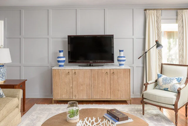
See the sideboard in the background? We had used this piece in my client’s previous home in their living room (see image directly below). It’s marketed as a media storage piece, but it works perfectly in their new dining room as a sideboard with storage for china and crystal inside.

The dining room is to the immediate right as you enter the home’s foyer, so we placed a small entryway table there and styled it to “speak” to the dining room.

Entryway

Entryway

Good gracious I just love how the bold blue hues in the painting reach out for those dining room walls. And the blue and white porcelain vase speaks to the blue and white pieces on the dining room buffet.

I couldn’t be happier with how this dining room came together, especially since it was a style stretch for the clients. And as an aside, after I had presented the plan for the dining room my client had reservations. She couldn’t quite see or feel how these unrelated items would come together, but she trusted me when I reassured her, and we’re all so happy with this room!

Hope you enjoyed this portion of the tour. Next I’ll be sharing the master suite and it’s good!


Project Reveal - Dining Room in a New Construction Home in Ooltewah

I have a real treat for you today, because I’m going to share a completed project for a wonderful couple who relocated from Texas to Chattanooga (Ooltewah, to be specific!)

Their home is newly built by local builders Waters-Holland, and the dramatic architecture and neutral color scheme created a wonderful backdrop for the direction we planned to take.

My clients’ previous home was very traditional and somewhat dark, and she envisioned a lighter color palette and a not so fussy aesthetic.

I instantly knew this project would be a good fit because I love to create classic, light hearted interiors with a mix of timeless design styles that will be relevant for years / decades to come, and this project checked all the boxes.

Also, the clients are wonderful - kind, trusting, and open to fresh ideas.

Here’s where we started:

IMG-4488.jpg
IMG-4485.jpg

As you can see, there is an abundance of natural light , beautiful white oak flooring, high ceilings and generous moldings all working in our favor!

My clients and I set a goal to create a warm, simple and timeless dining space for friends and family.

But first, we planned. The footprint of the room is more square than rectangle, so a round table would be a good fit for the space.

In an effort to create a curated look, we mixed a stained wood table with painted chairs. To create good functionality, we added a small server that would be used to display barware and and store pieces used for entertaining.

It’s also important to note that the opening to the dining room is the first room you see upon entering the home, so we wanted to create some eye candy right off the bat.

We couldn’t be more thrilled with the finished product!

We couldn’t be more thrilled with the finished product!

The mural sure brings the drama, but the color palette is earthy, which makes it easy to live with.

Classic square back Louis chairs in a painted finish will always be in style, and the chic distressed leather upholstery makes for care-free maintenance and adds a masculine touch.

abernathy dining mirror.jpg

The server is new, and it was selected for it’s size compatibility to the available wall space and it’s weathered finish, which contribute to the relaxed feel of the space.

The gold mirror came from my clients’ previous home, and it worked perfectly in the space. The alabaster lamp is a vintage find from a local antique mall, and I had the block print shade custom made to add another level of detail.

Other finishing touches were curated from my clients’ personal collection and styled by me.

We also had some custom roman shades made for the windows. A simple linen and cotton blend fabric accented with neutral tape trim doesn’t compete for attention, but adds more quiet sophistication to the room.

Warning: Iphone photo to follow:

IMG-5883.jpg

And there you have it! A sophisticated, custom dining space that will easily transition into the future!

In my next post I’ll share the living room project - you don’t want to miss it!

Ready to live in timeless comfort and beauty? The Green Room Interiors is now accepting new projects for winter 2020/2021. Contact us at thegreenroominteriors@gmail.com and tell us how we can be of service to you!


What I'm Working on Now - Lake House Living Room

Right now I’m working on a project I’m pretty excited about. It’s complete design project for a wonderful couple I’ve worked with on multiple occasions in their primary home on Signal Mountain. A few years ago they built a house on Watts Bar Lake for a weekend getaway for their active family and friends. I had the pleasure of working with them to select all of the finishes in the lake house during the construction phase, and now that the dust has settled on construction, we’re moving forward with getting the living room decorated.

Here is a list of priorities they gave me that guided our selections.

  1. Since my clients will be hosting multiple families with children, easy-care selections were imperative. After all, they didn’t want to be slaves to cleaning the upholstery nor did they want to be stressed out when kids with ice cream cones were in the house.

  2. My clients will host multiple families at the same throughout the warmer months, so they wanted to incorporate as much seating as would comfortably fit in the living room and dining areas.

  3. Since the house is surrounded by nature and gorgeous lake views, they wanted to keep the decor simple to allow the lake and the property to be the main focus.

  4. Their primary home is a brick Georgian style traditional home with very classic furnishings, and the lake house has a cottage vibe, so we decided that clean lines and natural elements would dominate the interiors. We also plan to mix in some classic design elements to give the room some longevity. #timelessovertrendy

In all projects I work on, form follows function, so I wanted to get the layout right before sourcing furniture pieces. The living room is a nice size, but not oversized, so it was important to pay attention to the scale of the furniture so we could incorporate as much seating as possible.

For the aesthetic, it’s natural/neutral with plenty of texture and high contrast.

df anz lake house textiles.jpg

Yum. Leather, wood, stone, and nubby textiles provide plenty of interest. Dark and light bring the contrast to keep the look crisp rather than frumpy. Fresh green stuff adds softness and life.

I love this direction!!!


Okay, here is our sofa selection. YES we’re going with the caramel leather!!! No, we’re not adding the nail heads. This sofa has such simple lines we decided to keep it pure and leave off the additional ornamentation.

mhirving.jpg

Proposed additional seating in the images below - all smallish in scale but comfy and so so handsome. PLUS - easy to maintain!!

This chic rocker definitely fits the direction we’re taking, no?. Natural wood finish and that fabulous woven seat and back remind me I’m in a very special place and it puts me in a very mellow frame of mind.

This chic rocker definitely fits the direction we’re taking, no?. Natural wood finish and that fabulous woven seat and back remind me I’m in a very special place and it puts me in a very mellow frame of mind.

ALSO

Leather woven occasional chairs. Easy care + comfy + so good looking!

Leather woven occasional chairs. Easy care + comfy + so good looking!

We’re going to add in some metallic finishes, baskets, greenery and place it all on a fabulous vintage persian rug.

Here’s where we hope to end up:

df anz lake house living room.jpg

Easy care finishes: Check

Seating for a crowd: Check

Simple,organic style with some contrast: Check

Almost forgot - the dining area of this open floor plan will tie in with the living room perfectly. They’ll share the clean lines, natural finishes, high contrast, and a touch of nature. Added bonus - the host chairs in the dining room can easily be transported to the living room and used for comfy seating as needed for super large crowds.

Do you see how important it is to plan your room’s design?

df anz lake house dining area.jpg

Currently we’re sourcing and ordering all of the pieces. Once we receive everything and I get it photographed I’ll post pictures.

Super excited to see this one come to life!

If you’re in the Chattanooga area and ready to live each day in easy elegance, call Kim at 423.653.3186 to discuss your project! We’re currently taking new projects for late summer 2019.


Chattanooga Interior Design Project Reveal - The Upper Level

HI again!

In my last post I shared the reveal of a new home Decorating project for a wonderful family in Chattanooga. Today we’ll go upstairs and have a look at those spaces!

In case you missed it, the aesthetic for this home is light, bright, and simple. The clients’ previous home was very traditional and was decorated with an Old Word/French Country twist - which worked perfectly for that home’s architecture. However, my clients were ready to embrace a more pared down style in their new home.

At the top of the steps is a loft area. We decided to utilize that space as a media/game room.

Chattanooga interiors

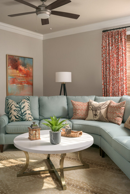
A cozy sectional is perfect for lounging and watching movies, especially in an area mostly used by family. My clients love color, and the blue and orange color palette is a great counterpoint to the light and neutral wall color.

Dartmouth St 785_Web_2.jpg

My clients wanted to incorporate a game table into the loft area, and I was lucky enough to source this mid century modern game table and chairs from a trusted local antiques dealer. The chairs are fantastic quality pieces and we had them recovered in a sturdy fabric to work within our color palette.

Right off of the loft area is a bedroom that is used by my clients’ daughter when she is in town. Our selections in this bedroom were guided by her style preferences.


Dartmouth St 785_Web_4.jpg

We tucked a little workspace into this area under the eaves to make it as functional as possible. The floral print on the drapes adds some movement and interest to the room without dominating the space. I love this understated feminine print!
chattanooga decorator teen bedroom

All of the art was selected by my clients’ daughter, and she can add to this gallery wall as she collects more pieces.

The last space we’ll look it is very special. It’s a home office for the lady of the house, and I’m pretty in love with this room.

chattanooga interior design home office

This space represents everything my client wanted in her home office. It’s colorful, light hearted, a little whimsical, and eclectic. This room gets the most beautiful natural daylight and it’s a such a happy space to work in!
That rounds out the tour of this beautiful home! I hope you enjoyed seeing it as much as I enjoyed working on it!

The Green Room Interiors is accepting new clients for Spring/Summer 2019. Contact Kim at 423.653.3186 to set up a consultation.

Chattanooga Interior Design Project Reveal - Main Level

Welcome!

Today I want to share a recently completed project that I’m sure you will enjoy seeing.

How about a little background info first?

I have had the pleasure of working with these clients on their previous home, and they’re great to work with. Not only are they trusting and decisive, but (added bonus) they had a pretty clear vision of the direction they wanted this new home to take! And speaking of the new home, it’s a downsize from their previous home and it’s a gorgeous newly constructed home that they bought upon it’s completion.

All of the finishes ( paint colors, cabinets, countertops, tile, stain colors, etc) were already selected when the clients made the purchase, and they provided a wonderful light and neutral backdrop for the furnishings.

The clients’ former home had an Old World French style of architecture, and although it was a beautiful home and a good fit for them previously, they were ready to embrace a lighter, cleaner aesthetic in the new digs.

Ready to tour?

Dartmouth St 785_Web_9.jpg

Like many of today’s new homes, the main level is quite open! We decided to work with the existing paint color (a light, warm greige,) and add color through furnishings and accessories. All of the furnishings you see here are new, with the exception of the nesting table set to the right of the sofa. The clean lined legs made these tables a perfect fit for our new direction!

Although there is no dedicated foyer, we created an area to drop keys and mail by adding a small chest near the front door.

Dartmouth St 785_Web_8.jpg

And here’s the opposite side of the room. We added a little drama by painting the backs of the bookcases off-black, which provides a stronger silhouette for the items on the shelves.

Newer homes that are very open don’t offer a lot of wall space to hang art, and we loved these prints from the clients’ previous home. Our solution? We placed them on the front of their built-in bookcases. I love a little of the unexpected!

The ceilings are very high in this area, and the topiary urns act as finials to each bookcase.

Dartmouth St 785_Web_6.jpg

This is the view from the front door, looking through the living room and kitchen into the dining room. The vaulted ceiling created a great opportunity for some design drama, so we capitalized on that opportunity and swapped out the builder’s fixture for this stunning gold showstopper. Yes, it’s large, but since it’s simple in form it doesn’t feel too heavy.

The Louis dining chairs are from my clients’ previous dining room, and they work perfectly in their new home.

Dartmouth St 785_Web_7.jpg

Here’s closer look at the dining room . The table and buffet have a slightly weathered finish, which contrasts beautifully with the modern art and contemporary chandelier. The overall aesthetic is very clean and simple, which makes a perfect backdrop for family dinners and casual entertaining!

The master bedroom is also located on the main level and it came with some wonderful architectural details. My clients opted to change the paint color to a restful blue. They had used this very color in their previous home, and it’s such a lovely color we were eager to incorporate it into their new home.

This room gets some beautiful natural light. We also love the coffered ceiling, hardwood floors, and tall doors. The chairs, bedding and pillows were brought over from the clients’ previous home. Everything else was selected to work with these desig…

This room gets some beautiful natural light. We also love the coffered ceiling, hardwood floors, and tall doors. The chairs, bedding and pillows were brought over from the clients’ previous home. Everything else was selected to work with these design elements.

I think the takeaway here is that with some careful selections, you can create a feeling of calm and enjoy some color at the same time!

Dartmouth St 785_Web_11.jpg

We opted to create a fun, bohemian look on a main floor bedroom that is used by the client’s adult son when he is in town.

Dartmouth St 785_Web_12.jpg

A clean-lined low brass bed is flanked by vintage mid century modern end tables topped with smoked glass. The charcoal velvet quilt is accented with mud cloth and bohemian inspired pillows. The end result is completely appropriate for guests while pushing the envelope a little.

I hope you enjoyed touring the main level of this lovely home today. In my next blog post we’ll tour the upstairs rooms. Hope you’ll stop by again for a look!

The Green Room Interiors is accepting new clients for Spring and Summer 2019. Contact Kim today to schedule your consultation. Email thegreenroominteriors@gmail.com