Let’s continue our tour of this beautiful new construction home in Chattanooga for a wonderful family that prefers a chic hotel look for their home’s interiors.
Although these clients are not afraid of using bold strokes of color, they wanted to work with the builder’s light neutral wall color throughout the home and they wanted classic furnishings with clean lines.
PSA: I think this is a wonderful approach to selecting furniture for your home. Clean lined pieces (meaning not a lot of curls, swirls and ornamentation) are so versatile. They easily transition from one design era to another, and they’re great for mixing in with more ornate pieces you may already own.
As for working with the light, neutral walls throughout the home, I felt the dining room was the perfect opportunity to add some bold color. Here’s why:
Most people don’t use their formal dining rooms daily, so you won’t tire of the bold color quickly.
A bold color in a contained space is a wonderful exclamation point to a mostly neutral scheme.
A bold color in an infrequently used space makes those special occasions a little more memorable, so those celebrations feel extra special.
Bring on the intimate dinners and special occasions!
Here’s where we started. Thanks to the builder, there are some beautiful architectural features to work with!
And here again is the finished product!
Shall we break it down? Obviously we have to start with the walls. We presented a wonderful, textural sisal grasscloth wallpaper that is at once bold and elegant. My super smart clients - who actually were a little hesitant about wallpaper in general, approved it immediately. It’s truly the star of this dining room!
Another favorite element in this space is the chandelier. The builder basic fixture was replaced by this stunning iron and gold leaf light fixture that elevates the look of the entire room.
The dining table is a timeless classic. Traditional at it’s core, the clean lines of the legs and gorgeous mahogany wood will remain relevant for decades to come.
I love to mix painted and stained finishes in dining areas, and these iron klismos chairs with the sculptural sabre legs echo the table base beautifully while providing a bit of contrast to the wood finish of the table!
We had custom chair pads made for comfort and to convey more warmth. The custom area rug has a quiet presence that grounds the seating area while providing some understated texture. The art glass bowl on the dining table is part of the homeowners’ collection.
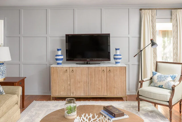
See the sideboard in the background? We had used this piece in my client’s previous home in their living room (see image directly below). It’s marketed as a media storage piece, but it works perfectly in their new dining room as a sideboard with storage for china and crystal inside.
The dining room is to the immediate right as you enter the home’s foyer, so we placed a small entryway table there and styled it to “speak” to the dining room.
Entryway
Good gracious I just love how the bold blue hues in the painting reach out for those dining room walls. And the blue and white porcelain vase speaks to the blue and white pieces on the dining room buffet.
I couldn’t be happier with how this dining room came together, especially since it was a style stretch for the clients. And as an aside, after I had presented the plan for the dining room my client had reservations. She couldn’t quite see or feel how these unrelated items would come together, but she trusted me when I reassured her, and we’re all so happy with this room!
Hope you enjoyed this portion of the tour. Next I’ll be sharing the master suite and it’s good!


