New Year/New Colors - The 2018 Edition

In case you haven't heard what the new "IT" colors are for 2018, let me enlighten you.

First up is Pantone's 2018 color of the year.

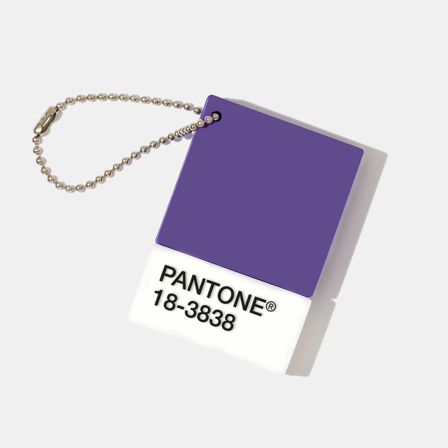
It's "Ultraviolet".

This shade, to be exact:

77ace110-c491-404f-bacf-9b9f02d906e1.jpg

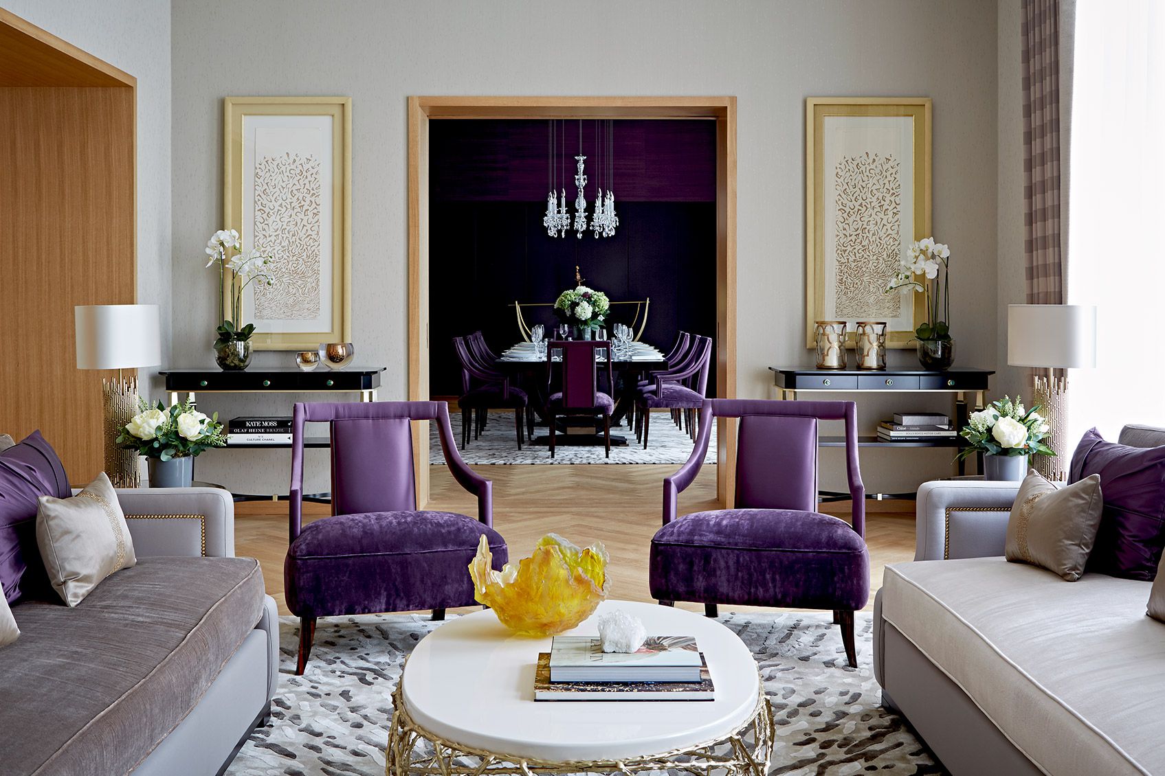
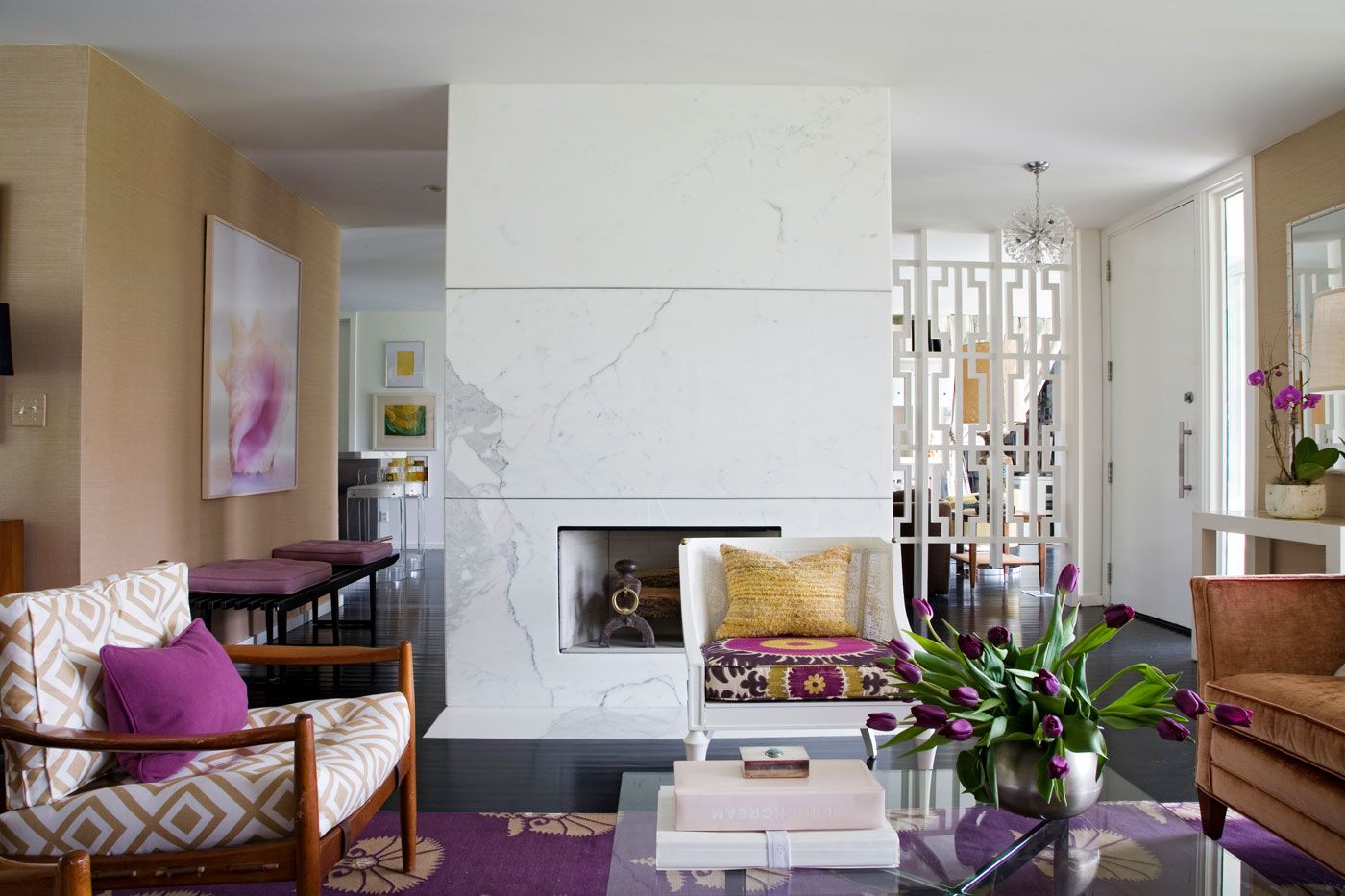
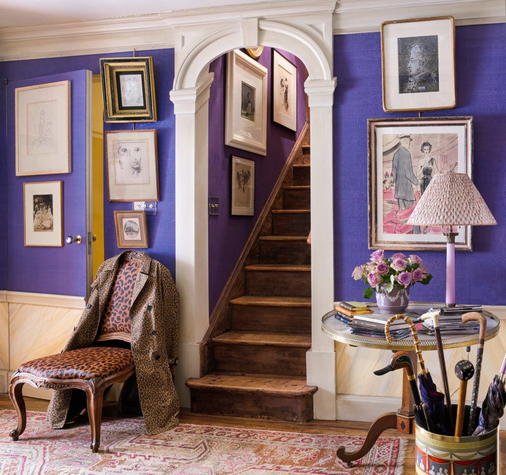
If you ask me, it's more of a royal purple.

b579010b-c43e-47c2-9455-c4f548cb1af6.jpeg

Too much?

How about this:

edbbbab7-a99f-4e10-b381-c45fab3c5bf6.jpg

Probably better in small doses.

Benjamin Moore's Color of the Year is equally bold and saturated.

"Caliente"

28d5fa77-a750-4127-bcb6-2d0d85356c76.png
bd395553-6217-404d-824b-6220d5dd6a62.jpg

I haven't had ANY requests for red walls in years nor have I had a hankering to incorporate them anywhere, but I have to admit that this Caliente room feels about as cozy and comforting as my Dearfoams on a chilly night.

Wondering what all of this means to you?

Well, it certainly doesn't mean you should swath all of your walls in Ultraviolet and Caliente!

BUT, if you're ready to take a step away from the pallor of all of those grays that have dominated interiors over the past several years, why not consider a few touches of bold color in small but meaningful doses.

Like coating your front door in Caliente.

e304629c-e23d-4654-8589-27435b280ae3.jpg

It's such a gorgeous counterpoint to the soft white and turquoise backdrop. (PS: Note how beautiful Caliente was with the soft blue accents in the room photo above).

Caliente accents in this kitchen by Nick Olsen is en fuego. A little red goes a long way.

Whenever I see a room by Angie Hranowsky I love purple a little more. It's her signature color and she makes it work. Every. Single. Time.

a1bcbbc3-ae7b-4a3d-a01c-5b37ccf74e24.jpg

So colors of the year for 2018.

Take them or leave them.

Your house. Your call.

The Green Room Interiors is taking new clients for 2018. If you're in the Chattanooga area and ready to live in timeless beauty, call Kim at 423.653.3186 or email thegreenroominteriors@gmail.com

Giving Thanks

It's hard to believe that the Thanksgiving holiday is already upon us. Here in Chattanooga we've had a very hot and very dry fall this year, so it's been hard to mentally transition into the holiday season.

Thanksgiving is easily my favorite holiday. Around here, the weather is usually perfect this time of year. Cool sunny days give way to cooler fall nights.

bb9d26c6-2caa-422a-89e2-079c5826160d.jpg

There's none of the hype of Christmas, what with trying to the find the perfect gifts for family and friends. Instead, it's a day that's about food and family (and football).

f5c9d10d-3d81-4d9c-9ca4-51a32a5edff7.jpg

Thanksgiving is a day set aside just to stop and reflect on the blessings we enjoy every day. Here is what I'm most thankful for:

1. Faith - I am thankful to be the child of a Kind and Loving God who hears and answers prayers. There have been times in my life where things were provided that could have come from no other place than from God. Things that couldn't be explained yet could be felt in my heart. God's love and presence is constant - and I am thankful for that.

b19443fa-8b07-4503-8ce0-a8ab5e19230a.jpg

2. Family. I have a beautiful family that I'm thankful for. I have an amazing husband that makes me feel loved and important every day. I am the proud mama of 2 beautiful daughters that are healthy, smart, and kind. I have a 3 year old grandbaby that brings so much joy to our lives that sometimes I think my heart will burst! I am blessed to still have my wonderful parents - both of them in their 80's and of strong minds and bodies. They have nurtured me my entire life and continue to do so. My two brothers are good, caring men and we all share a strong family bond.

c5d599de-ac39-4bf3-afc4-ce026b170d09.jpg

3. Home. More than just a roof over my head and shelter from the elements, I'm thankful for my cozy little house. It's my most favorite place that has all of my most favorite people in it. We laugh here, we cry, we argue, we make up, we celebrate, we make plans, we cook, we connect here.

b87dd799-c3ec-40e3-a7a4-54cbea5d7566.jpg

4. Work. What an amazing gift it is to be able to get up every morning and be excited to go to work! I love what I do and it's such a blessing to have the opportunity to share my God given talents with others.

5. Country. I'm thankful to be an American. I'm thankful to have the freedom to work hard, pursue my dreams and raise my family in a country where we can control our destinies. As Americans, our dreams can be achieved through determination, hard work, and smart choices. We have the freedom to succeed and prosper, yet we also have the freedom to make mistakes and start over.

434376d2-48f6-47c1-b737-747077703969.jpg

I wish you a Happy Thanksgiving full of love, blessings, and great food!

16d82a46-ea8e-467d-becc-65cc4994168b.jpg

HGTV Vs. Real Life Design

HGTV - does anyone even watch it anymore? They seem to have gone from decorating/gardening/home improvement shows to the Real Estate channel with seemingly non stop episodes of House Hunters that we have seen a hundred thousand times.

But I digress, because this is not really the main beef I have with HGTV.

What annoys me is how that they facilitate unrealistic expectations for what real life decorating and renovation projects entail. Within 30 minutes, they visit some sad room in need of an update, come up with a design plan for the space, and implement the entire design culminating in the big reveal to the overjoyed homeowners. And what about budgets? I would love to know how they arrived at these figures. Renovation/construction costs are the magical unicorn at HGTV. Apparently those Property Brothers are independently wealthy and don't need to charge for their services, nor do the designers who come up with the plan (you don't really think the Property Brothers design those spaces do you?). And someone has to shop for everything in the space and style it. All within 30 minutes and for less than $1,000.

Let me walk you through what goes into a real life bathroom renovation, as we have several going on right now. The image below is not mine, but I do love how collected and timeless it feels.

hgtv1.jpg

First, there's the Design Process. It involves a few hours to meet with the clients, have a look at the space, find out what's not working, and what they would like to see in the space (this info is used to guide the Design, not necessarily to take a work order) The room is then measured and photographed so we know what we have to work with.

hgtv2.jpg

Next we start figuring things out. Sure, the design process is creative, but in most cases there is some problem solving that requires knowledge of structural, plumbing and electrical code requirements. Safety first! To arrive at a functional floor plan, a to-scale footprint of the room must be created so that the space plan can be determined. Once the layout is decided upon, we begin sourcing materials for the room. Keep in mind that everything that is sourced for the design must first be researched by reading the product specifications to ensure that everything is of the proper scale. And that is true for each and every item sourced for the space, from vanities to mirrors to light fixtures to plumbing fixtures. And now try to wrap your mind around how many products are available for each of the design elements I just listed. There are literally thousands of faucets, sconces, toilets, tiles, mirrors and sinks to choose from. And then once, say, a tile is decided upon, how do you want that laid? On the diagonal? Herringbone pattern? Offset? What about borders? How wide, how high, etc. It's a ton work that has been researched and edited before it gets presented to the client. So (assuming you're the client) what you get on presentation day makes perfect sense and looks completely effortless - just like this Design Concept Board I did for an historic home powder room renovation.

hgtv3.jpg

And so while we're making sure everything will fit, we're also making sure that we'll arrive at a cohesive look when it's all said and done. Oh, and there's that budget thing too. We'll need to be certain that what we're creating is aesthetically pleasing, fits the space it's intended for, and fits the budget. Got it? Good

Once the design is finalized, another client meeting is schedule to go over the Design Plan. If we've done our job properly, we've come up with a plan that speaks to the client's personality. That being said, it's not out of the question for clients to request a small tweak here or there, and then it's back to the studio where the plan is fine tuned. This often entails another trip to the tile/fabric/lighting/ showroom so alternate selections can be made. Once all of the design elements are approved by the client, implementation begins. Yay! During this time materials are ordered (and managed), subs are scheduled (and managed) and clients' hands are held as they face the anxiety and exhilaration of witnessing the destruction and recreation of their new bathroom. And we're there the whole time. Answering text messages. Sending updates. Calming fears. Giving pep talks. Sharing little victories - like the light fixtures that were on back order but have shipped 2 weeks earlier than expected.

An average bathroom gut renovation takes about 4-6 weeks. If the footprint of the bathroom is altered, or if problems are uncovered during renovation, it could take longer. During this process, visits to the site by the designer are necessary to make sure everything that has been specified is being implemented, and many times to make little adjustments or on the spot decisions that sometimes come up during construction.

And then the moment we've all been waiting for arrives - the completion of the project. This is where we shine! The vision has come to life and has been executed with the highest attention to detail. The new bathroom functions flawlessly and all of the little touches are in place that create those special moments that capture the personality of our clients. Happy dances all around!

So if you've read this entire post up to this point - congratulations - and thank you. I guess what I'm trying to communicate here is that unlike what you see on HGTV, the entire design experience is a complex process that takes a lot of time and effort to deliver a seemingly effortless look. And just like on HGTV, that's what we're after. Something that makes sense when it all comes together, fits your budget, and makes your heart go pitter patter every time you see it!

Junior League Of Chattanooga Designer Showhouse Opens This Weekend!

Today's post is short but I just wanted to remind locals that the Junior League of Chattanooga Designer Showhouse opens this weekend and I couldn't be more excited!

des show.jpg

Unfortunately, I can't share photos (that would be cheating), but believe me when I tell you that it's an event you do not want to miss! I have witnessed the most amazing room transformations over the past several weeks and it has been an absolute privilege to partner with the Junior League and the other designers on this exciting event.

It occurred to me as I visited all of the rooms today that there are so many different design styles represented at the Showhouse, and I can honestly say that I love every one of the rooms! Celebrity (and local) designer Michelle Workman's living room is a brilliantly layered, ultra luxurious space, while Green and Lofty kept it simple, clean, and ethereal with their mix of breezy whites and organic accents. It's all amazing and I'm so proud to be included in this group of talented Chattanooga designers!

I just got my room finished up this afternoon (took it right down to the wire) , and as I was leaving I saw that preparations were being made for tomorrow night's Gatsby party (!). Oh, and some of the vendors were bringing in their wares for the downstairs marketplace - and let me tell you I saw one or 20 things I would love to have in my home!

watercolor.jpg

Please, please locals - do yourself a favor and make plans to visit the Showhouse. You will surely leave feeling inspired and your financial support will help the Junior League continue to do their good work in our community!

The Junior League of Chattanooga Designer Showhouse is at 526 South Crest Rd. in Chattanooga. The Showhouse is open every weekend in June. Fridays and Saturdays 10-6 and Sundays from 1-4. Tickets can be purchased at the door.

The Junior League Of Chattanooga Designer Showhouse

Today I have some very exciting news to share. The Junior League of Chattanooga is hosting it's first ever Designer Showhouse here in Chattanooga! Are you familiar with the Junior League and the work they do?

The Junior League is a volunteer group made up exclusively of women whose mission is to have a positive impact within the community through their volunteer efforts. The Junior League of Chattanooga was founded in 1917, and it's the second oldest Junior League in the southeast. The Junior League hosts several fundraisers throughout the year, and to date our local chapter has put nearly $2,000,000 and 425,000 volunteer hours back into our community. Those are some impressive numbers and quite a testament to the compassion, leadership and capability of this group of women. In years past they have hosted local kitchen and garden tours, but this will be the inaugural year for their Designer Showhouse, and it should be their biggest fundraiser of the year! I'd call this a pretty big deal!

Want to see the house?

jl exterior.jpg

It's a 1925 Mediterranean style home that sits on 6 acres on historic Missionary Ridge. If you're not familiar with "The Ridge", it's a geographic feature that surrounds a portion of downtown Chattanooga. Missionary Ridge was also site of the Civil War Battle of Missionary Ridge.

Here's a view of downtown Chattanooga taken from the Showhouse:

jl view.jpg

And more photos of the house and surrounding property:

jl pool.jpg

There's a pool and a cute poolhouse.

jl poolhouse.jpg

The surrounding gardens

jl entrance hall.jpg

And the grand entrance hall.

What I haven't mentioned yet is that I've been selected to decorate a bedroom!

jl exterior 2.jpg

See that massive porte cochere on left side of the photo? The bedroom I'm doing is located where the bay window is right above the covered porch! Full disclosure - I've already got a plan for my room and have started to implement the design. I haven't gotten very far yet - just painted the walls and I have some custom items in the works. Next week I'll share the before photos of my room as well as the design plan and a few progress shots. I'll be updating weekly from now until when the Showhouse opens to the public. And speaking of that, the Showhouse will open June 4, 2016 and will be open every Friday, Saturday, and Sunday during the month of June. There will also be a marketplace where local goods can be purchased, and lots of fun activities that tie into this event.

Check back next Wednesday for more updates, and make plans to attend the Showhouse in June!!

You can also learn more about The Junior League by visiting them on the web or calling 423 267-5053.

Pretty Little Details - Scallops

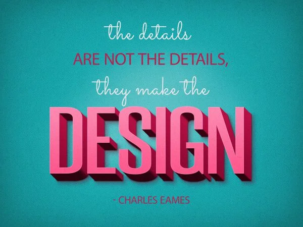
I'm sure you've heard it over and over again, but it bears repeating.

scallop.jpg

Details are the fun, unexpected touches that can take a space from run of the mill to noteworthy. The details are not always the first thing you notice, but they reveal themselves upon closer inspection, allowing you to experience their unique moments of brilliance a little at a time.

Today we're going to look at scallops - a fun detail that adds interest, movement and whimsy to a space.

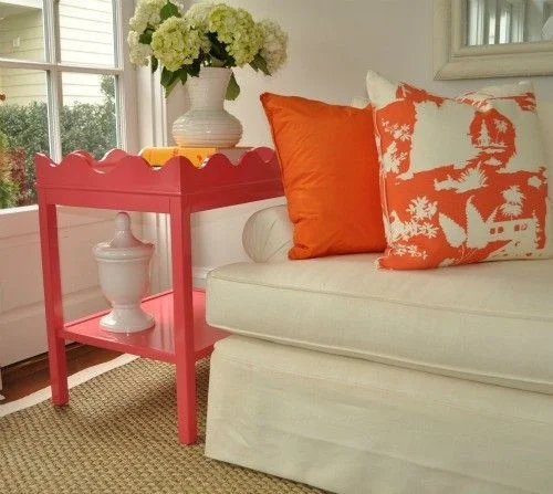
scallop2.jpg

The pink and orange color palette seen above is so crisp against the white walls and white upholstery, and the scalloped edge along the top of the side table adds movement and charm to an otherwise boxy design.

scallop3.jpg

The scalloped edges on the bedding above don't immediately jump out at you, but they add another layer of interest to this eclectic bedroom.

scallop4.jpg

In the image above, I love the softness the chandelier's scalloped form brings to this neutral bedroom.

scallop5.jpg

These whimsical chandelier shades are from Chattanooga-based Stray Dog Designs and they come in a rainbow of colors. This lively kelly green is my favorite!

scallop6.jpg

Above, the scalloped hood is the perfect finishing touch for this charming cottage style kitchen. (Extra points if you noticed the scalloped edges on the ends of the upper cabinets.) If I'm not mistaken, it looks like the cabinet hardware is scalloped too!

scallop7.jpg

Finally, a scalloped matelasse slipcover relaxes the formality of this antique sofa. Other noteworthy details are the white piping and buttons inset into each one of the scallops.

If you're in the Chattanooga area and would like some help creating a home that celebrates the details and makes your life a little bit sweeter, call Kim at 423.653.3186 or email thegreenroominteriors@gmail.com
What I'm Working On Now - Home Office In Signal Mountain, TN

Good day!

Today I want to share a project I'm working on for a busy family in Signal Mountain. They recently purchased their home, which was built in 1972, and it has kind of a lodge-y rustic meets Brady Bunch feel to it. If you know me at all, you know that I love unique, quirky spaces and this home definitely fits those categories. I love the house, and the surrounding property is just gorgeous!

The first room they selected to undergo a transformation is their home office. As far as the interior spaces go, the office is quite simple. It's basically a rectangle with a window and a few doors, so the layout is pretty straightforward. From a functionality standpoint, there are 4 children who will use the space as well as the parents, so there needed to be at least two separate workstations. Aesthetically speaking, we agreed that the office should have a casual, classic feel that takes the surrounding landscape into consideration.

The layout allows for 2 separate workstations with some separation in between. Have you ever had a few kids working in the same space at the same time on different things? We felt the separation was key in allowing the children to work harmoniously at the same time and also to provide a little display space for meaningful keepsakes.

And the direction:

The Green Room Interiors, Chattanooga, TN Interior Design of Home Office

The Green Room Interiors, Chattanooga, TN Interior Design of Home Office

We decided to go with the Original Home Office from Ballard Designs for the cabinetry. It's a modular system that allows you to order individual pieces to fit your space and suit your style. We chose to create a mix of painted and stained finishes, because we wanted to keep a light feel (white cabinetry), but my clients are also drawn to the warmth of wood, and the stained wood relates back to other wood elements throughout the home - mainly the kitchen, which is just off of the home office.

I selected Benjamin Moore's Edgecomb Gray for the walls. It's such a great, warm neutral gray. The room has been painted and we love the color!

We considered tucking an additional desk across the room to add one more workstation, but ultimately my clients decided to go with a comfortable chair that could be used for reading or just hanging out while the kids are working.

Did you notice the art above the desks? I was so happy to find these prints. My clients are originally from Louisiana and the wife mentioned early on that the Brown Pelican was a favorite of hers. It just made sense to incorporate Louisiana's Brown Pelican with Tennessee's state Mockingbird. It's really these personal touches that make a space meaningful, isn't it?

Last week I brought them to my favorite frame shop and we nailed down the mat and frame selections.

mat and frame 1.jpg
mat and frame 2.jpg

Side note: Even though these prints are going in the same space, we are going with different color bottom mats. I think each piece of art should stand on its own and you should use whatever matting brings out the best of the individual piece. The subject matter, frames and black top mat will provide the continuity.

And, upon closer look you can see that the bird designs are made from state maps. I can't wait to see these installed in the office.

And speaking of installation, the cabinetry has arrived, but unfortunately one of the stained pieces was damaged and the stain color was much different than the other stained pieces, so it had to be returned and the replacement piece shipped. The custom drapery is in progress and we should be ready to install the rest of the office within a week!

Thanks for stopping by - I'll post updates for the office installation and the pending kitchen updates soon!

If you're in the Chattanooga, TN area and need some help turning your house into your haven, I'd love to hear from you! Call Kim at 423.653.3186 or email thegreenroominteriors@gmail.com
Design Trends 2016

Really? Just when we added all of that brass, tiled everything with white subway tile, and painted everything gray (or white) a new year comes along with new Design Trends?

Don't worry. The world of Interior Design doesn't change all that quickly - and even if there are some new things on the horizon you should really stick with whatever makes your little design heart sing. And if you simply MUST have some of the latest and greatest, it's usually pretty easy to work some trendy accents in with whatever you've currently got going on.

So first we'll talk about color. Pantone has revealed it's color forecast for 2016 and it's this ridiculousness:

trend.png

Mmmmmmkay... Rose Quartz and Serenity. Shades of Donna Mills circa 1983.

trend2.jpg

No doubt this combo will go over about as well as last year's Marsala.

Benjamin Moore, on the other hand, announced that their color of the year is Simply White. I think Simply White is appropriate since white walls and white everything are still enjoying tremendous popularity.

So what else?

The trend I'm most excited about is the re-emergence of plaids and tartans. And that's not really anything "new". Design trends are mostly recirculated/reinvented trends of the past. We wait until everyone's nearly forgotten about them and reintroduce them so they feel new again. Pretty clever!

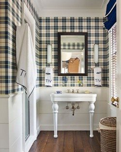
trend3.jpg

Tartan is as old as the hills but you have to admit that it feels pretty fresh in this little powder room.

trend4.jpg

Welcome to my dream home office. Note the plaid roman shades. WAIT - is that Serenity in here? It sure looks like it. And while it looks great in this space, I would probably NOT combine it with Rose Quartz in the same room, unless you're going for a Knots Landing Revisited look.

Another trend - although you can't really say it's a "trend" - is less junky painted furniture and more antiques.

Bring it.

trend5.png

No one does this whole Modern with Antiques look as masterfully as Ashley Goforth.

Finally, I think the use of raw and natural materials will continue to grow in popularity. No doubt a lot of this popularity can be attributed to Lauren Liess.

trend6.jpg

She has a talent for making raw, humble materials look modern and cutting edge instead of drab and frumpy- and that's not an easy thing to do.

trend7.jpg

See what I mean? I think she's single-handedly going to bring back 1970's chic - only way more chic than it ever was in the 1970's.

And so that completes my observations on Design Trends for 2016. Feel free to take it or leave it. If any of these trends speaks to your soul - I say embrace it! If it all leaves you feeling uninspired, then for heaven's sake, pass it up and stick with the things you love! Your home should be filled with things that lift your spirit, not a meaningless collection of trends.

Happy 2016!