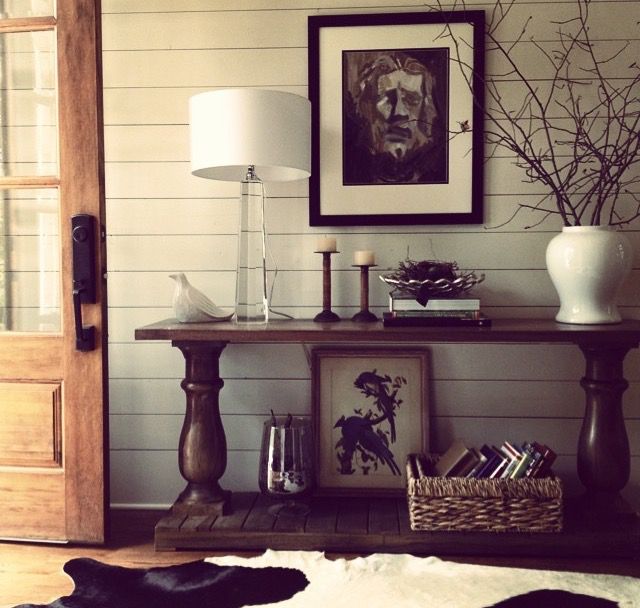
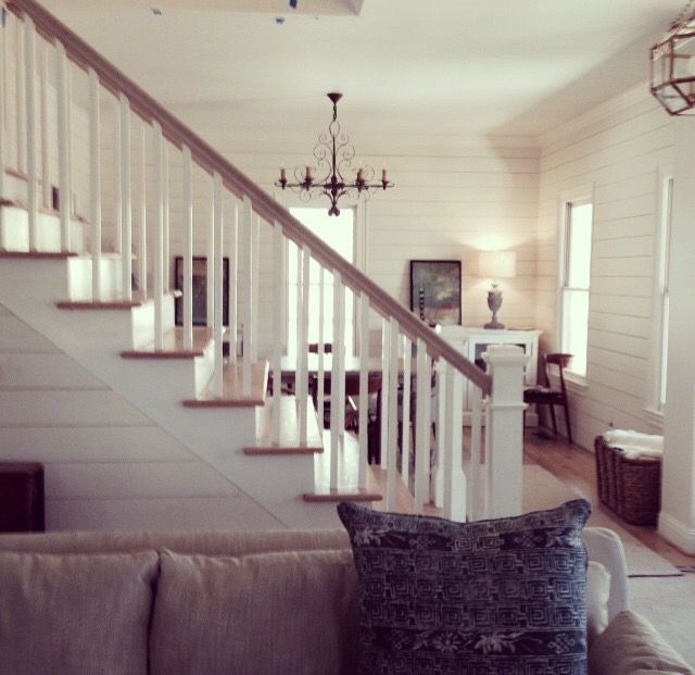
5 Pieces for Your Home that You Won't Regret Buying

When decorating a room, it's easy to get lured in to buying things that are trendy.  You know - the "it" item  you saw at Target that all the cool kids have dotted throughout their instagram feeds.     Before you design your entire living room around that groovy macrame' dream catcher, ask yourself if you realllly love it, and if you think you'll really love it 10 years from now.

Decorating your home is an investment, and it's wise to choose the majority of your design elements that are of good quality and will stand the test of time.  

Here are my recommendations for decor pieces you'll never regret buying. Ever. 

1.  Vintage Persian or Oushak rugs.  

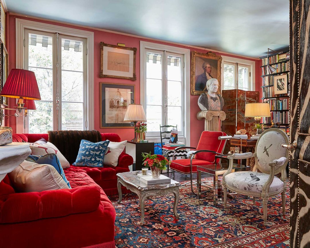
timeless pieces miles redd rug.jpg

In the room above by Miles Redd, the antique rug provides a starting point for the color palette in a room that is at once timeless and current.  That is the goal!  And a gorgeous rug can go with you from home to home down the road.

2.  Art that Speaks to You.

timeless art doesn't match.jpg

You should have an emotional connection to the art that hangs on your walls.  Don't buy a painting you're ambivalent about just because it has the same shade of blue found in your curtains.  Buy art that inspires and moves you.

3.  Antiques. 

It may seem contradictory, but antiques will always always have a place in fashionable interiors - whether your tastes run classic or contemporary.   (Bonus: beautiful pieces can be found at local antique malls and dealers at reasonable prices.  Keep your eyes open!)

Select pieces with straight, clean lines and minimal ornamentation for maximum versatility. 

timeless antiques.jpg

4.  Statement lighting

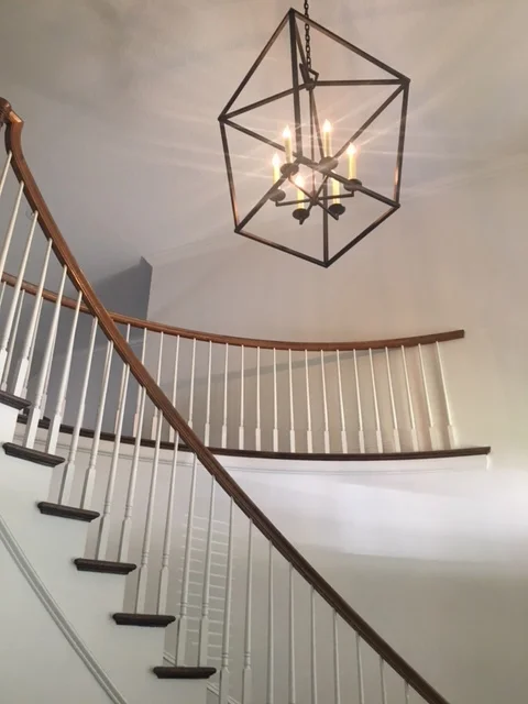
You'll never regret investing in a beautiful light fixture.  Whether it's antique or cutting edge modern, the power of a fabulous light fixture cannot be underestimated.

timeless light fixture.jpg

Great lighting doesn't always have to break the bank, as seen in this charming breakfast nook by Atlanta's Allison Allen.  The oversize paper lantern makes a big statement!

5.  An Ornate Mirror

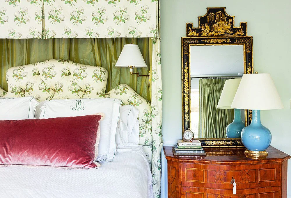
This is another chameleon that works well in traditional or modern settings.  And an ornate mirror will work with any color palette!

timeless ornate mirror.jpg
timeless sarah ruffin costello.jpg

Statement fixture, unique art, an ornate mirror, and antiques coexist beautifully in a room by Sara Ruffin Costello with a decidedly modern approach.  This room is completely timeless and will be forever chic.

I hope this post gives you the confidence you need to invest in pieces that will grow with you and provide decades of enjoyment in your home!


Chattanooga Interior Design Project - Foyer and Dining Room

Hi again!

A few short weeks ago I shared a project I had just finished up for a chic young couple who hired me to help with the main living areas of their newly renovated home. 

Today I have the pleasure of sharing the dining room and foyer of their classic American home!  

Ready?

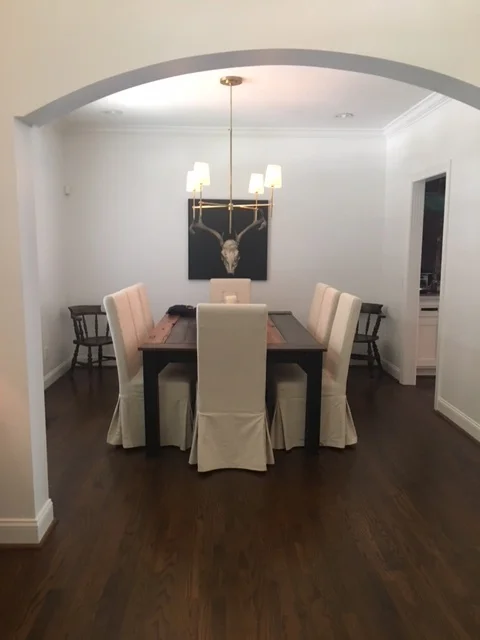
Ok so in the dining room we kept the furniture they already had, which was a custom rustic dining table and a set of upholstered Parson's chairs.  During renovation, they added a very smart looking modern gold chandelier, which offered a modern twist on a classic design.

Here's what the dining room looked like when I came on board.  (I love their darling vintage chairs in the corner too!)

IMG_1568.JPG

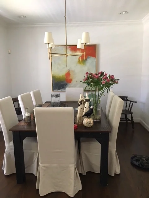
So a pretty good start, right?  I may have mentioned this in the previous post, but the clients have quite an eye for art, and bought a beautiful abstract painting while on a weekend trip to Atlanta.

Here's another photo of the room with the new piece of art in place.

IMG_2538.JPG

The art is so gorgeous, and we wanted to make a few changes that would really celebrate the painting and bring the whole room to the next level.

Are you thinking what I'm thinking?  Paint!!!  Those pretty white walls just weren't allowing this room to live up to it's full potential.

Here's where we landed:

Magnolia Vale Ln 377_Web_5.jpg

Behold the power of paint!!  This complex gray wall paint was just what we needed to compliment the painting and we added a fabulous vintage rug and vintage candle sconces to flank the painting.  And that's it!  Isn't it crazy how just a few simple changes can make such a dramatic impact on a room?  

On to the foyer:

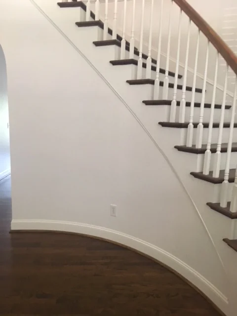
Here's what it looked like on my first visit to their home.  A super gorgeous foyer that just needed a few personal touches.

IMG_1571.JPG


And after

Interior Design Chattanooga

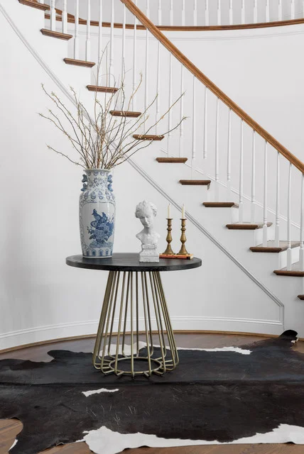
We repurposed their cowhide rug which was originally in the breakfast nook, added a modern round table to fit into the pretty curve of the staircase, and added a few classic accessories.  (The bust and candlesticks belonged to my client too!)

chattanooga interior designers

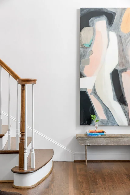
My clients had this enormous painting commissioned by local artist Vesela Baker, and it's the perfect counterpoint to the rustic bench that was handmade by my client's grandfather years ago.  We pulled it out of the master bath to it's new home by the front door and it's so unexpected and yet so right!

And so there you have it!  

We're all so happy with the end result and I'm sure our selections will serve them well for many years!!

If you're in the Chattanooga area and would like to get on my schedule for Summer or Fall of 2018, contact Kim at 423.653.3186 and tell me about your project!

All About Interior Design Fees and Why I Choose to Bill as I Do

Design fees.  They're such a mystery, aren't they?  You could ask 5 different designers how they charge for their work and you would probably come up with 5 different answers.   It's one of the first questions my Chattanooga clients ask when inquiring about "how I work".  

Let's break it down, shall we?

Hourly - this is popular one because it compensates the designer for all of the time they spend on your project.  Billable hours  include every bit of time used to conceptualize, procure (buy stuff), and install.  This does not mean that the designer with the lowest hourly fee will cost less!!!  That's because a designer with experience, processes in place, and good vendors and tradespeople can work more efficiently.  

watching the clock.jpg

The downside for the consumer is that they don't know where the bottom is.   Weekly invoices for hourly design services can get tedious and sometimes result in bad feelings when getting billed for replying to emails and phone calls.  BUT, in all fairness, it reflects all of the time needed by the designer to complete your project.  You might be able to get an estimate on the number of hours your designer thinks he/she will need to complete your project.  You should also know that your final cost will be lower if you are decisive, responsive, and organized.

Cost Plus - This is when the designer buys items for you at their cost and then marks up your merchandise by whatever percentage works for their business model.  This type of billing model is difficult for most designers because the internet has made so many products readily available the general public which were once available only to designers.  This is a risky way for designers to work because some clients would actually take the designer's creation and then order everything themselves, cutting out the designer completely - but I KNOW you would never do that!!!

cost plus.jpg

By the Square Foot - This is a popular way to bill for commercial jobs and kind of unusual for residential.  It seems fair because the fee is automatically in sync with the size of the space.  On the other hand, if you have a small space that is super tricky and you're trying to get multiple uses out of said small space, it could be very time consuming for the designer.  I guess in that case the price per square foot would be figured at a slightly higher rate.

A Combination of Any or All of The Above - Self explanatory really.  You might be charged hourly for the Design Concept and then go to Cost Plus for procurement.

Flat Fee - This is how I prefer to bill, and the reasons are many. Shall we go through it?

Why Flat Fee is Good for You:

1.  No surprises! You are quoted a flat fee for your project and that is the fee!  No wondering about how many hours this will take, no need to pull away from the project because too many hours are racking up.

design budget.jpg


2. No anxiety about getting that next invoice and wondering how much it's going to be for those revisions you requested.  Or for the time your designer spent looking for the perfect shade for the adorable vintage lamp you fell in love with.

3.  Your project will have a better chance of staying on budget because you have a finite amount allocated for the Design Fee.

Why Flat Fee is Good for Me:

1.  Do you have any idea how tedious it is to track every minute of each project every day?  Then to document the time spent on each project because you certainly can't do it from memory.  Now that you've tracked it and documented it, you now have to create an invoice that justifies the design hours and send it to your client. 

Ummmm - she spent 3 hours looking for a lamp shade?!?!?

bill.jpg

For me this is torture.

I would much rather spend my energy creating a fabulous plan especially for you and go about making this gorgeous space your new reality.  As a creative, this is what I love to spend my time doing - NOT watching the clock!! 

2.  Refer to #1.  

Intrigued? If you'd like to learn more about how I work and fees, be sure and grab a copy of my FAQ document!

Project Reveal - Interior Design - Chattanooga Living Room

Today I have an exciting  project to share with you.  The clients are an adorable couple who have a wonderful sense of style, but they needed some help editing down their ideas and staying on track with the design direction.   

When I came on board, they had already done quite a bit of renovations on their Chattanooga home and had done a magnificent job!  The kitchen, master bathroom, and flooring were all new, and most of the interior walls were coated in a bright, clean white. 

However, when it came to furnishing their rooms, they hit a wall.  So much energy spent and so many decisions made on the renovations left them feeling tapped out and a little overwhelmed.  Sometimes having lots of options is just ... daunting.

Style-wise, we were a great fit.  They have love and respect for the classics, but they also wanted to incorporate some design elements with a modern edge.  Bring on the mix!!

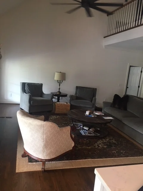
IMG_1548.JPG

Here's how the space looked when I saw it for the first time.  Iphone photography isn't doing it justice.

The furniture was a mix of new pieces - which are very nice - combined with the vintage occasional chair - a family heirloom - and that cute vintage lamp.  

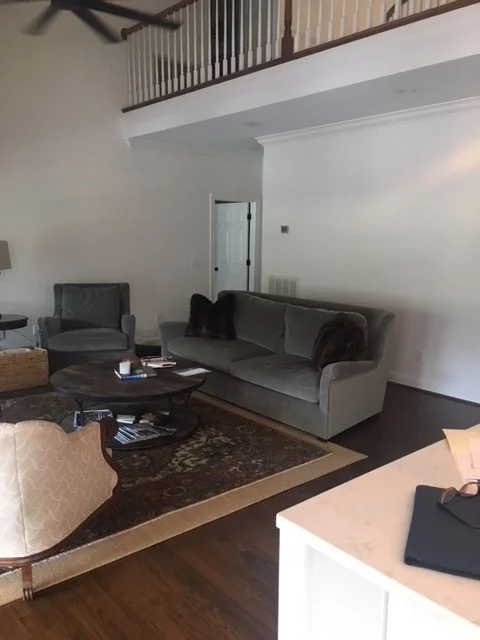
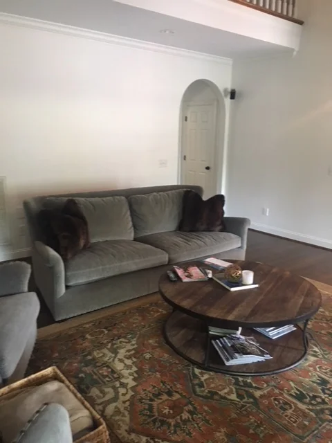
Here are few more "befores".

IMG_1549.JPG
IMG_1551.JPG

Again, a nice layout with perfectly lovely furniture pieces.  But, my clients were looking to make more of statement with their interiors that revealed more about who they are.  

And so we collaborated on ideas and an overall direction.  In the end, we decided to create a pared down, clean, classic space that was chic, eclectic, and of the moment.

OB-morales family room.jpg

They have room for 2 full sized sofas, and I suggested we do 2 mismatched sofas for a collected look.  One is slipcovered, the other is upholstered, and the clean lines shared by both pieces made them perfect companions.  Personality would be added with colorful pillows, a vintage rug, and some unique art that would be sourced by the clients - who were up for the challenge!

As you know, design is a process, so after a few tweaks and adjustments, the final space was a little different than what you see in the Design Board above, and we couldn't be happier with the results!

Where there were once 2 chairs we now have a comfy sofa and a fabulous wall of art, curated by my style savvy clients.

IMG_3099.jpg

This is a photo I took before professional photography seen below.  You can see the mismatched sofas together and that the layout is pretty much the same.

Magnolia Vale Ln 377_Web_1.jpg

Would you agree that the art makes the space?  The clients did a fantastic job of sourcing the art for our gallery installation.  I had the fun job of placing the art above one of the gorgeous new sofas.

Magnolia Vale Ln 377_Web_4.jpg

Here's our slipcovered sofa.  My clients had the art piece commissioned and we just love the simplicity of the floating glass frame, particularly combined with the ornate gilt candle sconces.  Those sconces were part of my client's collection and I couldn't wait to incorporate them into the design plan!

Magnolia Vale Ln 377_Web_3.jpg

Yes, that is my client's vintage chair done up in a dreamy blue velvet.  And how cute is Wiley - he's such a ham and wanted to be in every photo!  Custom drapery frames the french doors to the fabulous veranda overlooking the golf course. We went the iconic Zimba from Schumacher for the fabric and trimmed it out in simple orange grosgrain ribbon.

While we were at it, we also tackled the little breakfast nook off of the newly renovated kitchen.

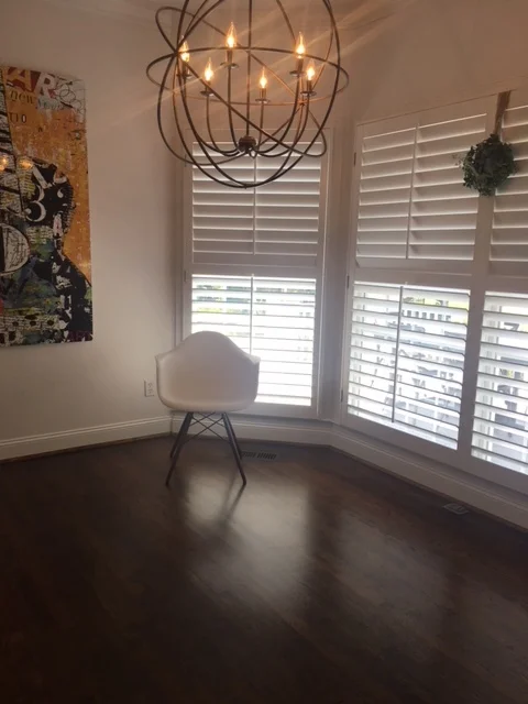
Here's a photo of how it looked when I came on board:

IMG_1556.JPG

Again, they're off to a great start with those gorgeous floors, updated lighting and fun art piece!

Here's where we ended up:

Magnolia Vale Ln 377_Web_2.jpg

We kept the modern chair inspiration, opting for the sexy and sculptural Panton chairs in white.  A rustic table keeps things interesting by providing textural contrast, and the zebra hide is a little unexpected and just. so.  chic!  My clients fell in love with the bold blue painting instantly and I knew it would work perfectly in this breakfast nook.  The previous painting got relocated to their swanky new master bath.

We're all so in love with the new look, but more importantly,  I feel like the room really reflects their amazing personal style! And isn't that what good design is all about?

Check back again soon - I'll be sharing photos of the newly designed dining room and the foyer. 


New Year/New Colors - The 2018 Edition

In case you haven't heard what the new "IT" colors are for 2018, let me enlighten you.

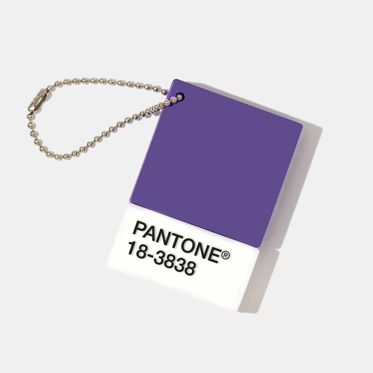
First up is Pantone's 2018 color of the year.

It's "Ultraviolet".

This shade, to be exact:

77ace110-c491-404f-bacf-9b9f02d906e1.jpg

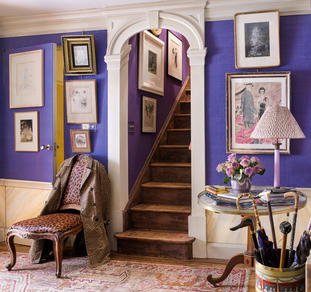
If you ask me, it's more of a royal purple.

b579010b-c43e-47c2-9455-c4f548cb1af6.jpeg

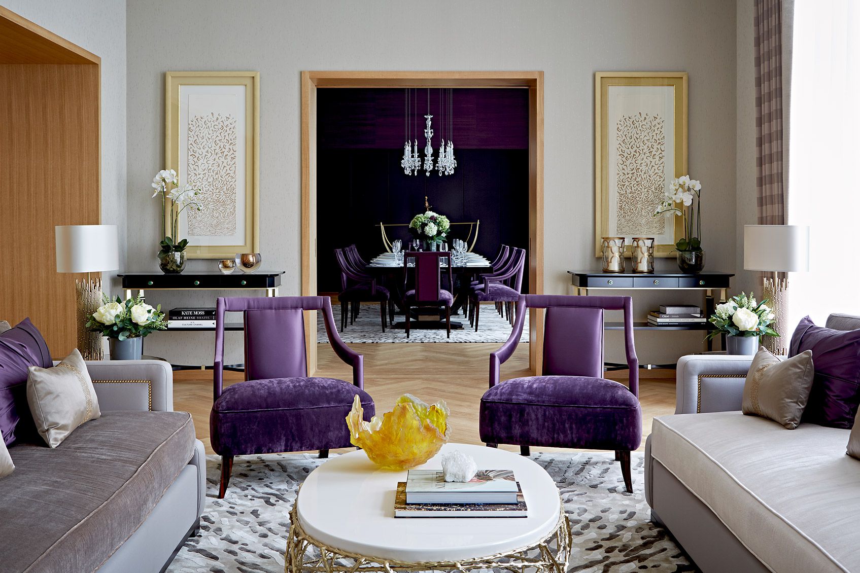
Too much?

How about this:

edbbbab7-a99f-4e10-b381-c45fab3c5bf6.jpg

Probably better in small doses.

Benjamin Moore's Color of the Year is equally bold and saturated.

"Caliente"

28d5fa77-a750-4127-bcb6-2d0d85356c76.png
bd395553-6217-404d-824b-6220d5dd6a62.jpg

I haven't had ANY requests for red walls in years nor have I had a hankering to incorporate them anywhere, but I have to admit that this Caliente room feels about as cozy and comforting as my Dearfoams on a chilly night.

Wondering what all of this means to you?

Well, it certainly doesn't mean you should swath all of your walls in Ultraviolet and Caliente!

BUT, if you're ready to take a step away from the pallor of all of those grays that have dominated interiors over the past several years, why not consider a few touches of bold color in small but meaningful doses.

Like coating your front door in Caliente.

e304629c-e23d-4654-8589-27435b280ae3.jpg

It's such a gorgeous counterpoint to the soft white and turquoise backdrop. (PS: Note how beautiful Caliente was with the soft blue accents in the room photo above).

Caliente accents in this kitchen by Nick Olsen is en fuego. A little red goes a long way.

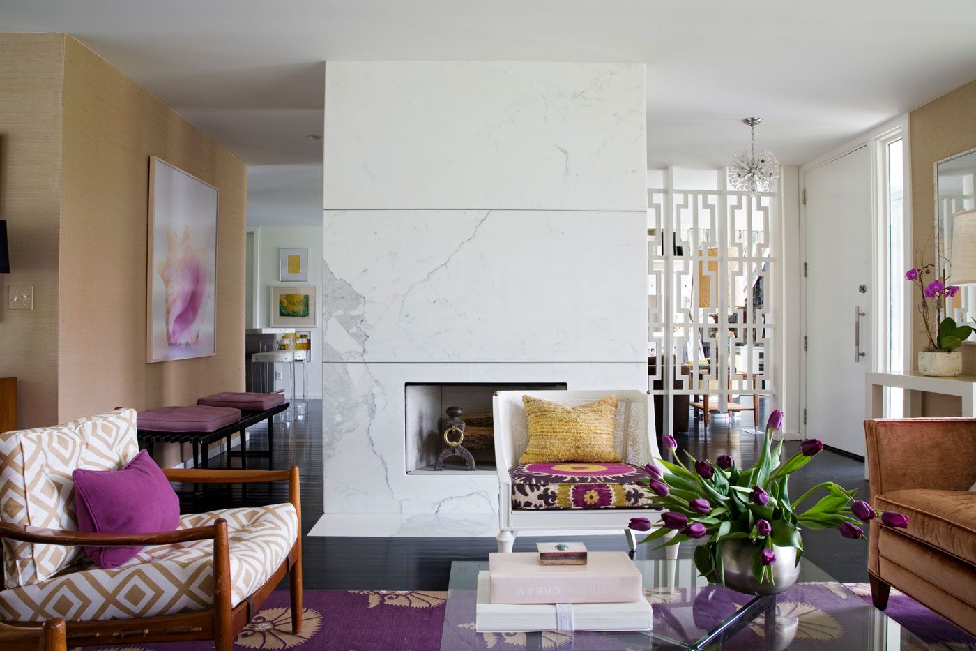
Whenever I see a room by Angie Hranowsky I love purple a little more. It's her signature color and she makes it work. Every. Single. Time.

a1bcbbc3-ae7b-4a3d-a01c-5b37ccf74e24.jpg

So colors of the year for 2018.

Take them or leave them.

Your house. Your call.

The Green Room Interiors is taking new clients for 2018. If you're in the Chattanooga area and ready to live in timeless beauty, call Kim at 423.653.3186 or email thegreenroominteriors@gmail.com

Why I LOVE New Traditional Interiors

Raise your hand if you think Traditional interiors are a predictable mix of Queen Anne legs and a somber color palette.

Allow me to enlighten you. (Literally!)

Walking into Ethan Allen (or any other furniture retailer) and ordering an entire "set" of living room furniture has - thankfully - become a thing of the past, and today's Traditional interiors are a little less predictable and a lot more inclusive of diverse furniture styles.

This brings with it a whole new level of casual comfort - which is just one of the reasons I love new Traditional interiors.

3a837ab8-528a-4290-9c38-b6ad80a797ab.jpg

Yes! Antiques will always have a place in Traditional interiors, but New Traditional spaces are lighter and fresher than the Traditional rooms of the past.

a0203841-247b-48b6-8b91-d53de866a1c1.jpeg

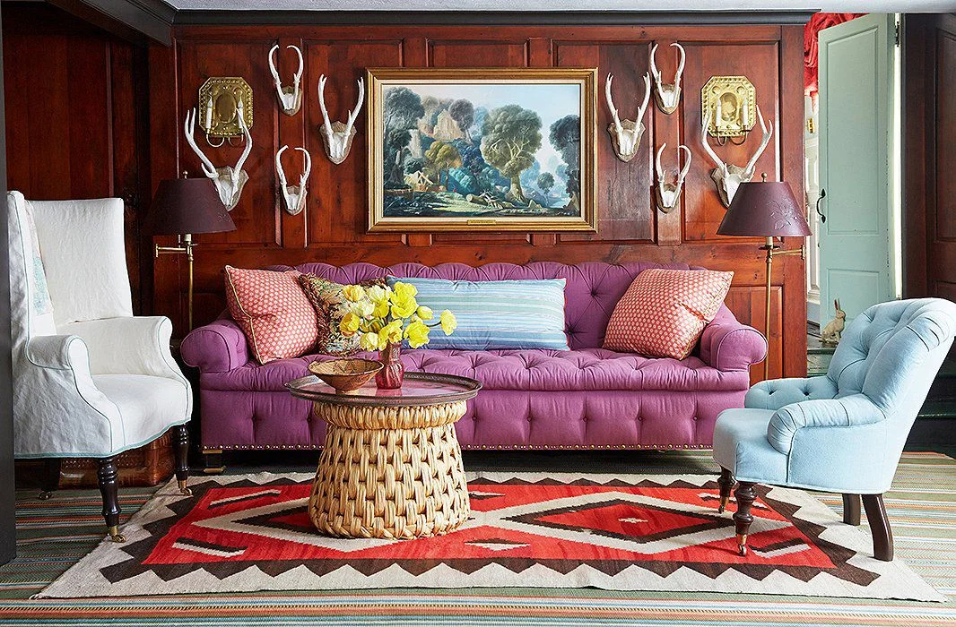
There's nothing stodgy or tired about this classic wood paneled den by Jeffrey Bilhuber. He created a youthful Traditional style by combining furniture styles (most of them quite Traditional by the way) and layering in vibrant textiles. I love this room because it has a fun, expected quality belies the classic design elements. And did you ever think you could use "Traditional" and "unexpected" in the same sentence - much less in the same room?!?

What does all of this mean to you and me?

Well, if you're investing in furnishings for your home, you can rest assured knowing that Traditional interiors have been en vogue for centuries, and this classic style of decorating will continue to stand the test of time moving forward.

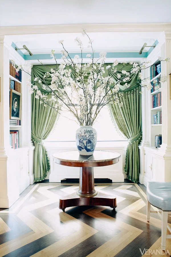
Here's a perfect illustration of the timelessness of Traditional Interiors. This entryway by Nick Olsen feels comfortable, sophisticated and completely of the moment - and yet I think the same thing will be said of it 20 years from now.

114f7064-7db2-4717-9049-e2580a4fc275.jpg

Bottom line? A mix of classic pieces, antiques, and a fresh color palette just never gets old.

AND

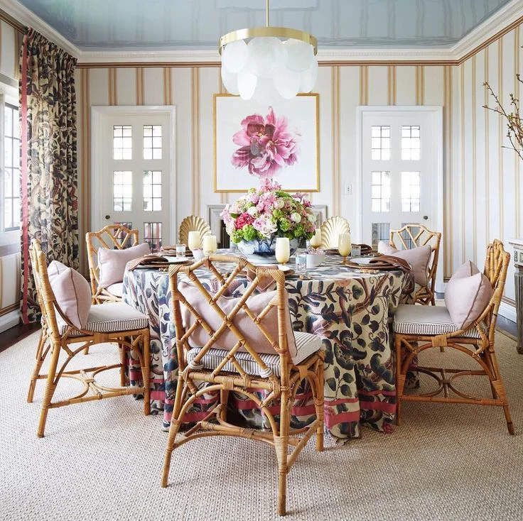
It's the unexpected details (lacquered ceiling, modern light fixture) that keep Traditional style fresh.

27d54cda-e515-44d0-a0ce-a1eaea961d64.jpg

New Traditional - what's not to love?

If you would like to create a home that feels fresh and will stand the test of time, call Kim today to set up a consultation. 423.653.3186.

The Joy Of Moldings

There's nothing I love more than a good old fashioned decorating project - the kind where you take an existing space and create a gorgeous living environment though color, furnishings, accessories and art.

One thing that makes that job a whole lot easier and much more impactful is having a backdrop of interesting architecture.

db13e1e5-a400-45e8-b0a6-e02050bf4cd7.jpg

While subtle, this particular treatment breaks up the expansive wall area and implies attention to detail, craftsmanship and luxury. It's the most formal of the molding treatments we'll talk about today.

ccc73793-fce7-4788-8a29-6253e520c1d8.jpg

The photo above is of an entry hall we did last year. We applied moldings directly to the sheetrock and painted everything in the same white satin paint. My client favors a slight nod to coastal design, and the white walls, bleached wood, and blue accents speak to her preferred aesthetic.

More recently, we installed a wall of wainscoting as a feature in a family room - again, applied directly to the sheet rock, and then painted everything out in the same color.

55fde963-b047-434f-aa6f-ff9a09877e8b.jpg

Here is a photo I took during installation. We also added the same type of molding over the mantel.

bb1e88b4-a460-496f-b7b3-315a3f4347c1.jpg

You should also know that moldings don't have to be formal. One of my favorite wall treatments is a simple board and batten style treatment that has a casual feel to it.

Here's a bathroom renovation we completed in the spring that combines board and batten walls, a navy vanity, and aged brass and bronze hardware for a preppy cabin vibe.

43dccd63-05cd-43de-a6e2-4c56146290ea.jpg
26c467d2-05c1-4610-99bd-da3a910b644c.jpg

And while it's not technically a molding, it seems the whole world has gone crazy for shiplap walls, and I get lots of requests for this from clients.

The texture and character you get from shiplap walls is outstanding.

Excuse the poor image quality in the next few images - these are phone pictures from over a year ago.

In the dining room below, white shiplap was used on all 4 walls.

05ddc2ee-6c3d-466e-b999-c72a5d278be3.jpg
d53b6200-d5e1-4bf3-a67c-4f277431e440.jpg

On this project (photo above) we created a single accent wall in this foyer with shiplap walls.

And in this Monteagle cottage renovation, we installed whitewashed shiplap in the living room, dining room and foyer. This was perfect for a cottage in the woods!

If your carpentry skills are good, adding moldings to your walls is a cost-effective way to create interest and add architecture to your home. If you are DIY challenged, the majority of the cost of adding these types of moldings is in the labor cost for skilled finish carpentry.

I say it's worth the trouble and/or the investment. Wall moldings are a great way to add architectural interest and provide a backdrop that celebrates the details!

Call Kim today if you're ready to take your home's interiors to the next level! 423.653.3186

Your Questions Answered - How Do You Work?

Would you believe me if I told you that most of the inquiries I get from potential clients have never worked with a professional designer before?

And can you guess what one of the first questions they have is? You guessed it -- "How do you work?". That's timid client speak for "How much do you charge?"

The answer to this question is not the same every single time. This is because my role is different from project to project.

757baa9a-b100-458c-9e9a-f658fb677976.jpg

Sometimes we are hired as a team to design and transform a space where construction is involved, overseeing everything from concept through demolition, construction, installation and styling. In this type of scenario there is a flat Design Fee to create a plan for the new space and then a percentage of the job to oversee the project from start to finish. This includes site visits, ordering materials, communicating with clients on progress and potential problems, coordinating and scheduling other trades that are involved, troubleshooting, and quality control oversight.

Master Bathroom Renovation in a Lookout Mountain Historic Home

Master Bathroom Renovation in a Lookout Mountain Historic Home

We recognize that your home is probably your largest investment, and we take the responsibility of your home improvement project seriously. We give it the same care and attention to detail that we would give to a project in our own home!

20c50f97-43e3-46c0-ae4f-25c4ecc9c615.jpg

At the other end of the spectrum, I offer services that are not quite as involved - such as Paint Color consultations. In this scenario, I charge a flat fee to come to your home, view your space and furnishings, and recommend paint colors that will play nicely with your existing decor and create the mood you'd like your space to convey. This type of appointment is straight-forward and at the end of our appointment you'll have clear answers to your most troubling questions. Most Design Consultations usually last about 90 minutes, and are billed via a one-time, flat fee payment that is due at the end of our consultation.

And then there's all the stuff in between. I am hired for everything from total room makeovers (my personal favorite), custom window treatments, new home construction finishes, all of the above or varying portions of the above.

Interior Decorating Project - total room makeover

Interior Decorating Project - total room makeover

So, trying to quote a design fee is a little like quoting the price of a car. In both instances, there are a number of variables that come into play and, in turn, affect the fee/price. These variables include the project scope (new pillows and curtains, or all new everything), Designer involvement (do you want me to order all of your furniture for you, do you want me to schedule and meet the painter, or do you want to handle these things yourself?), and the size and complexity of the space itself.

Here's what I can tell you. The peace of mind and enhanced quality of living you'll get in return is far greater than the Design fee, particularly if you consider that you'll be enjoying your gorgeous new space for years to come. Holidays will be more joyful, quiet evenings at home will be more nurturing, and those special times with family and friends will be even sweeter when you're surrounded in comfort and beauty!
Let's make your Chattanooga home your haven! Call Kim at 423.653.3186 today!