Your Questions Answered - Why Hire A Decorator

Does this sound familiar?

You get all heart eye smiley faces when pinning your favorite rooms, but you just don't know how to create that sort of magic in your own home.

or

You have a pretty good idea of what you want to create in your own home, but your full-time job and the demands of motherhood leave you little to no time to get your house decorated. And another Saturday at the paint store looking at 200 chips of gray paint does not top your list of favorite things to do.

or

It's all so overwhelming. You kind of love the sofa you saw while furniture shopping last weekend but then what rug would be best to use with that couch and should you do 2 more chairs or a loveseat? Maybe instead you should just get a sectional.

5983ed5f-3a1f-460c-ab0d-5c35f6fe964c.jpg

All of these questions (and more) can be resolved with the help of a professional Interior Decorator.

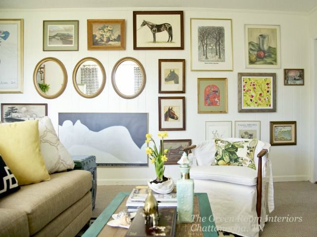
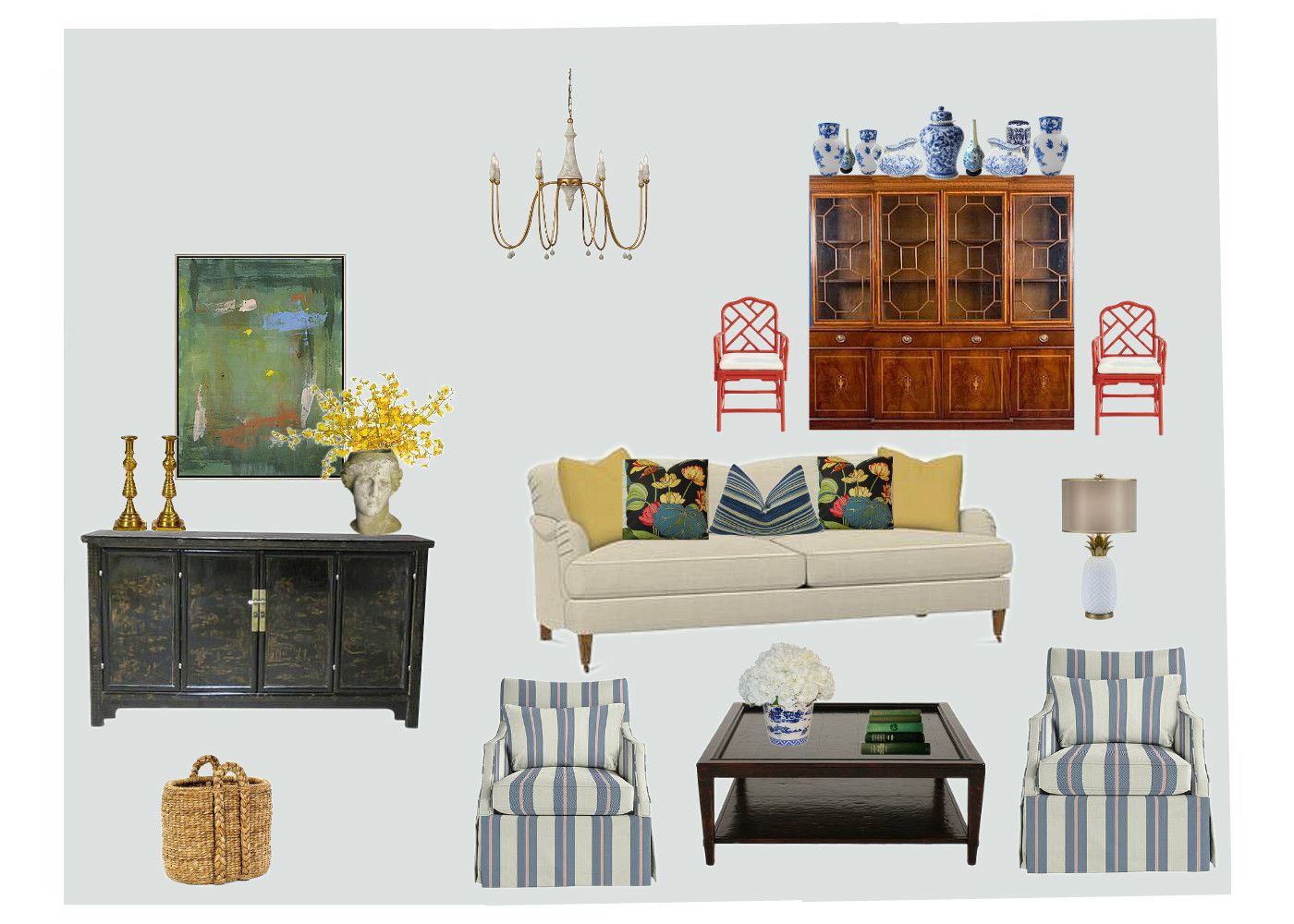
The Big Picture - Designers take a big picture approach to your room, starting with a Design Plan that addresses how your room functions (aka the layout), and reflects your most stylish self. I can't stress enough the importance of having a Design Plan to follow. Having a plan eliminates all of the confusion and gives us a clear blueprint to follow to create your special space.

2ecc4ed9-01bb-49d8-bedd-154cb213add1.jpg

Money - so what happens if you pull the trigger on that fabulous $5,000 sectional only to discover that it's waaaaay too big for your family room? It didn't look that big in the store, and now it's money down the drain! A design professional will save you from costly mistakes by measuring your room down to the fraction of the inch to ensure that your furniture will fit and that your room will address your needs in the most stylish way.

5bccfd8a-3ecf-4d22-8a93-6c47a3d31113.jpg

Designers can also help stretch your budget by scouting out a stylish estate sale find that will coexist perfectly with a super fancy piece of furniture!

f0d1dfb0-8c34-473d-a3cf-ed97e0a223e1.jpg

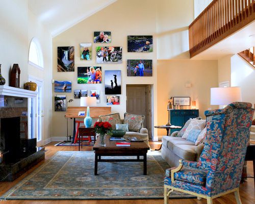
Creativity - This is a big one. We look at your room with fresh eyes and can visualize a space that the typical homeowner just can't conceive. As creative thinkers, we dream up ways to use furniture in unexpected ways, and we can take your wishes and turn them into a space that reflects your style - only way beyond what you could create for yourself.

5e395423-ceb5-4af5-b572-eccdce768936.jpg

Finishing Touches. That final layer of accessories is key to telling your story and reflecting your personality. Designers can artfully display your personal treasures in a way that is beautiful and personal, creating a space that is "all you".

fdd8e7ce-adf9-488e-80b3-cd9a6beb2a12.jpg

And some final thoughts - yes, decorating your home is an investment. Stuff is expensive, but when you consider what you get in return (peace of mind, a home that nurtures you and creates a welcoming mood for your guests) then it's an investment in your quality of life that brings with it an enormous amount of value. Home is your refuge, and it deserves the time and attention required to make it as unique and special as those who live in it.

If you're in the Chattanooga area and ready to create a haven at home, let's discuss! Get in touch with the Contact buttons on my website or email me at thegreenroominteriors@gmail.com

xo Kim

What I've Been Working On - Guest Bath Renovation

I have tried to sit down and put this post together for almost three months now and today I'm finally going to share this fun project with you!

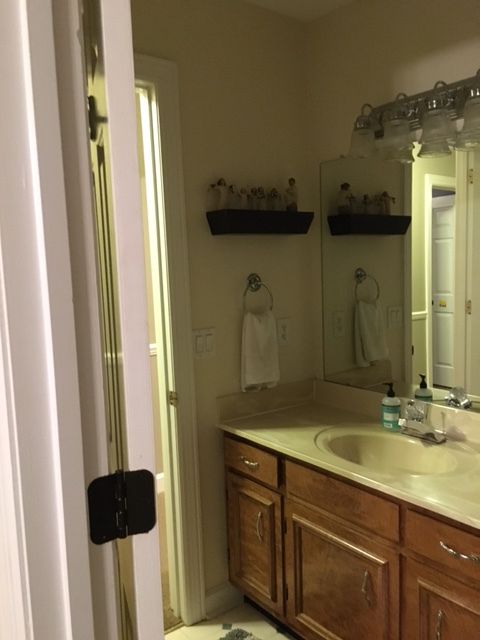
It's a tiny guest bathroom that is in a home that shared by a Dad and his two young boys. The home they live in was built sometime in the 80's, and we're pretty sure this bathroom is still sporting it's original 1980's finishes.

8855d237-efe0-442d-8c28-9805c1a8b6cb.jpg
817b095a-dc9a-4f36-8a2b-4d483dd86451.jpg
1fb85bf2-e970-4d78-b56b-9374d9fb8df8.jpg

I just love a project with a big potential for change!

Anyway, this bathroom is mostly used by my client's out of town parents and in-laws who come to town when he needs help with the boys while he's at work or traveling.

My client has great taste but needed some help picking a direction and pulling things together. I wanted to give him something that would be appropriate for an all-male household yet be feminine enough for his guests to feel comfortable and pampered too.

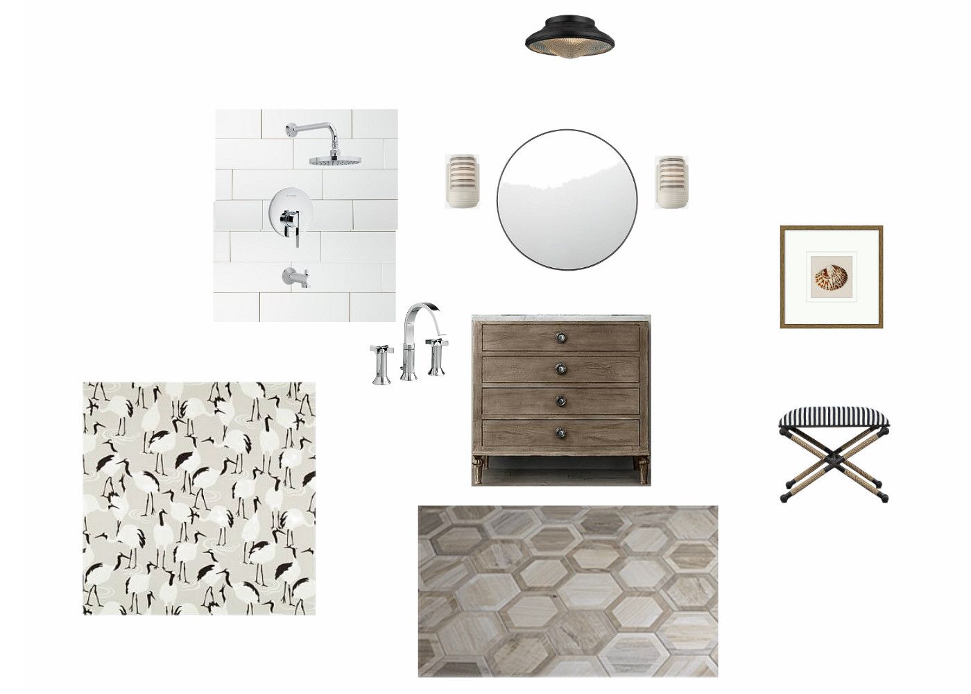
I got a style clue during the initial consultation when my client showed me the new Restoration Hardware catalog he had been admiring. Based on that and what I learned during our interview, I pulled together a few selections for the space.

f70d1168-9a94-40be-9a8c-22923473306d.jpg

The jumping off point was the vanity I sourced from Restoration Hardware. He loved the washed wood finish and I love how it looks like a charming antique piece that was converted into a vanity.

I also fell hard for these wood-look hex porcelain tiles, and I knew they would be dynamite with our vanity.

730f500f-af3b-4fe1-b4c8-4af44d79f66b.jpg

I like to include a whimsical touch, so I searched for something that would be appropriate for the space and add a little levity. This "Winter Cranes" fabric from Robert Allen was the answer I was looking for. The print is whimsical but it's still sophisticated with it's neutral palette.

Another favorite design element is these fantastic retro-style ceramic sconces from Schoolhouse Electric. I can't resist a stripe and these gray striped shades would be the icing on the cake.

f6817de7-0036-402b-9dd0-d2e160bd5441.jpg

Here's a little mood board to show how all of the selections work together within the space.

Now comes the part where I show you the "after". I'm absolutely thrilled with how the bathroom turned out, but I don't have tons of pictures to share. It's a small space to photograph with no natural light (read: tough to photograph), but I think this iPhone photo captures everything we incorporated into the space and demonstrates how much change is possible by just changing the finishes.

aa9231c1-f6f0-4520-b59c-f57a23db5ed4.jpg

We replaced the existing tub with a deep soaker tub and finished off the tub surround with clean and classic white subway tile and sparkly chrome fixtures.

f607bfd5-d8aa-4d84-bae0-b983f3dad344.jpg

I'm happy to report that parents and in-laws have used the space and it's getting rave reviews! So much so that we moved on to the renovation of the boys shared bathroom, and I'll share that transformation in my next post.

Thanks for stopping by!

Graphic Floors - Trendy Or Timeless?

With the explosive popularity of cement tiles in bold patterns, you might be wondering if this look will stand the test of time, or whether it's a trend to just wait out.

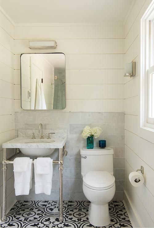
The pattern of the tile above and below is called "Tulum", and it's a favorite of mine.

4b58e144-3cfd-4ded-a9ee-a74ecb7931d6.jpg

The graphic floor of this Kelly Wearstler designed foyer was achieved with different varieties of marble and is definitely the star of the show!

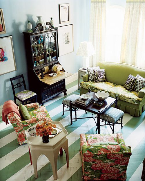
Painted floors are the most flexible way to create bold patterns, limited only by your imagination (or your skill set!)

aa962fba-4574-4b4e-a231-2a3ea15358a4.jpg

Charming kitchen above designed by Nick Olsen.

Guest room below by the brilliant Jeffrey Bilhuber.

While I don't think graphic floor patterns are necessarily trendy, I do think they are very specific, and they may be challenging to "work in" with other design elements.

Novice decorators will want to keep other design elements simplistic, allowing the graphic floor to be the main feature.

e7577722-a4af-4804-b707-2cfc2fda8639.jpg

The exception to that would be a striped floor, because stripes go with everything!

b6ba3b54-6c0c-42af-9a0c-214fc21968ad.jpg

Still worried that the graphic floor trend will pass? Check out this room (circa 197x) below by the iconic American decorator, Billy Baldwin.

45732fae-1857-49b8-99b1-c11f1807da35.jpg

If you're considering installing a patterned floor, my best advice is to proceed with caution. Commit to a smaller area, like a powder room.

Even though you may be totally convinced that you can't live without it right now, flooring is a pretty permanent and not always inexpensive to change out if you grow tired of the look down the road.

xo Kim

This Sofa Won't Go Out Of Style. Ever.

As style-focused consumers, we walk a fine line between what's currently trending and what will stand the test of time. Especially at this point in history. We are flooded with so. many. beautiful images of cutting edge design on Pinterest, Instagram, Houzz, TV and shelter magazines. It's hard not to get caught up in it and fall prey to the look of the moment.

And I'm not sure if that's money well spent. Instead, I think it's preferable to stick to the classics for the major furniture purchases. T

Today we'll have a look at a sofa I think will look good 20 years from now and will fit right in with whatever is trending in the design world.

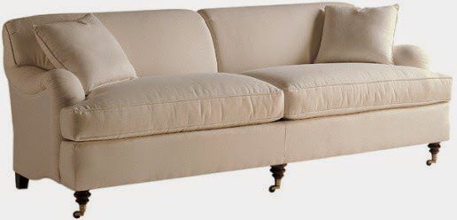
It's the English Roll Arm Sofa. This would have to be my top pick for favorite sofas of all time. It's uber classic and yet it holds its own in modern settings too.

9139a58a-0dc0-446a-a611-578e4371c229.jpg

Not too feminine and not too masculine, the English roll arm looks great done up in solid fabrics (linen or velvet are top choices).

3d8a30d1-4a22-479c-8954-4da693232db6.jpg

Above is the Glenlee sofa from Anthropologie. Note the turned legs on casters and tight back. This is an English roll arm in its purest form!

Are you more of a risk taker? Never met a pattern you didn't like? No worries! The English roll arm has you covered.

95d4b98c-547f-4289-bb76-ff876194a205.jpg
e7c53758-78e4-4cfa-87f2-b370bfa7dfd7.jpg

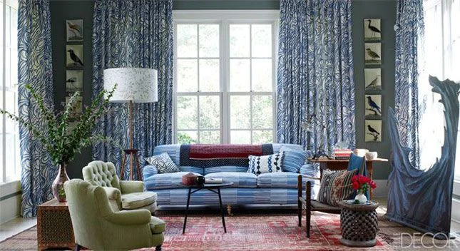
Photo above, note how well our traditional English roll arm mixes with the more modern companions. How I adore a colorful, eclectic mix like this - perfection!

Here's another happy, eclectic room that features an English roll arm sofa, this time in a fun floral print piled with pink pillows:

5a402e75-1a08-4363-812d-0acb125d57e7.jpg

Do you like your English roll arm a little quieter? Fear not. Here's a slipcovered version that is relaxed and understated.

Finally, I'll leave you with a roundup of my favorite English roll arm sofas in three price categories:

(Damn) Good:

d893ba96-30a0-4ab0-b42e-d902315c83fc.jpg

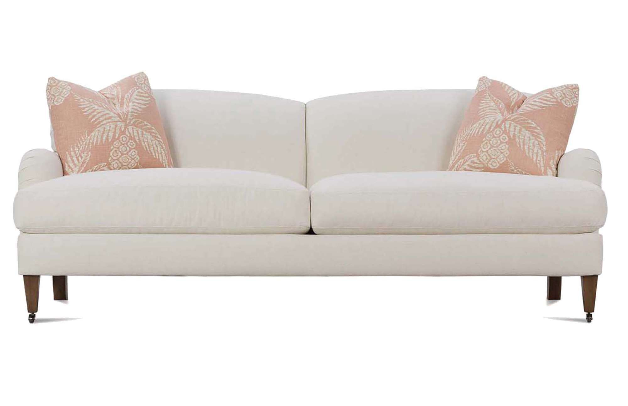
This is the Brampton sofa from the Robin Bruce collection by Rowe Furniture. It's American made, extremely comfortable and well priced. To further entice you, a nice selection of fabric options are available (including crypton). Mommies rejoice!

2. Better:

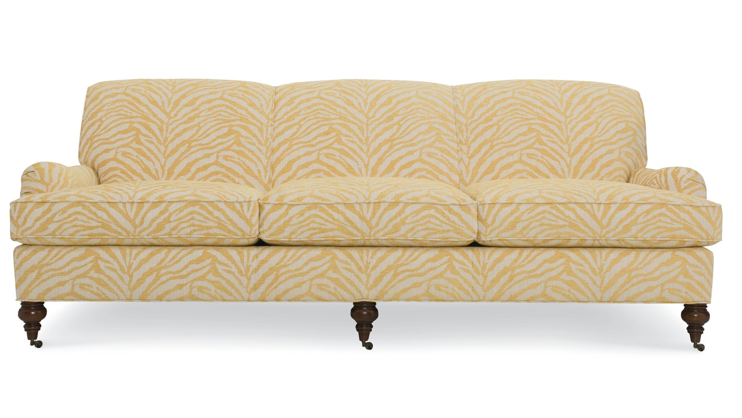
This is the Telford sofa from CR Laine upholstered in a fun and fabulous yellow zebra fabric. YOLO.

3. Best:

e00d8029-a383-41c3-9dd4-3e169c315ab9.jpg

From Baker, the "Elements Long Sofa".

A few more inspiration images:

4658210b-3a5d-43bc-935b-d7b2d9c6af1d.jpg
ab890226-2dfd-40e1-b6ef-1f76769bc4dc.jpg
7764dbf1-dcb2-4722-8457-3625bfac5740.jpg

xoKim

Mad For Plaid

Maybe it's the cool weather that's finally moved in. Maybe it's because Christmas is just a few weeks away. Whatever the reason, I'm feeling particularly attracted to plaids and tartans lately.

d9e230d9-e1dc-4b17-ab11-4d7fcaa04bd6.jpg

Scot Meacham Wood's apartment that was featured in House Beautiful a few years ago is a favorite and makes me love plaid even more. It has a comfortable, collected appeal. The aesthetic is an updated take on English country.

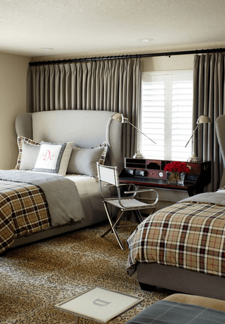
Plaids and tartans add instant warmth.

f54cb75d-d8ba-42e1-a61b-8f2378845f3f.jpg

Antiques and plaid are perfect partners, again, creating an English country feel.

efcd47df-09b7-4401-8c8a-8ad96ab78ce0.jpg

Which is not to say that plaids couldn't work in a modern setting.

549f0fc4-f656-4aa5-ae2d-8c22623658c7.jpg

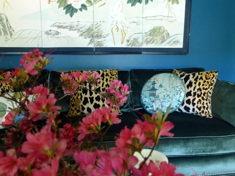
Plaid and leopard? It can be done.

As can plaid and pink!

178cbafb-16d7-4844-8b40-56634369710f.jpg

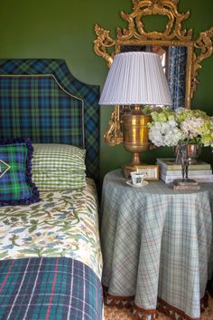
I love the plaid headboard and pillows combined with the floral coverlet below.

04ef0b3d-6b63-496d-b89d-fd0679992139.jpg

In fact, plaids and florals are perfect partners!

Here's more English country - plaid chairs and floral chairs - about as comfortable as it gets.

6a5d4f28-14b6-40b9-96b5-16213d0c9d7f.jpg

What do you think? Will you be adding some plaid to your winter decor?

Giving Thanks

It's hard to believe that the Thanksgiving holiday is already upon us. Here in Chattanooga we've had a very hot and very dry fall this year, so it's been hard to mentally transition into the holiday season.

Thanksgiving is easily my favorite holiday. Around here, the weather is usually perfect this time of year. Cool sunny days give way to cooler fall nights.

bb9d26c6-2caa-422a-89e2-079c5826160d.jpg

There's none of the hype of Christmas, what with trying to the find the perfect gifts for family and friends. Instead, it's a day that's about food and family (and football).

f5c9d10d-3d81-4d9c-9ca4-51a32a5edff7.jpg

Thanksgiving is a day set aside just to stop and reflect on the blessings we enjoy every day. Here is what I'm most thankful for:

1. Faith - I am thankful to be the child of a Kind and Loving God who hears and answers prayers. There have been times in my life where things were provided that could have come from no other place than from God. Things that couldn't be explained yet could be felt in my heart. God's love and presence is constant - and I am thankful for that.

b19443fa-8b07-4503-8ce0-a8ab5e19230a.jpg

2. Family. I have a beautiful family that I'm thankful for. I have an amazing husband that makes me feel loved and important every day. I am the proud mama of 2 beautiful daughters that are healthy, smart, and kind. I have a 3 year old grandbaby that brings so much joy to our lives that sometimes I think my heart will burst! I am blessed to still have my wonderful parents - both of them in their 80's and of strong minds and bodies. They have nurtured me my entire life and continue to do so. My two brothers are good, caring men and we all share a strong family bond.

c5d599de-ac39-4bf3-afc4-ce026b170d09.jpg

3. Home. More than just a roof over my head and shelter from the elements, I'm thankful for my cozy little house. It's my most favorite place that has all of my most favorite people in it. We laugh here, we cry, we argue, we make up, we celebrate, we make plans, we cook, we connect here.

b87dd799-c3ec-40e3-a7a4-54cbea5d7566.jpg

4. Work. What an amazing gift it is to be able to get up every morning and be excited to go to work! I love what I do and it's such a blessing to have the opportunity to share my God given talents with others.

5. Country. I'm thankful to be an American. I'm thankful to have the freedom to work hard, pursue my dreams and raise my family in a country where we can control our destinies. As Americans, our dreams can be achieved through determination, hard work, and smart choices. We have the freedom to succeed and prosper, yet we also have the freedom to make mistakes and start over.

434376d2-48f6-47c1-b737-747077703969.jpg

I wish you a Happy Thanksgiving full of love, blessings, and great food!

16d82a46-ea8e-467d-becc-65cc4994168b.jpg

Chattanooga Interior Design Project - Home Office Makeover

It's been a while since I've posted anything here because I've been busy participating in an online linking event called The One Room Challenge. The premise of this event is that participants make over a room of their choice over a six week period updating their progress once a week. On the final week of the event, everyone posts photos of their completed room.

The room I decided to make over was a room in my own home - a much needed home office. A bedroom in our house became available when my oldest daughter moved out and my youngest daughter claimed her upstairs bedroom.

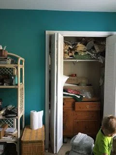
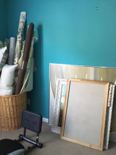
My biggest priority from a functionality standpoint was getting more storage. I desperately needed storage for rolls of fabric and wallpaper, samples from vendors, and a place to store materials for upcoming installations.

Here's a look at the space before. I wont's sugarcoat it - it's pretty bad. My intentions were good but finding the time to plan and execute the design was rather elusive.

one room before.jpg
one room before2.jpg
one room before3.jpg

Regarding space planning, I knew I wanted two workstations. One area where I could work at my computer and have easy access to client files. The second workstation needed to be a place where I could spread out materials used in the development stages of designs for my clients.

Once my needs were determined and the layout was decided that would best address those needs, it was time to focus on the aesthetics - my favorite part. Since this is an office in my own home where I will mostly be working alone or with an assistant, I felt free to really personalize the space. And that's what I did. I envisioned a space that felt fresh, feminine and full of beautiful color. The color palette I landed on was lavender and red with metallic gold accents.

one room collage.jpg

As you can see in the moodboard I created above, there are a mix of design styles - mostly traditional with a few modern accents. The paint color I used on the walls is Benjamin Moore's Touch of Gray. It's a very subtle shade of lavender that changes with the light. Somehow, this color manages to feel energetic and restful at the same time.

Want to see the finished space?

one room after.jpg

It's quite a change, isn't it? I relied heavily on vintage items - I love pieces that are a little rough around the edges and don't mind showing their age.

one room after2.jpg

To address my storage needs, I bought two metal garage shelving units from Home Depot and spray painted them with a metallic gold. The loveseat provides a nice perch for family members who want to hang out with me while I'm working. Ok, mostly it's the dog.

one room after3.jpg

In the image above, you can see how I gained more storage by removing the bifold doors from the closet and installing long shelves. It's the perfect solution for holding multiple bolts of fabric and wallpaper! Open storage below the shelves is useful for storing lamps and other accessories waiting for installation in my clients' homes. The vintage French dining table is wondeful place to lay out fabrics, trims and wallpapers as I work through the design process, particularly with the natural light from the big window.

one room after4.jpg

Here's the other workstation. My computer, printer and client files are housed here. I also had a little fun creating an inspiration board.

one room after5.jpg
one room after6.jpg

I really enjoy working with color and I find it energizes me and lifts my spirits.

one room after7.jpg

My fabric storage is seen in the background of the photo above, and a big tray on my work table keeps pencils, paint decks, notepads and supplies both tidy and close at hand.

one room after8.jpg
one room after9.jpg

The vintage elephant seen above provides a little whimsy and ups the "happy" factor. Fun touches like this can really lift your spirits!

one room after10.jpg

This little Windsor chair was my husband's chair from his grandparents house, and it now has a new purpose - holding all of my magazines and keeping inspiration within easy reach!

one room after11.jpg

If you're really paying attention you noticed the pillows on the sofa are different from the pillows in the first images. I love that my color palette gives me the flexibility to change things up like this!

one room after12.jpg
one room after13.jpg

One last note. I am a huge proponent of splurging on custom window treatments. There is simply no substitute for the beauty and sophistication of hand crafted window treatments that are made to fit your particular windows and your aesthetic. This room would not feel the same without these custom curtains. They're made of a simple cotton linen blend with velvet accents and they transformed this space into a cozy retreat. Curtains out of a bag just can't do this! (Speech over.)

I'm so thrilled with how my office turned out! It's nice to have a space that is organized, comfortable, and "me". And isn't that what it's all about?

Thanks for stopping by - and if you're in the Chattanooga area and could use some design assistance, I'd love to hear from you! Call Kim at 423.653.3186 and tell me about your interior dreams!
Project Reveal - Interior Decoration Of A Downtown Chattanooga Condo

Today I have a fun project to share with you. It's a recent installation of a condo in downtown Chattanooga and it's a good old fashioned decorating project, meaning there was no construction or renovation involved -we just made the space over with new furnishings and finishing touches.

The most noteworthy architectural features of the condo are the high ceilings and the huge windows. This is always a winning combination, fostering a feeling of light and spaciousness.

Before I was hired for the project, the owners had just had the condo painted. Normally I spend a good deal of time searching for the right color; the color that will help convey the mood we're trying to create. But since my clients just spent a small fortune on the paint job, and they selected a neutral, cool gray (Sherwin Williams March Wind), I decided to work with the existing color so we could utilize the budget for new furnishings and accessories. Luckily, the previous owners of this condo invested in custom curtains. With 13' ceilings and lots of windows, curtains alone could have been a budget buster. Thankfully, the curtains we inherited were an easy to work with creamy white and were beautifully made, so we decided to work them into the design.

Anyway, the main level is pretty open, with this particular area being the lounging/tv area. How gorgeous are those windows?!?!! Here is how this area appeared when I came on board.

condo1.jpg

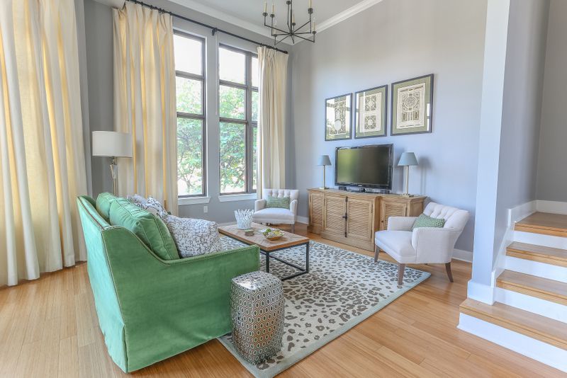
And here's how it looks now:

living green.jpg

Isn't it amazing how simply changing the furnishings (and a nice sunny day) can transform a space? I'm so crazy about that green velvet sofa. I love a single seat cushion - it's a nice clean look. It's also more functional because no one has to sit on the crack!

condo2.jpg

We utilized quite a few neutrals in the space, and I think the green adds some balance and life to the cool gray walls. The sofa color also helps bring a little of the greenery seen outside the windows into the space, making a subtle connection with nature.

The owners struggled with how to address the tall tv wall. This is a common problem. The armoire is tall, but that's about all it has going for it.

condo3.jpg

And here's the tv wall after:

condo4.jpg

We opted for a wider tv console to fill the space horizontally, and I flanked it with a pair of wide and low linen tufted chairs. The natural wood finish of the console adds some needed warmth and texture to this cool lofty space.

condo5.jpg

I hung a series of vintage garden maze prints above the tv fill up the tall wall. If you scroll down to the next photo, you'll see that just because you have 13' ceilings, you don't have to cover the entire wall. Keep things at a comfortable level.

condo6.jpg

The nearby dining area is completely open to the tv area, so we selected furnishings that would blend together. In a space that's so open, a limited color palette is the usually the best approach. Because you're seeing so much of the space at once, it's best to keep things simple.

condo7.jpg

The dining table is a mid century piece that was part of my client's collection. I selected these fully upholstered Queen Anne style chairs for an updated traditional look. I like how they straddle the line between modern and traditional. Looks like we're having pine cones for dinner. Haha.

condo8.jpg

Here's another traditional furniture piece that was culled from the homeowners furnishings. I found the mirror at an antique store and I just love the juxtaposition of the ornate gold frame against the modern architecture.

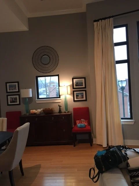
Below is another "before". I think my client did a fantastic job creating a symmetrical vignette, but I wanted to simplify the look and go with larger pieces. Can you guess which piece of theirs I repurposed?

condo9.jpg
condo10.jpg

Naturally, I reused their antique sideboard. I solved the awkwardly placed window situation by simply hanging a large piece of art over the window, and I edited down the furnishings and accessories. A pair of modern lamps and a floor plant in a basket finish off this area in a simple, sophisticated way. I'm crazy about the pinks and greens against the cool gray walls and I added a little more warmth with a gold floating frame around the abstract art.

condo11.jpg

Again, in the image above, notice that the painting above the sideboard is placed at a comfortable level.

condo12.jpg

I think this photo gives you a good sense of how open the floor plan is.

condo13.jpg
condo14.jpg

The coffee table is a textural mix of rough wood, slick ceramic coasters, and a touch of gold.

Thanks for taking the tour with me today! This was such a fun project with trusting, open minded clients.

As an aside, if you look at the "before" photos you'll notice that the trees outside the windows are dormant. This is because we started the project in very late winter and just finished up a few weeks ago. Not because there were any problems, but because things take time. Design plans have to be developed, custom sofas have an 8-10 week lead time, and design is a multi-step process. We all agree it was worth the wait!