HGTV Vs. Real Life Design

HGTV - does anyone even watch it anymore? They seem to have gone from decorating/gardening/home improvement shows to the Real Estate channel with seemingly non stop episodes of House Hunters that we have seen a hundred thousand times.

But I digress, because this is not really the main beef I have with HGTV.

What annoys me is how that they facilitate unrealistic expectations for what real life decorating and renovation projects entail. Within 30 minutes, they visit some sad room in need of an update, come up with a design plan for the space, and implement the entire design culminating in the big reveal to the overjoyed homeowners. And what about budgets? I would love to know how they arrived at these figures. Renovation/construction costs are the magical unicorn at HGTV. Apparently those Property Brothers are independently wealthy and don't need to charge for their services, nor do the designers who come up with the plan (you don't really think the Property Brothers design those spaces do you?). And someone has to shop for everything in the space and style it. All within 30 minutes and for less than $1,000.

Let me walk you through what goes into a real life bathroom renovation, as we have several going on right now. The image below is not mine, but I do love how collected and timeless it feels.

hgtv1.jpg

First, there's the Design Process. It involves a few hours to meet with the clients, have a look at the space, find out what's not working, and what they would like to see in the space (this info is used to guide the Design, not necessarily to take a work order) The room is then measured and photographed so we know what we have to work with.

hgtv2.jpg

Next we start figuring things out. Sure, the design process is creative, but in most cases there is some problem solving that requires knowledge of structural, plumbing and electrical code requirements. Safety first! To arrive at a functional floor plan, a to-scale footprint of the room must be created so that the space plan can be determined. Once the layout is decided upon, we begin sourcing materials for the room. Keep in mind that everything that is sourced for the design must first be researched by reading the product specifications to ensure that everything is of the proper scale. And that is true for each and every item sourced for the space, from vanities to mirrors to light fixtures to plumbing fixtures. And now try to wrap your mind around how many products are available for each of the design elements I just listed. There are literally thousands of faucets, sconces, toilets, tiles, mirrors and sinks to choose from. And then once, say, a tile is decided upon, how do you want that laid? On the diagonal? Herringbone pattern? Offset? What about borders? How wide, how high, etc. It's a ton work that has been researched and edited before it gets presented to the client. So (assuming you're the client) what you get on presentation day makes perfect sense and looks completely effortless - just like this Design Concept Board I did for an historic home powder room renovation.

hgtv3.jpg

And so while we're making sure everything will fit, we're also making sure that we'll arrive at a cohesive look when it's all said and done. Oh, and there's that budget thing too. We'll need to be certain that what we're creating is aesthetically pleasing, fits the space it's intended for, and fits the budget. Got it? Good

Once the design is finalized, another client meeting is schedule to go over the Design Plan. If we've done our job properly, we've come up with a plan that speaks to the client's personality. That being said, it's not out of the question for clients to request a small tweak here or there, and then it's back to the studio where the plan is fine tuned. This often entails another trip to the tile/fabric/lighting/ showroom so alternate selections can be made. Once all of the design elements are approved by the client, implementation begins. Yay! During this time materials are ordered (and managed), subs are scheduled (and managed) and clients' hands are held as they face the anxiety and exhilaration of witnessing the destruction and recreation of their new bathroom. And we're there the whole time. Answering text messages. Sending updates. Calming fears. Giving pep talks. Sharing little victories - like the light fixtures that were on back order but have shipped 2 weeks earlier than expected.

An average bathroom gut renovation takes about 4-6 weeks. If the footprint of the bathroom is altered, or if problems are uncovered during renovation, it could take longer. During this process, visits to the site by the designer are necessary to make sure everything that has been specified is being implemented, and many times to make little adjustments or on the spot decisions that sometimes come up during construction.

And then the moment we've all been waiting for arrives - the completion of the project. This is where we shine! The vision has come to life and has been executed with the highest attention to detail. The new bathroom functions flawlessly and all of the little touches are in place that create those special moments that capture the personality of our clients. Happy dances all around!

So if you've read this entire post up to this point - congratulations - and thank you. I guess what I'm trying to communicate here is that unlike what you see on HGTV, the entire design experience is a complex process that takes a lot of time and effort to deliver a seemingly effortless look. And just like on HGTV, that's what we're after. Something that makes sense when it all comes together, fits your budget, and makes your heart go pitter patter every time you see it!

Thoughts On Creating A Home Office

After 5 years in this home, I've decided it's high time to get serious about creating a home office for myself. Since my oldest daughter left the nest and my youngest will graduate high school in the spring, there's really no excuse for not taking advantage of the real estate that's available. I do have a bedroom I've claimed as the office, but it's a far cry from my ideal workspace. Rather than share sad pictures of this space, let me paint you a picture of current office conditions.

I have an old desk for my computer on and a bunch of cardboard filing boxes, some/most of them on the floor. And speaking of things on the floor, that's where a lot of things end up due to a lack of proper storage pieces and shelving. I also have one of those useless shallow closets with a rod, a shelf above it and bifold louvered doors. Not exactly ideal.

The first step in designing any space is getting the layout right. Form has to follow function, particularly in an office where the goal is be organized and productive. (So basically, you have to figure out the room's layout before you start thinking about pretty things, like paint colors, fabrics, and art.)

The image below doesn't represent my own office space, but you can see how drawing out the room to scale is key to getting furniture placement right before any purchases are made.

white1.jpg

Here are few things I will be keeping in mind as I start to plan my office space.

Work Surface - As I collect fabric, wallpaper, paint, tile and flooring samples for a project, it's helpful for me to spread them all out and play around with the options until I come up with the most pleasing mix.

office2.jpg

There are many things I love about the setup above. I like the long work table, the wall of inspirational art, dual workstations, and the books stored below the desk for easy access. I could see the lower area being used for fabric and wallpaper samples and catalogs.

Storage - there is a huge need for storage in my line of work. There are product samples, accessories and furnishings that need to be stored until installation day, and the massive amounts of paper that come with each job (order confirmations, receipts, packing slips, spec sheets, client profiles, and on and on.)

office3.jpg

Have you seen these shelves that Windsor Smith put in Tracy Anderson's headquarters? They're your basic big box store metal shelving units that she had brass plated, added wheels, and replaced the shelves with slabs of marble. I probably would not go to the expense of brass plating and adding marble shelves, but I think this shows how humble materials can be used in exciting ways. I think you could get the same effect with a little spray paint and some wallpaper. And there's tons of storage for larger items.

Here's another storage idea I love:

office4.jpg

Brooke Gianetti used an old built in china cabinet for storage in her office. I like that there's a little bit of display on top and closed storage on the bottom.

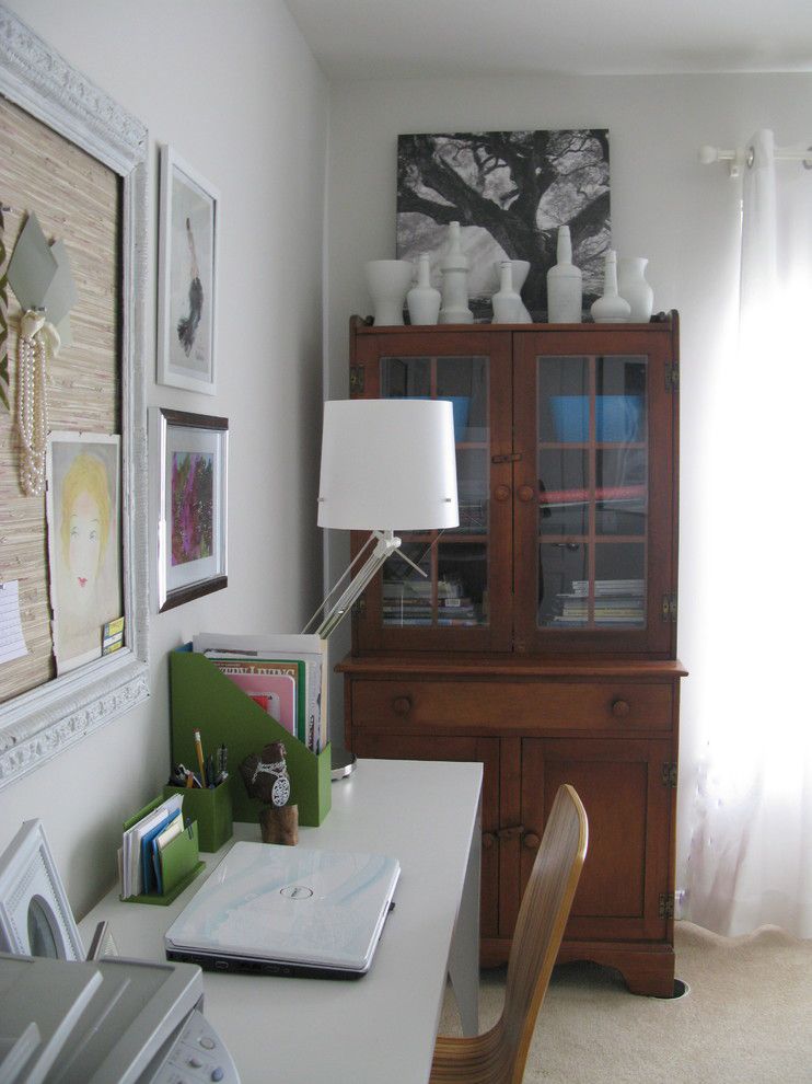
Below is another antique used for home office storage. See the framed bulletin board with a grass cloth surface? It's an easy modification that looks a little more personalized that a plain cork board. You could do this with a favorite fabric too!

office5.jpg

One area that could be valuable to me is the 1972 shallow closet with bifold doors. I would like to remove the doors and fill the closet with shelves (sans the work station seen below). This would be an ideal storage solution for bolts of fabric, wallpaper and client accessories as they await installation day.

office6.jpg

I think the office below is my favorite and it was designed by Myra Hoefer.

office7.jpg

Here's what I find so appealing. The giant work table in the center of the room means you could be working on multiple projects at once. Seating can be accessed from any side of the table which really gives you some flexibility. Added storage is found on the shelf below the table, so materials are easily accessible while not being used. I also adore that antique storage piece. It provides tons of storage and gives the space so much personality!

Style - even though offices are viewed as utilitarian spaces, I think it's important to bring the pretty. Your surroundings have a big impact on your state of mind, and you should feel good in your work space.

This one feels about right for my style:

office8.jpg

Soft colors, simple floral window treatments, and stylish seating feel comfortable to me.

So to summarize, when planning your home office

1. Assess your needs. What pieces do you need to perform your daily tasks?

2. Measure your room, and create a drawing (to scale) to determine the best way to utilize the space that makes sense for your work process.

3. Source the furnishings for your office that will meet your needs, fit your floor plan and reflect your personality. As long as the piece is addressing the function it's meant to address, the sky is the limit! Have fun with the pieces and add some personality.

Chintz In Modern Interiors

Most people think "Chintz" and Modern" don't belong in the same sentence, much less that they can coexist in the world of interiors. And I get it. If you grew up in the 80's when Laura Ashley and Waverly polished cotton chintz fabrics were all the rage and window treatments looked like this:

chintz1.jpg

then you probably have an anti-chintz clause in your Decorating Plan.

I, on the other hand, happen to still like a pretty and colorful fabric that's inspired by nature's biggest and boldest blossoms.

chintz2.jpg

The key is to have a very light hand when using floral chintz fabrics. I think the image above demonstrates just how effective and relevant these fabrics can be in today's interiors. The white walls and graphic stripes on the table skirt take the space out of the 80's and put it firmly into the right now. In case you're wondering, the fabric on the curtain is Scalamandre's China Rose. It's been in production for decades and is still highly sought after.

chintz3.jpg
chintz4.png

I love the floral chintz headboard above - and - oh my - peach walls! It's so refreshing to see something other than gray, isn't it? Can you imagine how different this room would feel if there were lots of other patterns used with the floral headboard? The Decorator kept the other design elements simple and clean, which gives takes the room in a modern direction.

chintz5.png

Here Miles Redd takes an old school chintz, (Althea by Lee Jofa) and ups the ante with forest green lacquered walls. Would I call this space Modern? Not in the sense that it's modern in style, but Miles Redd has a knack for using old school materials in a way that makes them feel "of the moment". Bottom line is that this room is timeless, and will be relevant decades into the future. And speaking of old school, pleated lamp shades (above) are also enjoying a resurgence in popularity. This makes me happy.

chintz5.jpg

Chintz upholstery + antiques + oversize modern art = forever timeless. Note the seagrass rug and the baskets. Those design elements go a long way to bring the formality of the space down to a more casual/comfortable level, which is how we're decorating now.

The bedroom below? Well, this is me. Not my work, that credit goes to Megan Rice Yager. But this is a bedroom I would be totally comfortable with for myself. The soft color palette, the feminine feel, and the Chinoiserie accents all add up to my idea of perfection. The headboard and the valance are done in Colefax & Fowler's Bowood, an iconic print that has been around for decades.

chintz6.png

OK, I got one more for you. Below is Lee Radziwill's Paris apartment circa I'm-not-sure-when, but I would say at least 10 years ago. And doesn't it feel Modern? Yes, there is chintz upholstered everything, but the white walls, simple curtains, natural fiber rug and edited accessories make it could have been done yesterday.

chintz7.png

So the takeaway here is that you CAN use chintz today. You just need to pick a pattern you love and don't layer lots of additional busy patterns with it. Keep your backdrop simple, and mix in a few modern design elements - like a lucite table or a piece of modern art. Remember, the most memorable interiors are those that have an interesting mix of styles and materials - if you keep these guidelines in mind, there's no reason a bit of chintz can't be part of your mix!

My Junior League Of Chattanooga Designer Showhouse Bedroom Reveal

I know - a long name for a post!

Now that all of the work is done , I want to share photos of the room I decorated for the first ever Junior League of Chattanooga Designer Showhouse. Let me tell you this was an exciting/overwhelming/stressful/exhilarating roller coaster of a project, but I'm so pleased with how it turned out! I may have mentioned in a earlier post that I took the installation of my room down to the wire, so I didn't schedule professional photography before the Showhouse opened. As luck would have it, the photography gods smiled upon me because in the late afternoon the day before the Showhouse opened, in walked a vision of loveliness - aka talented local photographer Wagner Abercrombie with her photography equipment and amazing photography skills. Wagner was actually there to photograph the bedroom next door to me by Green and Lofty, but she agreed to shoot my space as well on that very afternoon. Wagner gets and giant THANK YOU and I also want to thank everyone for the kind and supportive comments about my room. And now for those of you who were not able to tour the Showhouse personally, here are some photos of my completed room.

jl bed.jpg

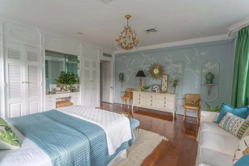
Hello. My name is Kim and I like color. The color palette I landed on for this space is mostly blues and greens. Because blue, green and teal (blue-green) are analogous colors, there's not a lot of contrast between them which helps keep the color palette from becoming overwhelming.

jl bed 2.jpg

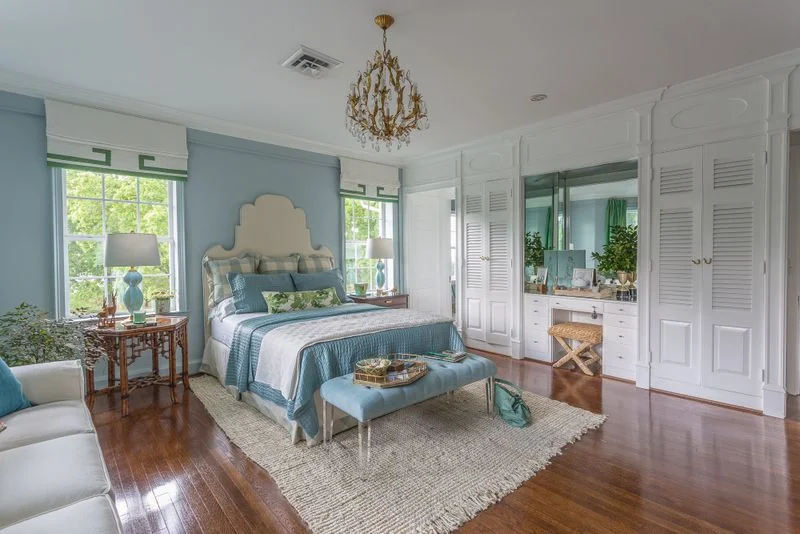
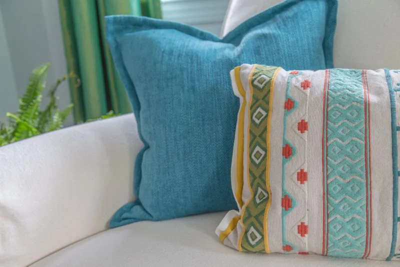
The headboard is custom and is piped in blue. The roman shade valances are also custom and are trimmed in the same green taffeta as the curtain panels. Pillows are a quiet mix of buffalo check and Peter Dunham's Fig Leaf. To create more interest, I decided to shake up the symmetry of the bed wall by using non-matching end tables. The Furniture Shoppe here in Chattanooga provided the beautiful end tables, and they work perfectly here. (TIP: If you are using non-matching night stands with matching lamps, make sure your night stands are the same height).

jl bed 3.jpg

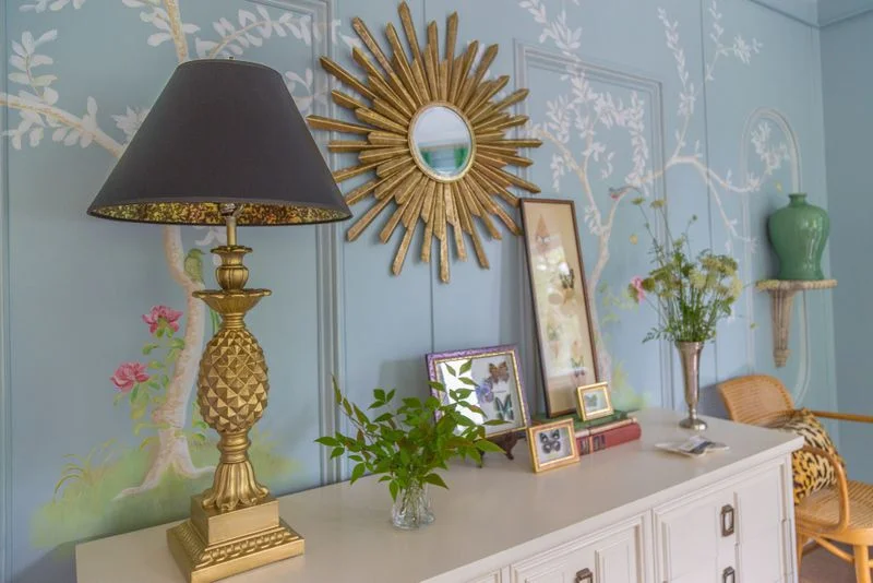
If you know me at all, then you know I have a lifelong love of Chinoiserie. I think it's the blend of nature, whimsy and sophistication that speaks to me. In any case, I incorporated a hand painted Chinoiserie inspired mural on the wall opposite the bed. Local artist Lydia Reynolds created this magic for me, and I am so grateful for her talent.

jl mural.jpg

A collection (my own) of framed butterflies is displayed against the mural wall. I am constantly inspired by the beauty of nature and I try to incorporate it into every room I design. I decided to use fresh cut leaves and wildflowers to bring in even more of nature's beauty in a way that's not too fussy.

jl bed 4.jpg

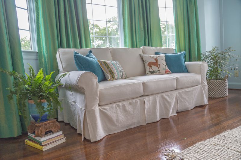
I also love decorating with vintage finds, so I decided to be true to my style and incorporate some vintage pieces into my bedroom. The gilt crystal chandelier is from my own collection and it adds a little sparkle and sophistication. I also like the contrast it provides to the simple, natural fiber rug and the casual slipcovered sofa (generously provided by The Furniture Shoppe Chattanooga). The key to a successful layered/collected look is finding the right balance of high and low, sleek and rough, old and new.

I decided to work with the built-in mirrored vanity wall and only changed out the hardware and styled the vanity. I added the raffia x-bench because the rough texture of the stool was the perfect contrast to the slick mirrored surfaces.

jl bed 5.jpg

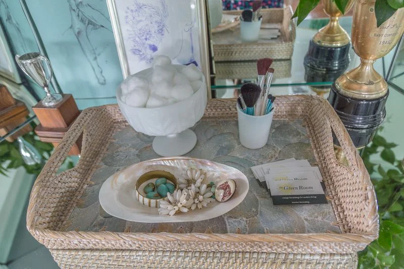
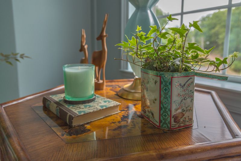
More texture and more vintage items were used to style the vanity. Fresh cut branches of greenery bring warmth and life to this area.

greenery.jpg
vanity.jpg

Even though I love color, I like to temper it by incorporating a lot of white. White is a palette cleanser and it provides a clean backdrop for the stronger colors.

jl sofa.jpg

Here's another look at the Chinoiserie inspired wall painting. Wouldn't it be a treat to wake up to this scene every morning?

jl bed 6.jpg
jl end table.jpg
jl pillows.jpg
jl bed wide.jpg

Thank you again to the Junior League of Chattanooga for inviting me to participate and for all of the good work you do in our community! And thank you to the Furniture Shoppe and my drapery / upholstery workrooms for the fine work you do. You guys make me look good!

Also - This is the LAST WEEKEND that the Junior League of Chattanooga Designer Showhouse will be open. If you haven't had a chance to visit yet, I strongly encourage you to take the tour! I promise you'll leave feeling inspired!

A Bunk Room For Everyone

Today we'll take a look at a design trend that continues to gain momentum. Bunk rooms. They're functional. They're fun. They're here to stay, and style-wise, there's a bunk room for everyone!

I certainly don't consider myself a minimalist, but I find this bunk room from Thorp Designs in the UK so appealing! It feels clean, breezy and restful - a true retreat!

bunk.jpg

Is your style more Modern Glam? Then I think you'll love the bunk room below by Sophie Metz in Nantucket! The suspended bed is a great use of the space under the sloped ceiling.

bunk2.jpg

There are no bunk beds in the bunk room below. Under bed storage provides the platform for each bed, which is so smart and clean looking. To me, this room has textural appeal with just the right amount of color.

bunk3.jpg

The bunk room above and below are both from Tracy Hardenburg of Dallas. I love the use of color in both of these spaces.

bunk4.jpg

If you're reader of design blogs, then you've surely seen the bunk room created by Grace from A Storied Style in the last round of the One Room Challenge. It's bold and fun and no doubt a huge hit with the kids!

bunk5.jpg

Remember at the beginning I said there was a bunk room style for everyone? Here's one that's a little more grown up and sophisticated/romantic. I love how the drapery panels provide privacy and softness. Every little detail was planned out - did you notice the sconces above each bed?

bunk6.jpg

Did you ever think it would be possible to sleep 6 in a single room so stylishly?

bunk7.jpg

I'm currently working with 2 different clients on new construction homes that have incorporated bunk rooms into their new homes. And although this isn't a bunk room proper, we recently built and installed bunk beds as part of a Signal Mountain client's basement renovation.

bunk8.jpg

So I think bunk rooms are here to stay. Would you consider a bunk room in your home?

Junior League Of Chattanooga Designer Showhouse Opens This Weekend!

Today's post is short but I just wanted to remind locals that the Junior League of Chattanooga Designer Showhouse opens this weekend and I couldn't be more excited!

des show.jpg

Unfortunately, I can't share photos (that would be cheating), but believe me when I tell you that it's an event you do not want to miss! I have witnessed the most amazing room transformations over the past several weeks and it has been an absolute privilege to partner with the Junior League and the other designers on this exciting event.

It occurred to me as I visited all of the rooms today that there are so many different design styles represented at the Showhouse, and I can honestly say that I love every one of the rooms! Celebrity (and local) designer Michelle Workman's living room is a brilliantly layered, ultra luxurious space, while Green and Lofty kept it simple, clean, and ethereal with their mix of breezy whites and organic accents. It's all amazing and I'm so proud to be included in this group of talented Chattanooga designers!

I just got my room finished up this afternoon (took it right down to the wire) , and as I was leaving I saw that preparations were being made for tomorrow night's Gatsby party (!). Oh, and some of the vendors were bringing in their wares for the downstairs marketplace - and let me tell you I saw one or 20 things I would love to have in my home!

watercolor.jpg

Please, please locals - do yourself a favor and make plans to visit the Showhouse. You will surely leave feeling inspired and your financial support will help the Junior League continue to do their good work in our community!

The Junior League of Chattanooga Designer Showhouse is at 526 South Crest Rd. in Chattanooga. The Showhouse is open every weekend in June. Fridays and Saturdays 10-6 and Sundays from 1-4. Tickets can be purchased at the door.

Junior League Showhouse Bedroom - Some Progress

Today I have a quick update on the room I'm decorating for the Junior League Showhouse here in Chattanooga.

In my last post I proclaimed that I would be true to my own aesthetic and embrace using color! Working with color is my favorite, and I love to develop interesting color palettes. I also want to stress that colorful interiors don't have to be bold or shout at you! Color is a wonderful tool that can be used to create any type of mood, and although I'm using a big dose of color, my goal is to create a bedroom that's classic and fresh and restful and quiet and pretty and sophisticated. Too many adjectives?

Here are a few rooms that demonstrate the look I'm going for.

jl inspire.jpg

I adore this bedroom by Meg Braff. I adore everything she does. It's colorful, but layering in shades of white keeps the wall color from being overwhelming. It feels vibrant and restful at the same time. The black shades add some crisp sophistication - which I love with smiley face heart eyes.

jl inspire2.jpg

Here's another dreamy bedroom that inspires me. In the bedroom above by Phoebe Howard, the strong wall and curtain color is lightened up with white bedding. Did you notice the chic black lamp shades?

So real quick, here's a before photo of my room, just to use as point of reference.

jl before.jpg

I don't know the official name of this color, but I like to refer to it as "Color least likely to be selected by me."

Here's peek at the new wall color.

jl paint.jpg

I went with "Smoke" from Benjamin Moore and I'm so pleased with it! It's a gorgeous smokey blue with green undertones. AND it's soooo much better in person than what you're seeing in my iphone photo above.

Did you notice I painted most of the trim the same color as the walls? There's a reason for that. I wanted to simplify the backdrop of the room because there are competing architectural details at play. Painting everything the same color helps to unify as well as update the space.

So not only are the walls painted, but the window treatments have been installed too! Large moments. I have to admit, two of the biggest thrills for me are 1. When the room is painted. 2. When the curtains go up.

jl curtain.jpg
jl bay window.jpg

The green taffeta curtains, although somewhat bold, are completely magical in the space! They feel so rich and luxe and I love them so!! And don't be concerned about the light fixture. It will be replaced with something far less "faux tuscan".

Finally, I'll leave you with a little glimpse of the heardboard:

jl headboard.jpg

It's custom. My awesome workroom made it up out of a textural linen blend with some pretty blue piping. The fabrics are simple but the shape is bold. And that's an approach I use over and over again. That whole opposites attract high/low, classic/modern tension that keeps things interesting.

Also - the roman (also custom made by my awesome workroom) has a Greek Key-esque motif made from scraps of the tafetta curtain fabric.

I love everything in this room SO MUCH that sometimes I go by the house and just visit with it and bask in it's goodness.

I have to leave you with these little snippets for now but trust me there is much more more to come and I'm completely head over heels with all of it.

The Junior League of Chattanooga Designer Showhouse opens to the public June 4, 2016 and will be open every weekend during the month of June.

Junior League Of Chattanooga Showhouse - "Before's" And Direction

I really should have named this post "Before's and Inner Turmoil". Think about it. I have this room to decorate and I can do absolutely anything I want with it. It's a dream! It's a nightmare! The sky's the limit (wait -the sky AND the budget are the limit!) All I have to do is pick a direction.

What's the right thing to do here? Really push the boundaries and do something completely out of my comfort zone? Show house rooms are meant to wow and inspire! Do I do something completely over the top?

These are the questions that have been keeping me up at night, and some things are still undecided. I'm having major commitment issues - and collectively decorators are the worst decision makers when it comes to their own projects. Clearly I'm not the exception to this rule!

But enough about my insecurities. You came for the pictures, so as promised, here are the "before" photos of the bedroom I'm decorating.

jl vanity bf.jpg

This is the wall directly on your right as you enter the room. Some components of this wall appear to be original, and some of it appears to have been added later in the house's life. I have decided to keep this wall as is - except maybe just changing out the hardware. I haven't settled on the hardware yet.

jl before paint.jpg

So we're basically panning around the room. This wall adjoins the previous wall of built-ins. The bed will be placed between these windows. (See, I have made some decisions).

Still panning. Bay window wall is directly opposite the wall of built-ins. High note: original hardwood floors just refinished and looking fab! They appear to be quartersawn oak.

jl bay window bf.jpg

And then there's this wall. I have restored many a historic home in my day and one thing that I've seen over and over again is that along the way, people want to "update" or put their mark on these homes. Fair enough. It's your house and we're living in the here and now.

jl before.jpg

First, I thought about removing the moldings. These's quite a bit going on here already, and not all of it is cohesive. I also considered adding more moldings to this wall. Then I considered leaving the moldings as they are, and doing some sort of fancy art arrangement. Deciding what to do with this wall has challenged me and quite possibly could be responsible for the extra 5 pounds I'm packing, but I finally decided what to do and it has been done!

As for the overall direction, for a hot second I considered doing one of those super elegant, all neutral bedrooms that are so popular right now. The bedroom below is by Susan Ferrier. Incredibly luxe, chic and understated.

jl luxe.jpg

But who am I kidding? I absolutely LOVE working with color and so I've decided not to fight the feeling. Color it is.

I'll be revealing a little more next week. Hope you'll join me!