I really should have named this post "Before's and Inner Turmoil". Think about it. I have this room to decorate and I can do absolutely anything I want with it. It's a dream! It's a nightmare! The sky's the limit (wait -the sky AND the budget are the limit!) All I have to do is pick a direction.
What's the right thing to do here? Really push the boundaries and do something completely out of my comfort zone? Show house rooms are meant to wow and inspire! Do I do something completely over the top?
These are the questions that have been keeping me up at night, and some things are still undecided. I'm having major commitment issues - and collectively decorators are the worst decision makers when it comes to their own projects. Clearly I'm not the exception to this rule!
But enough about my insecurities. You came for the pictures, so as promised, here are the "before" photos of the bedroom I'm decorating.
This is the wall directly on your right as you enter the room. Some components of this wall appear to be original, and some of it appears to have been added later in the house's life. I have decided to keep this wall as is - except maybe just changing out the hardware. I haven't settled on the hardware yet.
So we're basically panning around the room. This wall adjoins the previous wall of built-ins. The bed will be placed between these windows. (See, I have made some decisions).
Still panning. Bay window wall is directly opposite the wall of built-ins. High note: original hardwood floors just refinished and looking fab! They appear to be quartersawn oak.
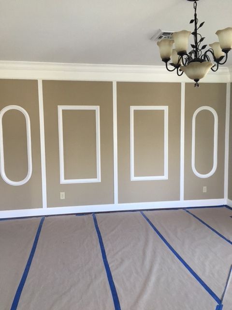
And then there's this wall. I have restored many a historic home in my day and one thing that I've seen over and over again is that along the way, people want to "update" or put their mark on these homes. Fair enough. It's your house and we're living in the here and now.
First, I thought about removing the moldings. These's quite a bit going on here already, and not all of it is cohesive. I also considered adding more moldings to this wall. Then I considered leaving the moldings as they are, and doing some sort of fancy art arrangement. Deciding what to do with this wall has challenged me and quite possibly could be responsible for the extra 5 pounds I'm packing, but I finally decided what to do and it has been done!
As for the overall direction, for a hot second I considered doing one of those super elegant, all neutral bedrooms that are so popular right now. The bedroom below is by Susan Ferrier. Incredibly luxe, chic and understated.
But who am I kidding? I absolutely LOVE working with color and so I've decided not to fight the feeling. Color it is.
I'll be revealing a little more next week. Hope you'll join me!


