I have tried to sit down and put this post together for almost three months now and today I'm finally going to share this fun project with you!
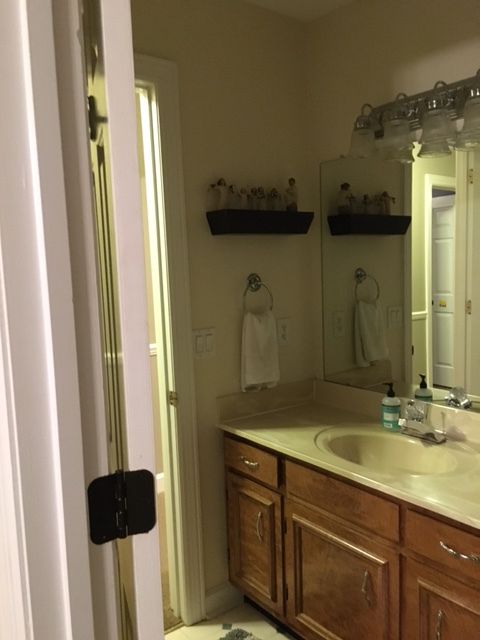
It's a tiny guest bathroom that is in a home that shared by a Dad and his two young boys. The home they live in was built sometime in the 80's, and we're pretty sure this bathroom is still sporting it's original 1980's finishes.
I just love a project with a big potential for change!
Anyway, this bathroom is mostly used by my client's out of town parents and in-laws who come to town when he needs help with the boys while he's at work or traveling.
My client has great taste but needed some help picking a direction and pulling things together. I wanted to give him something that would be appropriate for an all-male household yet be feminine enough for his guests to feel comfortable and pampered too.
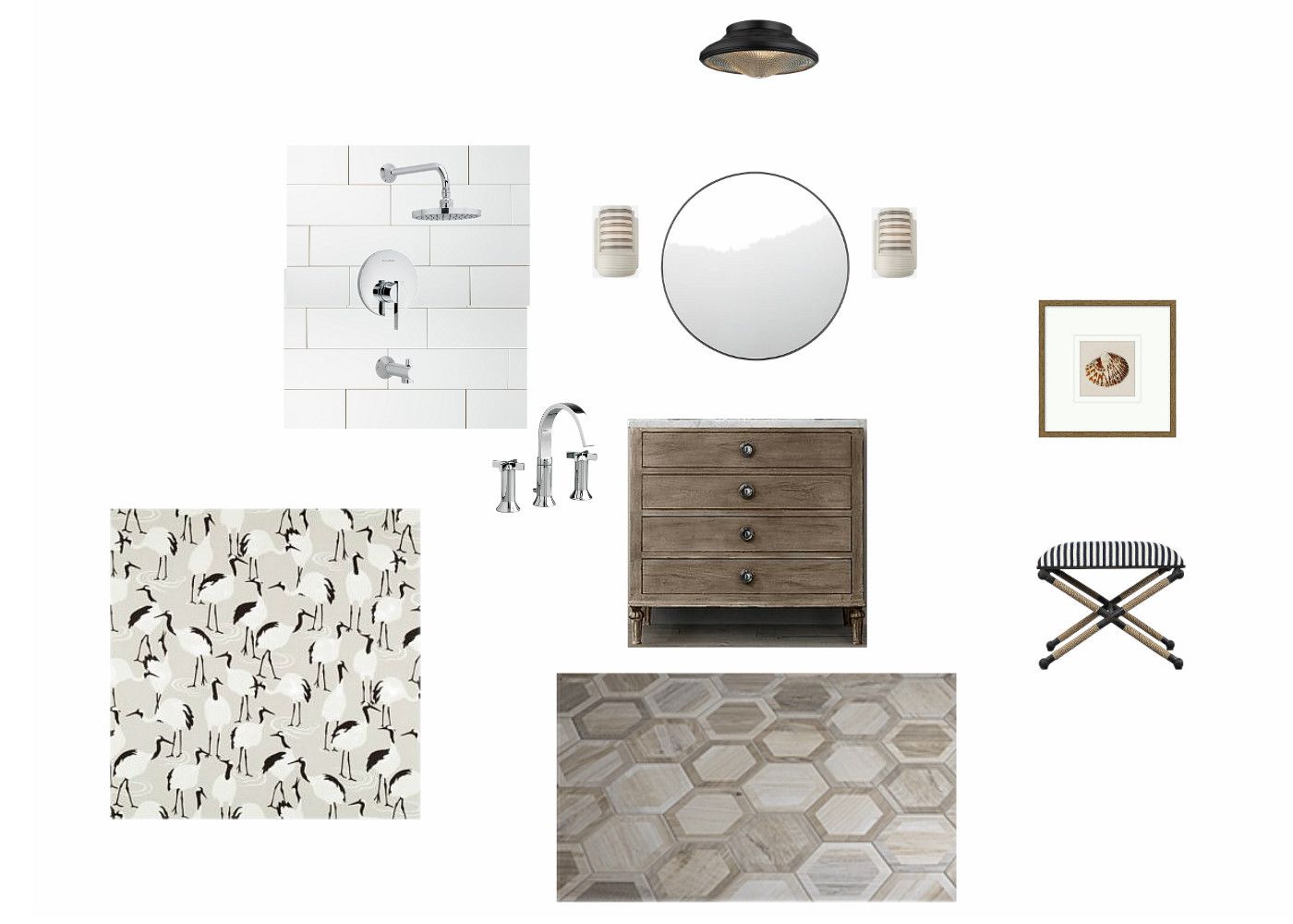
I got a style clue during the initial consultation when my client showed me the new Restoration Hardware catalog he had been admiring. Based on that and what I learned during our interview, I pulled together a few selections for the space.
The jumping off point was the vanity I sourced from Restoration Hardware. He loved the washed wood finish and I love how it looks like a charming antique piece that was converted into a vanity.
I also fell hard for these wood-look hex porcelain tiles, and I knew they would be dynamite with our vanity.
I like to include a whimsical touch, so I searched for something that would be appropriate for the space and add a little levity. This "Winter Cranes" fabric from Robert Allen was the answer I was looking for. The print is whimsical but it's still sophisticated with it's neutral palette.
Another favorite design element is these fantastic retro-style ceramic sconces from Schoolhouse Electric. I can't resist a stripe and these gray striped shades would be the icing on the cake.
Here's a little mood board to show how all of the selections work together within the space.
Now comes the part where I show you the "after". I'm absolutely thrilled with how the bathroom turned out, but I don't have tons of pictures to share. It's a small space to photograph with no natural light (read: tough to photograph), but I think this iPhone photo captures everything we incorporated into the space and demonstrates how much change is possible by just changing the finishes.
We replaced the existing tub with a deep soaker tub and finished off the tub surround with clean and classic white subway tile and sparkly chrome fixtures.
I'm happy to report that parents and in-laws have used the space and it's getting rave reviews! So much so that we moved on to the renovation of the boys shared bathroom, and I'll share that transformation in my next post.
Thanks for stopping by!


