Today I have an exciting project to share with you. The clients are an adorable couple who have a wonderful sense of style, but they needed some help editing down their ideas and staying on track with the design direction.
When I came on board, they had already done quite a bit of renovations on their Chattanooga home and had done a magnificent job! The kitchen, master bathroom, and flooring were all new, and most of the interior walls were coated in a bright, clean white.
However, when it came to furnishing their rooms, they hit a wall. So much energy spent and so many decisions made on the renovations left them feeling tapped out and a little overwhelmed. Sometimes having lots of options is just ... daunting.
Style-wise, we were a great fit. They have love and respect for the classics, but they also wanted to incorporate some design elements with a modern edge. Bring on the mix!!
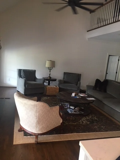
Here's how the space looked when I saw it for the first time. Iphone photography isn't doing it justice.
The furniture was a mix of new pieces - which are very nice - combined with the vintage occasional chair - a family heirloom - and that cute vintage lamp.
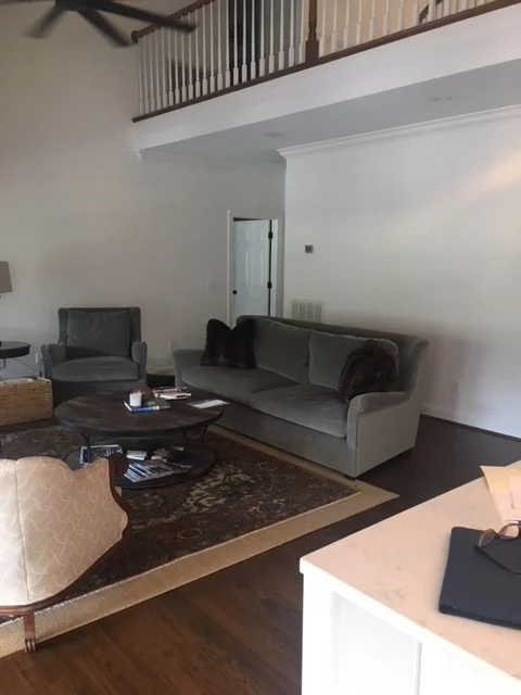
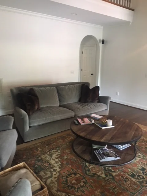
Here are few more "befores".
Again, a nice layout with perfectly lovely furniture pieces. But, my clients were looking to make more of statement with their interiors that revealed more about who they are.
And so we collaborated on ideas and an overall direction. In the end, we decided to create a pared down, clean, classic space that was chic, eclectic, and of the moment.
They have room for 2 full sized sofas, and I suggested we do 2 mismatched sofas for a collected look. One is slipcovered, the other is upholstered, and the clean lines shared by both pieces made them perfect companions. Personality would be added with colorful pillows, a vintage rug, and some unique art that would be sourced by the clients - who were up for the challenge!
As you know, design is a process, so after a few tweaks and adjustments, the final space was a little different than what you see in the Design Board above, and we couldn't be happier with the results!
Where there were once 2 chairs we now have a comfy sofa and a fabulous wall of art, curated by my style savvy clients.
This is a photo I took before professional photography seen below. You can see the mismatched sofas together and that the layout is pretty much the same.
Would you agree that the art makes the space? The clients did a fantastic job of sourcing the art for our gallery installation. I had the fun job of placing the art above one of the gorgeous new sofas.
Here's our slipcovered sofa. My clients had the art piece commissioned and we just love the simplicity of the floating glass frame, particularly combined with the ornate gilt candle sconces. Those sconces were part of my client's collection and I couldn't wait to incorporate them into the design plan!
Yes, that is my client's vintage chair done up in a dreamy blue velvet. And how cute is Wiley - he's such a ham and wanted to be in every photo! Custom drapery frames the french doors to the fabulous veranda overlooking the golf course. We went the iconic Zimba from Schumacher for the fabric and trimmed it out in simple orange grosgrain ribbon.
While we were at it, we also tackled the little breakfast nook off of the newly renovated kitchen.
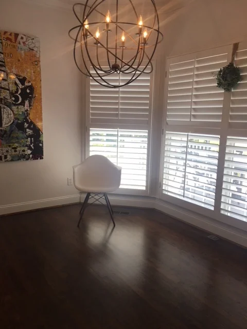
Here's a photo of how it looked when I came on board:
Again, they're off to a great start with those gorgeous floors, updated lighting and fun art piece!
Here's where we ended up:
We kept the modern chair inspiration, opting for the sexy and sculptural Panton chairs in white. A rustic table keeps things interesting by providing textural contrast, and the zebra hide is a little unexpected and just. so. chic! My clients fell in love with the bold blue painting instantly and I knew it would work perfectly in this breakfast nook. The previous painting got relocated to their swanky new master bath.
We're all so in love with the new look, but more importantly, I feel like the room really reflects their amazing personal style! And isn't that what good design is all about?
Check back again soon - I'll be sharing photos of the newly designed dining room and the foyer.
