Wow Them With Wallpaper

If (like me) you are of a certain age, you probably made a pact with yourself during the 90's that you would never ever have wallpaper anywhere in your home again. Ever. Wallpaper was big in the 80's, and it was all well and good until it fell out of favor. Oh how we suffered through the monumental task of stripping it away and dealing with the carnage that was left behind (wall damage.)

But (as with the pain of childbirth), time has a way of softening the blow and allows us to reconsider that which we thought we had left behind. And so I ask that you cast your fears aside and revisit the possibilities of the wonderful world of wallpaper!

wallpaper.jpg

I mean do you really want to hide your head in the sand and miss out on the opportunity to enjoy something like this? I didn't think so.

wallpaper2.jpg

I too thought I was "done" with wallpaper, yet here it is in my own guest bathroom.

Have a portion of a look at the wallpaper we used in a powder room in our Monteagle cottage renovation via my amazing Iphone 4S (hangs head in shame). Oh how I love the contrast between the white ship lap walls of the hallway and the patterned paper in the powder room. Tension = interest.

wallpaper3.jpg

This is a powder room I designed for some wonderful clients on Signal Mountain. It has kind of a groovy vibe but the blue and white colorway is classic!

wallpaper4.jpg
wallpaper5.jpg

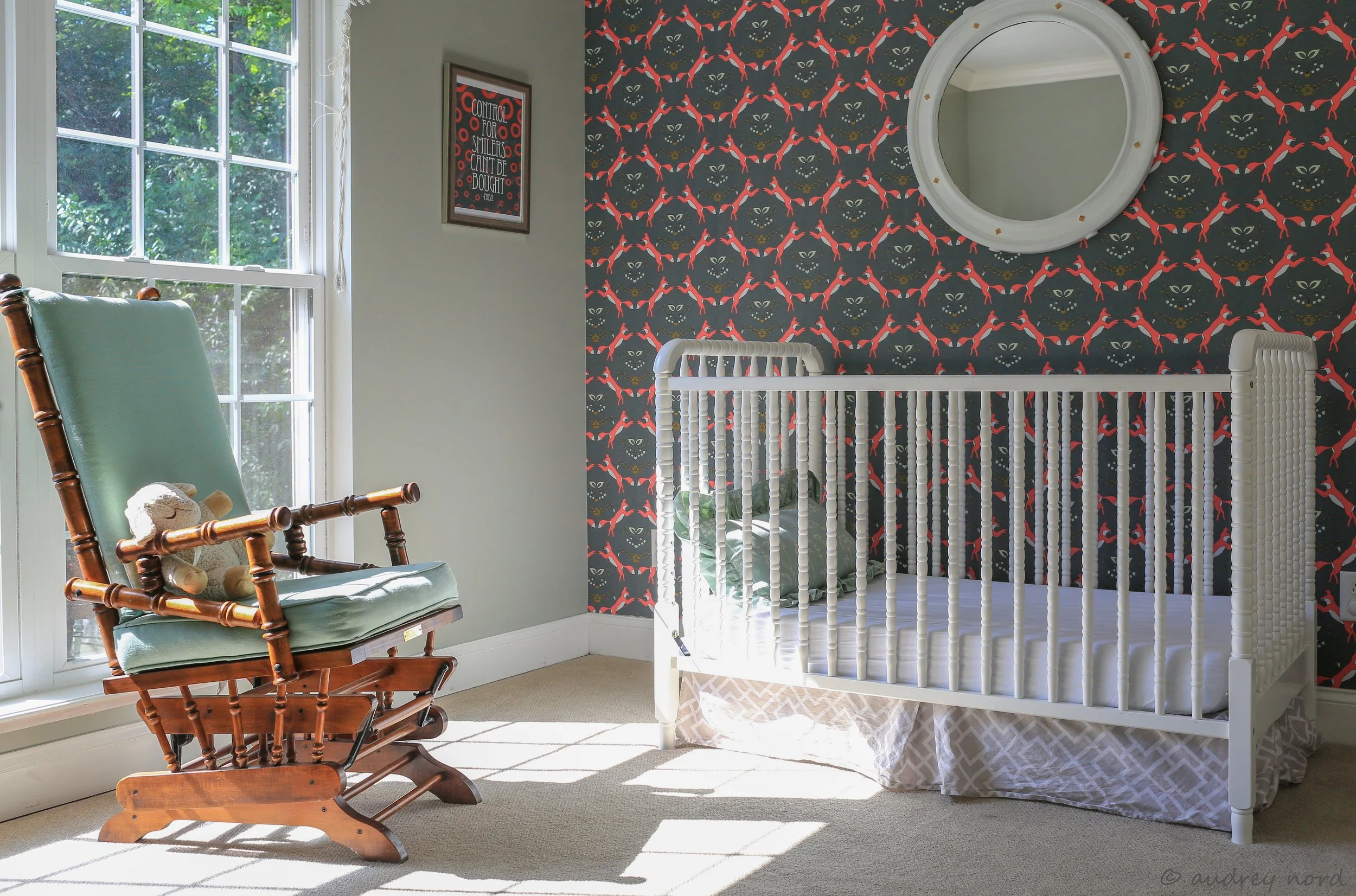
And in this sweet nursery I used wallpaper to make the crib wall the focal point of the room. Can you make out the Foxes in the wallpaper pattern?

I also have a few in process projects involving wallpaper.

wallpaper6.jpg

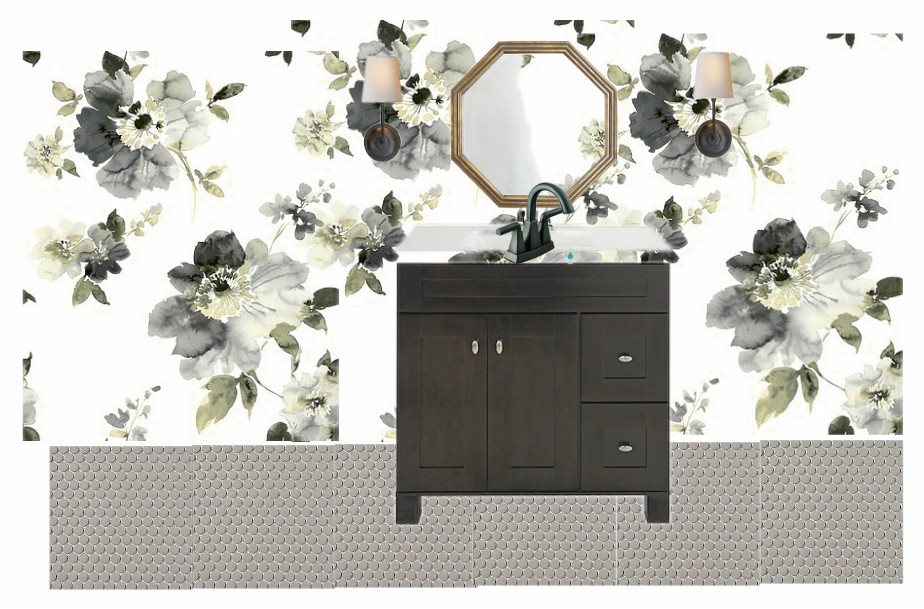
The guest bathroom in our Ridgeside renovation is getting a bold floral wallpaper in neutral tones that has a watercolor effect. I paired the modern wallpaper with vintage style gray penny tiles for a look that's appropriate for the era of the 1920's but still feels current.

UPDATE: Here's an instagram photo of the above bathroom :

wallpaper7.png

And I designed this nautical themed bathroom for a boy's bathroom at The Father Of The Bride House. (See previous blog post)

wallpaper8.jpg

The bathroom design above is going in another 1920's era home. The pedestal sink, subway tiles and penny tiles work perfectly in older homes, and the navy and white color palette is so fresh!

And this just in - I got a few new books from my wallpaper rep a few weeks ago and there are some fantastic papers that I would LOVE to use somewhere.

wallpaper9.jpg

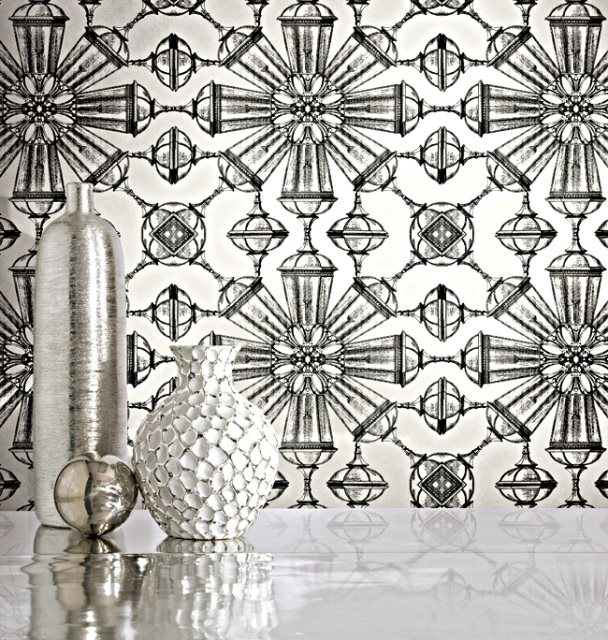
This cheeky goblet print in black and white would be wonderful in a lackluster kitchen.

wallpaper10.jpg

I adore this classic botanical themed wallpaper - complete with butterflies. It has an 80's Mario Buatta feel, doesn't it? Perfect for a powder room

wallpaper11.jpg

This is the same wallpaper in another colorway. Pretty is back!

Are you ready to get back on the horse? Contact me at 423.653.3186 if you're ready to make those wallpaper dreams a reality!

Thoughts On Creating A Successful White Room

They're everywhere - those bright, beautiful, clean, airy spaces with white walls. Even though I love to work and live with color, I can see why white rooms are so appealing.

white1.jpg

You want one too? I say you can do it, but there are a few things you'll need to keep in mind to have a successful white room.

1. The biggest player in a white room is natural light. What makes white rooms so special is that they feel bright and airy, and without a lot of natural light your white walls will feel dingy and dirty no matter how bright your white paint is. And nobody wants that.

My family room (above) is the only room in my house I painted white. It has a southern exposure and it is bathed in light all day long! The paint color I used is Benjamin Moore Moonlight White. It has just enough yellow in it to keep it from going c…

My family room (above) is the only room in my house I painted white. It has a southern exposure and it is bathed in light all day long! The paint color I used is Benjamin Moore Moonlight White. It has just enough yellow in it to keep it from going cold.

2. Size matters. Especially where white rooms are concerned. A white room just works better in a larger space because it naturally lends itself to a feeling of volume and airiness.

My family room is also the largest room in my house, which really gives the white walls an opportunity to bounce the light around.

My family room is also the largest room in my house, which really gives the white walls an opportunity to bounce the light around.

3. Add in some texture.

Sea grass rugs, iron coffee tables, and natural wood tones all work beautifully with white walls.

Sea grass rugs, iron coffee tables, and natural wood tones all work beautifully with white walls.

Considering white walls but worried you might miss having some color? Don't be concerned because

Art - it looks fantastic on white walls.

white5.jpg

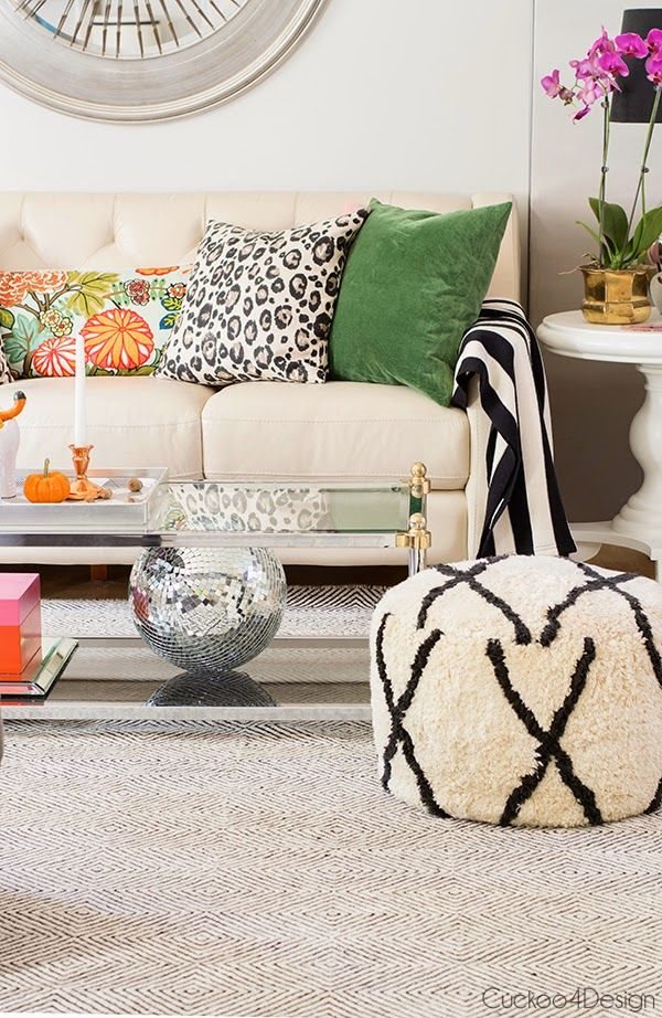
so do fun, colorful fabrics,

white6.jpg

and rugs! Particularly the aged, highly patterned variety.

white7.jpg

If you're in the Chattanooga area and in need of some design assistance, contact me. I can help!

Not All Neutrals Are Beige!

I get it. You're paying a lot of money to have your home professionally painted (or perhaps investing your blood sweat and tears a.k.a doing it yourself).

You: "If I'm going to shell out my hard earned cash, I want something that's going to look good with everything until the end of time!"

Me: "Okay, but can we look at neutrals that aren't beige? Or gray?." Or greige?"

You: (Crickets....)

It's true! There are lots of neutrals that are NOT beige or even kin to it.

Allow me to enlighten you.

neutral1.jpg

Can you even imagine a more gorgeous color? It's soft, it's tranquil, it's timeless - it's pure happiness in a can! This is Benjamin Moore's Palladian Blue. I wish I could take credit for the room - it was done by Caitlin Creer Interiors. Palladian Blue looks good with EVERYTHING! I dare you to find a color that won't work with it. It can't be done.

neutral2.jpg

Here is a color I have used over and over and over again. I don't have any information on specific paint color or brand used in Stephen Fuller's entry above but you could get this look with Benjamin Moore's Guilford Green or Fernwood Green. YES, green is neutral, particularly this fresh hue. Think about all of the lush greens found in nature and how well they marry with everything from bark and stone to the most vibrant blooms of spring and summer. (#greenisneutral)

white3.jpg

Okay, this one may be a stretch, but hear this - a subtle shade of lavender looks good with everything! (As demonstrated in this Martha Stewart space.) And she knows a thing or two about looking good. Need more convincing?

neutral4.jpg

TIP: if you're one of those people that has lots of brown wood furniture, lavender looks phenomenal with wood tones! If you take my advice and incorporate a pale pale muted lavender, all of your friends will wonder when you got so smart and so stylish. (#paintchangeslives)

And just because I love you and because maybe you really just want a beige that looks good with everything, here are a few that I've used and wouldn't hesitate to use again.

neutral5.JPG

This is Benjamin Moore's Bleeker Beige in a 1905 downtown Chattanooga home we restored over 12 years ago. I like Bleeker Beige because it's warm and toasty without those oppressive gold undertones. Side note: I'm all kinds of proud that even though I decorated this room over a decade ago, it still feels current. PS - that's Palladian Blue on the ceiling. Bleeker Beige loves blue!

And below, my other go-to beige, although it sometimes reads a little gray - Benjamin Moore's Grant Beige. Here you see it in a staircase in a 1920's historic home restoration we completed about 8 years ago on Lookout Mountain. Grant Beige is a chameleon, changing from beige to gray depending on the light. If you look at the top of the photo and the bottom of the photo you can see how different it looks because of the lighting. One thing that's consistent about it is that it always looks great!

neutral6.JPG
neutral7.jpg

Here is Grant Beige in the living room of the same house on Lookout Mountain. It's slightly grayer than Bleeker Beige, and it's a great neutral!

If you're in the Chattanooga area and struggling with paint color selections, I can help! Contact me at 423.653.3186