Pretty Kitchens That Are NOT White + Gray + Marble

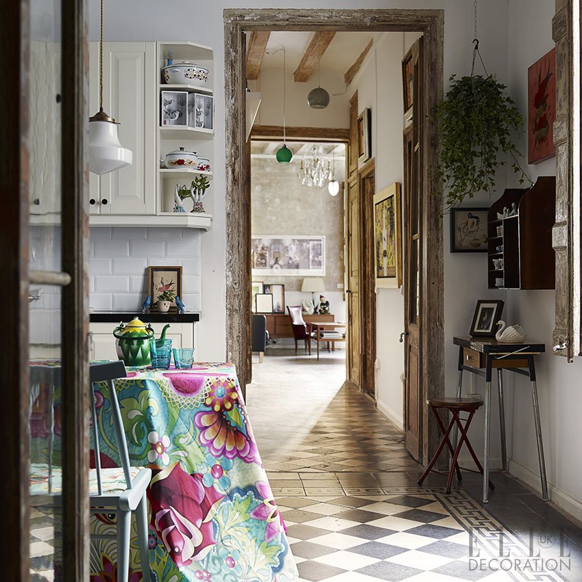
Honestly, I do understand the appeal of a white kitchen! They're timeless, simple, bright, and clean looking, so I would never say it's "wrong". But with the saturation of the white/gray cabinets +white marble countertops + brass hardware + subway tile formula, I feel like there's a bit of a herd mentality going on where kitchens are concerned. Today we'll look at the colorful side of kitchens.

kitchen1.jpg

I love the warm, collected feel of this kitchen. The lower cabinets look like pine, which I love. And it proves you don't have to have all color everywhere to make an impact.

kitchen2.jpg

Above, a favorite kitchen by Andrea Schumacher. Yes, there's white cabinetry and marble countertops here, but there's also an infusion of color and personality!

kitchen3.jpg

I featured this HGTV kitchen last week when I blogged about scallops (note vent hood). I came back to it this week because the color palette is not the norm for a kitchen, and I like that.

kitchen4.jpg

I think yellow and kitchens are perfect together. Again, a little bit of color goes a long way!

kitchen5.jpg

Here is mostly white/marble kitchen with a very unexpected green painted floor, which takes it from sterile to friendly. And fresh.

kitchen6.jpg

Love the mint colored cabinetry with the rustic beams and chrome fixtures. Feels farmy and sophisticated at the same time.

kitchen7.jpg

Kitchen above by Nick Olsen. No white or gray cabinetry, marble countertops OR white subway tile to be found, and it's a little bit city mouse and a little bit country mouse. AND it doesn't look like every other kitchen on Pinterest.

kitchen8.jpg

Kathryn Ireland's kitchen. Mint cabinetry with touches of pink and mismatched lighting. Feels approachable,doesn't it?

kitchen9.jpg

I'll leave you with this image, because it proves that kitchens don't have to be all white and gray to feel modern.

The point I'm trying to make here is there is no right or wrong (mostly) when it comes to the design of your kitchen/home. If you love a gray/white/marble kitchen, by all means, you should have one! However, if you're happier surrounded by color, don't let what is trending on Pinterest dictate what you have in your home! Make it your own with no apologies!

The Green Room Interiors provides Interior Decorating and Design Services in Chattanooga, TN. If you would like some help turning your house into your haven, call Kim at 423.653.3186 or email thegreenroominteriors@gmail.com

Pretty Little Details - Scallops

I'm sure you've heard it over and over again, but it bears repeating.

scallop.jpg

Details are the fun, unexpected touches that can take a space from run of the mill to noteworthy. The details are not always the first thing you notice, but they reveal themselves upon closer inspection, allowing you to experience their unique moments of brilliance a little at a time.

Today we're going to look at scallops - a fun detail that adds interest, movement and whimsy to a space.

scallop2.jpg

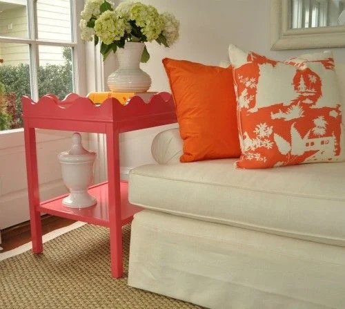
The pink and orange color palette seen above is so crisp against the white walls and white upholstery, and the scalloped edge along the top of the side table adds movement and charm to an otherwise boxy design.

scallop3.jpg

The scalloped edges on the bedding above don't immediately jump out at you, but they add another layer of interest to this eclectic bedroom.

scallop4.jpg

In the image above, I love the softness the chandelier's scalloped form brings to this neutral bedroom.

scallop5.jpg

These whimsical chandelier shades are from Chattanooga-based Stray Dog Designs and they come in a rainbow of colors. This lively kelly green is my favorite!

scallop6.jpg

Above, the scalloped hood is the perfect finishing touch for this charming cottage style kitchen. (Extra points if you noticed the scalloped edges on the ends of the upper cabinets.) If I'm not mistaken, it looks like the cabinet hardware is scalloped too!

scallop7.jpg

Finally, a scalloped matelasse slipcover relaxes the formality of this antique sofa. Other noteworthy details are the white piping and buttons inset into each one of the scallops.

If you're in the Chattanooga area and would like some help creating a home that celebrates the details and makes your life a little bit sweeter, call Kim at 423.653.3186 or email thegreenroominteriors@gmail.com

In The Kitchen: Statement Hoods

Today I thought I would do an inspirational post about kitchen hoods. Although utilitarian by nature, hoods can also be decorative and can add lots of personality to your kitchen.

hood.jpg

First, let me just say this kitchen by Rebekah Zaveloff is a favorite! The black, white and wood finishes are timeless. But that hood?!? Total scene stealer. I love the simple, strong shape and that band of brass around the bottom takes it to the next level. Side note: if you're still on the fence about mixing metals, this image should give you the confidence to forge ahead! (chrome/brass/copper)
hood2.jpg

Another gorgeous black and white kitchen from Rebekah Zaveloff. This time the tapered hood is covered in subway tile. The white tile lends a tidy, orderly feel to a kitchen. I love this look and we recently created a custom hood for a client that was covered in subway tile. Below is a photo taken during renovation:

hood3.jpg
hood4.jpeg

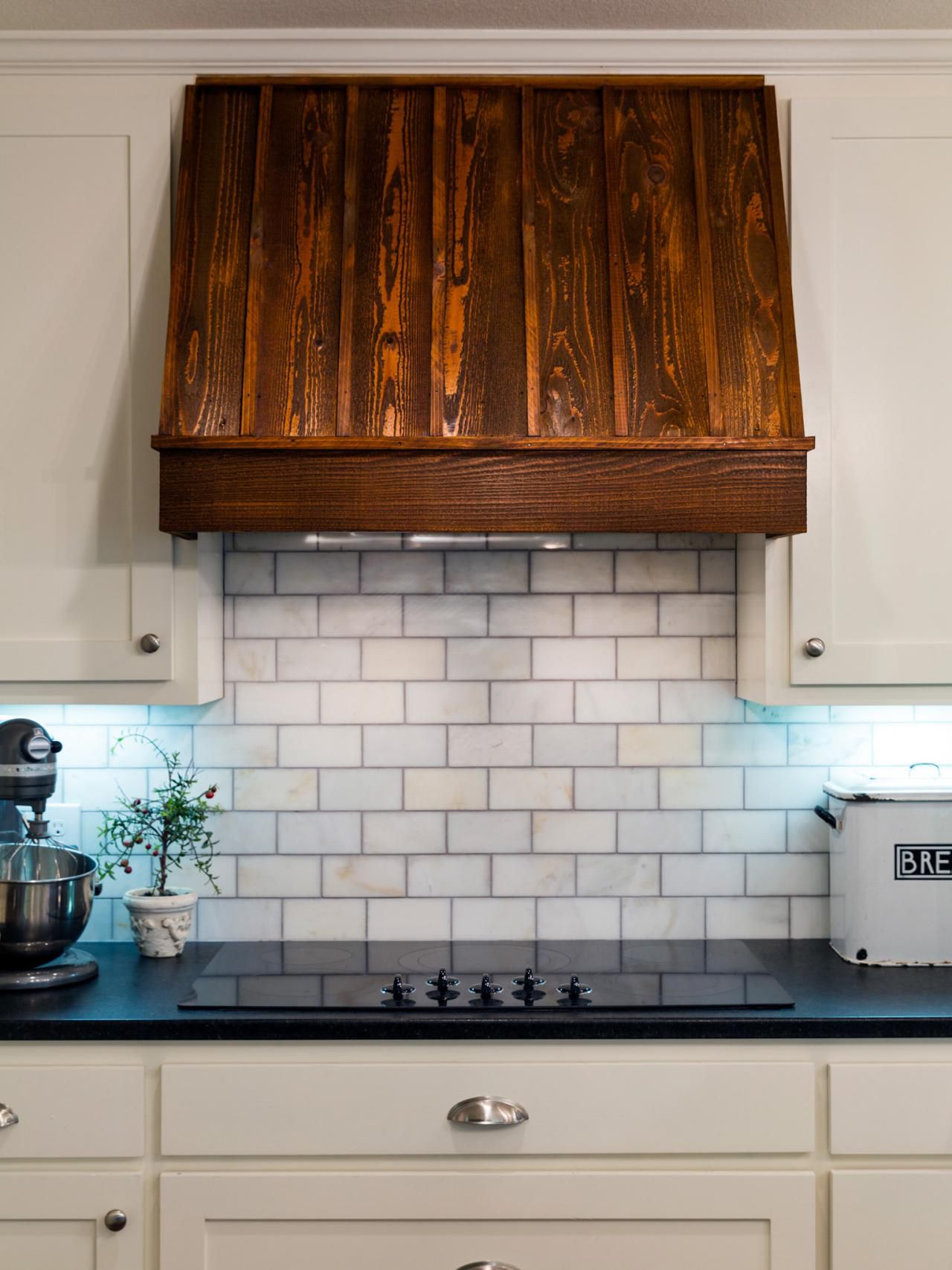
Just the addition of the wood on this kitchen hood above (from HGTV Magazine) adds a wonderful textural contrast to all of the slick surfaces in the kitchen above. I probably would have chosen a different stain color for the wood, but I do appreciate the softness and warmth the wood brings to the space.

hood5.jpeg

Another thing to keep in mind that statement hoods don't have to be loud and showy. I adore the simplicity of the hood above, and it's tapered, curvy form is nice contrast to the surrounding boxy cabinetry.

hood6.jpg

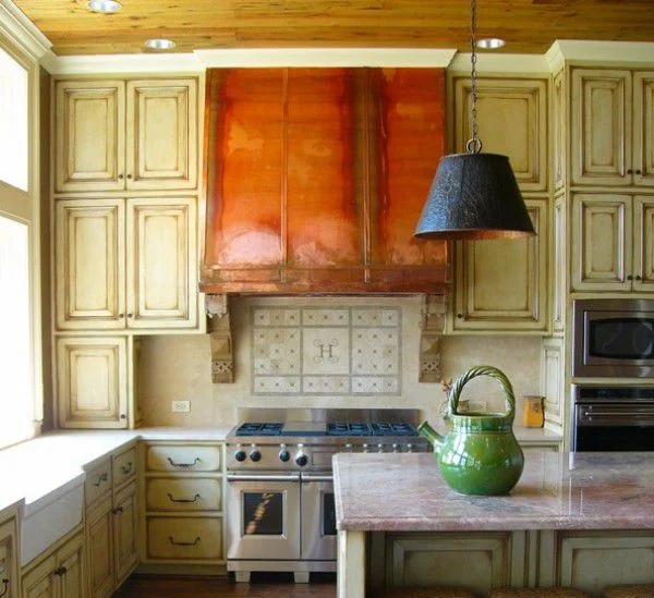
In the image above, the hood is simple in form, but the copper makes a strong statement and the weathered finish underscores the rustic feel of the kitchen. This is such a warm, comfortable kitchen!

hood7.jpg

I could not love this hood or this entire kitchen from Design Manifest more! The shape of the hood reminds me of a pagoda, and the brass band around the bottom is a little unexpected. I love how a classic material like brass feels so modern in this application.

Planning a kitchen renovation? I say forego the conventional microwave /fan combo and upgrade to a custom hood - and have some fun with it. Whether it's with shape, scale, materials used or a combination of these options, a great looking hood will add interest and personality to your kitchen.

The Green Room Interiors provides Interior Decorating Services in the Chattanooga, TN area. If you'd like some assistance with the design of your interiors, call Kim Lemmon at 423.653.3186 or email thegreenroominteriors@gmail.com.

5 Easy Ways To Mix Up The Look Of Your Dining Room

It used to be that people bought "suites" of furniture. If you were shopping for, say, dining room furniture, you would go to the furniture store and choose a dining room suite that included the table, the chairs, the china cabinet, and the buffet. (sigh).

dining suite.jpg

Garanimals for furniture. In theory, I can see why this is attractive to a lot of people. It eliminates the anxiety that comes with making thoughtful decisions for each design element, and it eliminates the fear of getting it "wrong".

But at what cost? Where's the personality? Where's the joy?

Are you struggling with mixing furniture styles? It's okay, we're going to break it down in baby steps! If you're in the matching furniture rut, here are a few things you can do to change up your look and add a little pizzazz.

1. Paint those chairs! It will brighten and refresh the entire room. Can you imagine how different the room below would feel if the chairs were the same brown wood as the table?

dining chairs.jpg

Add a pair of upholstered or slipcovered host chairs. If your chairs are all wood, this is a great opportunity to add some texture in a room that normally doesn't have much. Bonus: Upholstered chairs create a feeling of luxury, too!

dining chairs 2.jpg

Swap out a few of your dining chairs for a bench. This will lend a more casual feel to your dining room.

bench.jpg

4. Add an small upholstered sofa or settee. Talk about luxury - and comfort! This move alone could transform your dining room from a once a year meal destination to a frequently used, multi-purpose space.

dining settee.jpg

5. Replace a few of your dining room chairs with chairs in a completely different style. Next, sit back and enjoy your new role as trendsetter.

dining chairs3.jpg

But you don't have to stop at one of these changes. You can incorporate a few or all of my suggestions. The payoff will be big!

dining room.jpg
dining room2.jpg
dining room3.jpg
dining room4.jpg

See? Mixed trumps matched. Every time.

Design Trends 2016

Really? Just when we added all of that brass, tiled everything with white subway tile, and painted everything gray (or white) a new year comes along with new Design Trends?

Don't worry. The world of Interior Design doesn't change all that quickly - and even if there are some new things on the horizon you should really stick with whatever makes your little design heart sing. And if you simply MUST have some of the latest and greatest, it's usually pretty easy to work some trendy accents in with whatever you've currently got going on.

So first we'll talk about color. Pantone has revealed it's color forecast for 2016 and it's this ridiculousness:

trend.png

Mmmmmmkay... Rose Quartz and Serenity. Shades of Donna Mills circa 1983.

trend2.jpg

No doubt this combo will go over about as well as last year's Marsala.

Benjamin Moore, on the other hand, announced that their color of the year is Simply White. I think Simply White is appropriate since white walls and white everything are still enjoying tremendous popularity.

So what else?

The trend I'm most excited about is the re-emergence of plaids and tartans. And that's not really anything "new". Design trends are mostly recirculated/reinvented trends of the past. We wait until everyone's nearly forgotten about them and reintroduce them so they feel new again. Pretty clever!

trend3.jpg

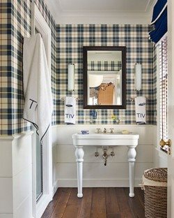
Tartan is as old as the hills but you have to admit that it feels pretty fresh in this little powder room.

trend4.jpg

Welcome to my dream home office. Note the plaid roman shades. WAIT - is that Serenity in here? It sure looks like it. And while it looks great in this space, I would probably NOT combine it with Rose Quartz in the same room, unless you're going for a Knots Landing Revisited look.

Another trend - although you can't really say it's a "trend" - is less junky painted furniture and more antiques.

Bring it.

trend5.png

No one does this whole Modern with Antiques look as masterfully as Ashley Goforth.

Finally, I think the use of raw and natural materials will continue to grow in popularity. No doubt a lot of this popularity can be attributed to Lauren Liess.

trend6.jpg

She has a talent for making raw, humble materials look modern and cutting edge instead of drab and frumpy- and that's not an easy thing to do.

trend7.jpg

See what I mean? I think she's single-handedly going to bring back 1970's chic - only way more chic than it ever was in the 1970's.

And so that completes my observations on Design Trends for 2016. Feel free to take it or leave it. If any of these trends speaks to your soul - I say embrace it! If it all leaves you feeling uninspired, then for heaven's sake, pass it up and stick with the things you love! Your home should be filled with things that lift your spirit, not a meaningless collection of trends.

Happy 2016!

The Undecorated Room - It's A Thing And Harder To Achieve Than You Might Think!

How's that for a blog post with a long name?

Today I want to take a closer look at rooms in an "undecorated" style that I find so appealing. It's harder to successfully pull one of these spaces together than you might think, because traditionally there is some sort of jumping off point for a room's design that dictates the all of the remaining selections.

decor.jpg

The image above comes from Thibaut, and everything in this bedroom is perfectly coordinated. The floral print on the settee is the jumping off point for the entire room. The colors of the wallpaper, the trim on the drapes, the lamp and the pillows are all found in the floral fabric. This room is looks very decorated - perhaps a little too perfect!

By contrast, the "undecorated" room is a space where coordinating colors and furniture styles are not the highest priority. Instead, it's about bringing the unrelated pieces together as a whole - where comfort and mood trump everything else.

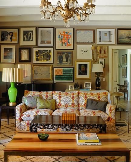
Below is one of my favorite living rooms of all time. It's Kristen Buckingham's living room, and it's perfectly undecorated.

decor2.jpg

What makes it so hard to break this down is that there is no particular style, color palette, or common thread that unites these pieces. And somehow it all works.

The two rooms below are by Ben Pentreath.

decor3.jpg
decor4.jpg

Again, there's no obvious color palette that was adhered to, no period or particular style of furniture that can pinpointed - just collections of unrelated elements that speak to each other.

The undecorated room is more about the feeling it evokes. Nothing is too precious, and it wouldn't matter if something was moved from it's original location in the room. Each piece brings something special to the room's design, and it's ultimately about how the unique pieces come together as a whole. Undecorated rooms feel timeless because they usually incorporate a broad range of furniture styles and a fluid color palette, so there's no pinpointing exactly when the room was created.

decor5.jpg

Want to try this at home? My advice would be to start small - maybe work in a few pillows that broaden your current color palette. Keep the big picture in mind (as in don't get too obsessed with finding the exact shade of green to match the leaves on your curtain fabric). And mix in a few timeworn accessories - old books, a vintage footstool, a framed piece of art or an antique occasional table.

If you're in the Chattanooga and feeling overwhelmed with decorating your home, give Kim a call at 423.653.3186. I can cut through the all confusion and create a home you'll be thrilled to come home to!

The Wish List - Floor Length Tablecloth

I can't believe it but Thanksgiving is just a few short weeks away! I love Thanksgiving. It's my favorite holiday because it's just about spending time with family, sharing a great meal together, and reflecting on all of the blessings we have in our lives. What could be better?

Hmmmmm....since you asked, what could be better for me is a Thanksgiving table with a floor length tablecloth. There's something so luxurious about a beautiful floor length tablecloth and someday I hope to have one for myself!

tablecloth.jpg

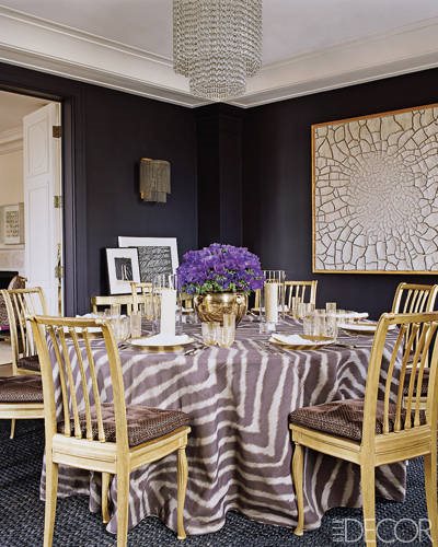
This image of Aerin Lauder's dining room that appeared in Elle Decor a few years ago sealed it for me. I especially love a big round table with a floor length tablecloth. The entire space is just magical.

tablecloth2.jpg
tablecloth3.jpg

Admittedly that rich shade of purple isn't for everyone (that took courage!) but the entire setting is even more luxe and cozy thanks to the floor length tablecloth. Also note the classic details like the bullion fringe at the bottom of the banquette and the tape trim on the tablecloth.

tablecloth4.jpg

Meg Braff's dining room above as seen in House Beautiful features a vibrant yellow floor length tablecloth. I have loved this dining room for years.

Tablecloths can be simple:

tablecloth5.jpg

vibrant:

tablecloth6.jpg

or not a tablecloth at all!

tablecloth7.jpg

Which leads me to another item on my wishlist.

Bookcases in the dining room. Don't get me started. We'll save that topic for another time.

Are you ready for turkey day at your house?

The Green Room Interiors provides residential decorating services in the Chattanooga, TN area. If you need some assistance with the design of your home, contact Kim at 423.653.3186.

A Good Alternative To Fiddle Leaf Figs

There is simply no denying the beauty and drama that a big, healthy fiddle leaf fig brings to a space.

fig.jpg

What's not to love? They're sculptural, and they bring a little bit of nature in. Side note: that rug (!!!)

fig2.jpg

The big leathery leaves are textural and so beautiful!

The bad news is that I hear they're hard to keep alive. I haven't tried one myself, but I've heard the sad stories and witnessed the struggle in keeping them looking healthy and bright.

So if you haven't yet met, allow me to introduce you to the Bird of Paradise.

fig3.jpg

Big, leathery leaves? Check

fig4.jpg

Strong, sculptural form? Check

fig5.jpg

Mother Nature on the inside? Check!

And they're easy to find. I've seen them in the Wal Mart garden center and they were very reasonably priced.

Think you want to give it a go?

Here are care instructions.

1. Place your plant in a sunny location. They need 5-6 hours of sunlight a day.

2. Although they stay green year-round, Birds of Paradise experience a dormant period where growth will be slower.

3. Birds of Paradise are tropical, so during the warmer months they will enjoy a daily misting of water. (Mist once weekly during cooler months.) The same is true for their watering schedules. During the warm growing season, they require more water than when dormant. While dormant only water when the soil is dry.

4. Fertilize bi weekly during the growing season and just once monthly while dormant.

And here's a little bonus. If you keep your Bird of Paradise happy, it might even reward you with some blooms!

fig6.jpg

Happy indoor gardening!

Chattanooga people - if you need some help creating your personal oasis at home, give me a call at 423.653.3186 or email thegreenroominteriors@gmail.com