Here's Why I Think Chinoiserie is Timeless 2.0

Here is a blog post I wrote 4 years ago about the timelessness of Chinoiserie design elements. My feelings on the subject haven’t changed a bit, so I thought I would share it again today.

No doubt you've noticed the resurgence in popularity for all things Chinoiserie over the past few years, probably (sadly) to the point of oversaturation.  I remain undeterred.  I've loved Chinoiserie design elements for decades (seriously) and even though I'm disheartened to see it become so mainstream, I'm not ready to jump ship yet .

Here's why I think Chinoiserie has staying power.

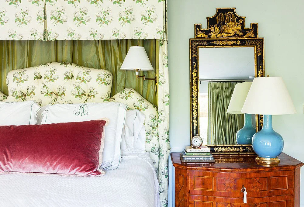
1.  Chinoiserie prints are nature inspired.


chinoiserie bedroom.jpg


Mother Nature has always been and always will be the greatest source of design inspiration.  Period. So it stands to reason that if we continue to look to nature for design inspiration, then Chinoiserie prints and wallpapers will always be relevant.


chinoiserie dining room black and white.jpeg

2. Chinoiserie is Whimsical


chinoiserie cabinet.jpg

And couldn’t we all use a little humor in our lives?

Can you even look at this without smiling?

Can you even look at this without smiling?

3. Chinoiserie plays well with others. (design styles)

chinoiserie modern.jpg

Here (above) Chinoiserie blends perfectly with the modern console and lighting.

And below, Chinoiserie will always work perfectly with Classic furnishings and antiques!

chinoiserie traditional okl.jpg

Chinoiserie mixed with Louis chairs below - and put together in a most modern way.


chinoiserie and french.jpg

4. Chinoiserie is bold.

Pagoda bed is not for the faint of heart!

Pagoda bed is not for the faint of heart!

The legendary Alex Papachristidis throws caution to the wind with an exuberant textile mix that is accented with whimsical Chinoiserie design elements.

The legendary Alex Papachristidis throws caution to the wind with an exuberant textile mix that is accented with whimsical Chinoiserie design elements.

5. Chinoiserie is timeless. We have been charmed by Chinoiserie for centuries and will continue to be for centuries to come.

The bedroom belong belonged to Oscar de la Renta in 1983.

chinoiser oscar dlr 83.jpg

Excuse the poor image quality below, but this Billy Baldwin room done sometime in the 1970’s demonstrates Chinoiserie’s staying power!

chinoiserie billy baldwin.jpg

I rest my case!

If you’re in the Chattanooga and would like to live in timeless comfort and beauty, give Kim a call at 423.653.3186 . I’d love to hear about your project!


Interior Design Trends for 2019 and What It Means to You

Well, it’s that time of year again where design trends for the new year are being revealed by major media outlets. I always find their predictions so interesting - and to be taken with a grain of salt. After all, who are they to tell us how to live in our homes? I do have some thoughts on said trends and I’ll share those with you today.

  1. Terrazzo is predicted to make a strong comeback, which makes you wonder if there really is anything new under the sun. Terrazzo enjoyed tremendous popularity in the midcentury era because of it’s low cost and low maintenance qualities. It’s also an attractive material because the color and pattern are easily manipulated to create different looks.

terrazzo countertops.jpg

Here terrazzo is used as a counter top in a contemporary setting, but the confetti look of it will show up in smaller home decor items, wallcoverings, and fabric.

Terrazzo rug from Burke Decor.I don’t currently see myself embracing the Terrazzo trend in a big way, but maybe it will grown on me.2. Curvy Furniture - Perhaps it’s a deliberate counterpoint to all of the angular, modern furniture that’s been domin…

Terrazzo rug from Burke Decor.

I don’t currently see myself embracing the Terrazzo trend in a big way, but maybe it will grown on me.

2. Curvy Furniture - Perhaps it’s a deliberate counterpoint to all of the angular, modern furniture that’s been dominating interiors over the past several years, but furniture with curves is expected to be popular in 2019.

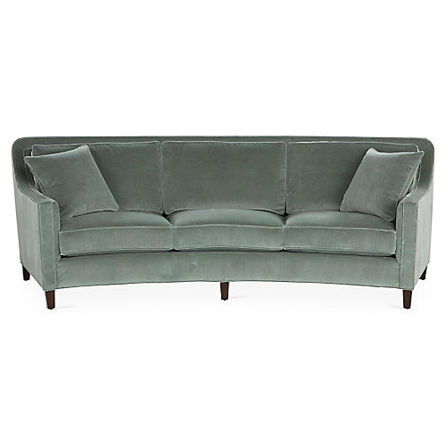
Didn’t realize we were setting trends at the time, but we just ordered this Cayman sofa from Miles Talbott for a client a few weeks ago. She saw this sofa on the sales floor of a local furniture store and absolutely fell in love with it, rejecting a…

Didn’t realize we were setting trends at the time, but we just ordered this Cayman sofa from Miles Talbott for a client a few weeks ago. She saw this sofa on the sales floor of a local furniture store and absolutely fell in love with it, rejecting all other options we had considered. Because she had such a strong reaction, I wholeheartedly supported her decision, whether it was “on trend for 2019” or not.

A word of caution - sofas that curve have a larger footprint than a standard sofa. Make sure you read the furniture specs carefully to ensure you have the depth that a curved sofa requires!
3. COLOR! Well now, here’s a trend that makes me happy! And I think we’re talking more than just “pops” of color on neutral backdrops. Ugh. Enough of that look please!!! The pallor of beiges and grays are being replaced with layers of beautiful, vibrant color.

Can you tell I’m on board with this one? Color is everything in a room! It can create mood like nothing else!

Here a calming blue was used in combination with earthy rust accents to create a comfortable master retreat for some wonderful clients in Chattanooga.

Here a calming blue was used in combination with earthy rust accents to create a comfortable master retreat for some wonderful clients in Chattanooga.

Dartmouth St 785_Web_11.jpg
In this Showhouse room by Atlanta’s Gordon Dunning, green is used to create a sophisticated, nature inspired retreat.

In this Showhouse room by Atlanta’s Gordon Dunning, green is used to create a sophisticated, nature inspired retreat.

And speaking of green, look for green to challenge blue as the most favored color of 2019. Green has been my favorite color for decades and I don’t see that changing anytime soon! I’m still so enamored with these fabulous green velvet sofas seen below we used on a recent living room project in Chattanooga!

River Gorge Dr 843_Web_7.jpg

4. Kitchens - more classic, less industrial. Is this really a trend? Classic kitchens will always be stylish and in demand. The end.

This will never be wrong or “out”. A white kitchen with timeless finishes is forever stylish. Ditto on the white subway tile splash and polished nickel hardware. Kitchens are too expensive to replace to get sucked in by fleeting trends and wonky lig…

This will never be wrong or “out”. A white kitchen with timeless finishes is forever stylish. Ditto on the white subway tile splash and polished nickel hardware. Kitchens are too expensive to replace to get sucked in by fleeting trends and wonky lighting - keep it Classic for timeless appeal!

I got one more for ya.

5. Murals and Scenic Wallpaper - This trend is already off and running and shows no signs of slowing down. Here’s a sneak peek of a dining room project in Chattanooga that I’ve been working on. It’s nearing completion and this amazing mural is the star of the show. It’s a one of a kind piece created exclusively for this dining room and it ‘s beauty and timeless appeal are undeniable!

IMG_5305.jpg

So that’s my take on trends for 2019. Use what you love and it will bring you joy for years to come - regardless of what’s trending!

If you’re ready to create fresh and family friendly interiors that will stand the test of time, give Kim a call at 423.653.3186 to schedule a consultation!

The Most Timeless Print of Them All!

Floral. Ikat. Geometric. Paisley. Block Print. Plaid. Toile. There are so many wonderful prints to work with when it comes to decorating your home! I’ve found that people can be a little reluctant to incorporate prints into their homes - mostly because they’re afraid that whatever print they select will be “out” in a short period of time. I get it - decorating is expensive so we want to select design elements with real staying power!

What if I told you there was one category of print you should never fear?

It’s true and it’s a personal favorite of mine.

It’s the fresh and fabulous stripe!

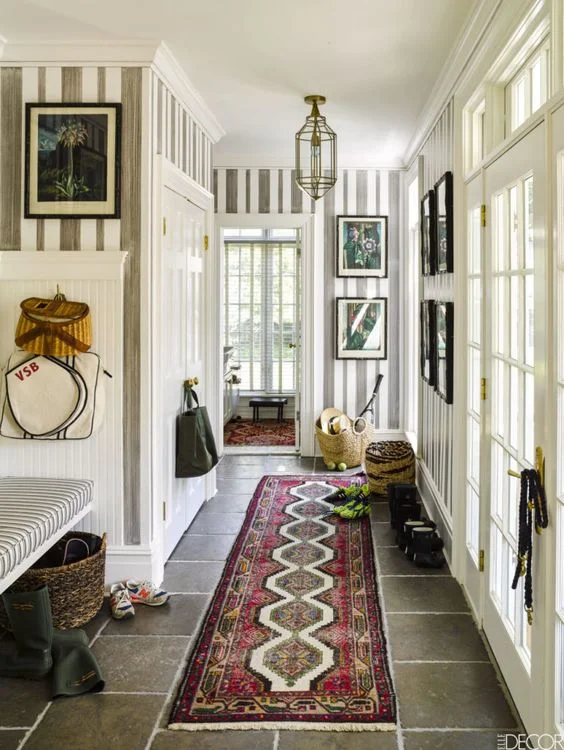
veronica beard mud room.jpg

Here are striped walls in a mud room in Veronica Beard’s weekend home as seen in Elle Decor. If I’m not mistaken, the stripes were hand painted.


stripes shelleyjohnstone.jpg

I can’t get enough of this dramatic Shelley Johnstone designed dining room. The walls are upholstered in a Schumacher stripe. It’s so chic and so pretty - and completely timeless!

But don’t think decorating with stripes is limited to wall treatments.

striped chairs.jpg

These fresh blue and white striped chairs are in the home of Nashville designer Sarah Bartholomew. Stripes just never get old!

It’s also hard (for me) to resist a striped rug.

stripes rug and sofa.jpg

Did you even know you can have more than one stripe in a room? Here Mark D. Sikes fearlessly placed a striped sofa right on top of a striped rug! I love this room!!

Love these striped roman shades (below) in Harlem based designer Sheila Bridges’ chic and colorful kitchen.

stripes sheila bridges.jpg

For the timid decorator, striped pillows are a great way to interject the fresh, timeless feel of stripes to your room, ala Suzanne Kasler (seen below).

stripes suzanne kasler.jpg

Here are a few more striped goodies to inspire. Enjoy!

striped nick olsen bedroom.jpg
stripes nick olsen.jpg
striped lamps.jpg
stripes miles redd.jpg


stripes painted floor.jpg
stripes jeffrey bilhuber.jpg

If you’re feeling overwhelmed about decorating your home, give Kim at a call at 423.653.3186 and let’s work together to create place you’ll be thrilled to come home to!


The Fifth Wall

I'm sure you've heard the expression "the fifth wall" before, but in case you haven't, we're talking about ceilings - typically the most underutilized parcel of real estate in our homes.

Have you heard?  They don't have to be painted "ceiling white".  

As a passionate professional decorator, it's pretty exciting to think about the possibilities that exist for ceiling decoration.  And they don't all have to be overly complex or dramatic.

It can be as simple as using your favorite color on the ceiling, as seen in this collected living room by Tilton Fenwick.  The pink ceiling is unexpected but really warms up the space and makes it feel intimate.


 You could even push the envelope a little further by wallpapering the ceiling, as Shelley Johnstone did below with this amazing Fornasetti malachite wallpaper.  Gorgeous! 


You could even push the envelope a little further by wallpapering the ceiling, as Shelley Johnstone did below with this amazing Fornasetti malachite wallpaper.  

Gorgeous!


wallpaper ceiling shelley johnstone.jpeg

A strong architectural statement can be created on the ceiling by combining beefy moldings over a lacquered watery blue finish.  Stunning dining room below is by Atlanta designer Suzanne Kasler.

Chattanooga interior designer painted ceiling

Finally, if you want to go all out and really create a memorable environment, consider a tented ceiling.  It's not for the faint of heart, but it's my favorite of all of the ceiling treatments!

tented ceiling bill ingram sl idea house.jpg

This room (above) was part of the Southern Living idea house a few years ago.  It was designed by architect and designer Bill Ingram, and it's unforgettably beautiful.  I love how it's a little over the top but still incorporates simple, nature inspired design elements.  Good stuff!

I hope I've inspired you to explore all of the possibilities with the fifth walls in your home!

New Year/New Colors - The 2018 Edition

In case you haven't heard what the new "IT" colors are for 2018, let me enlighten you.

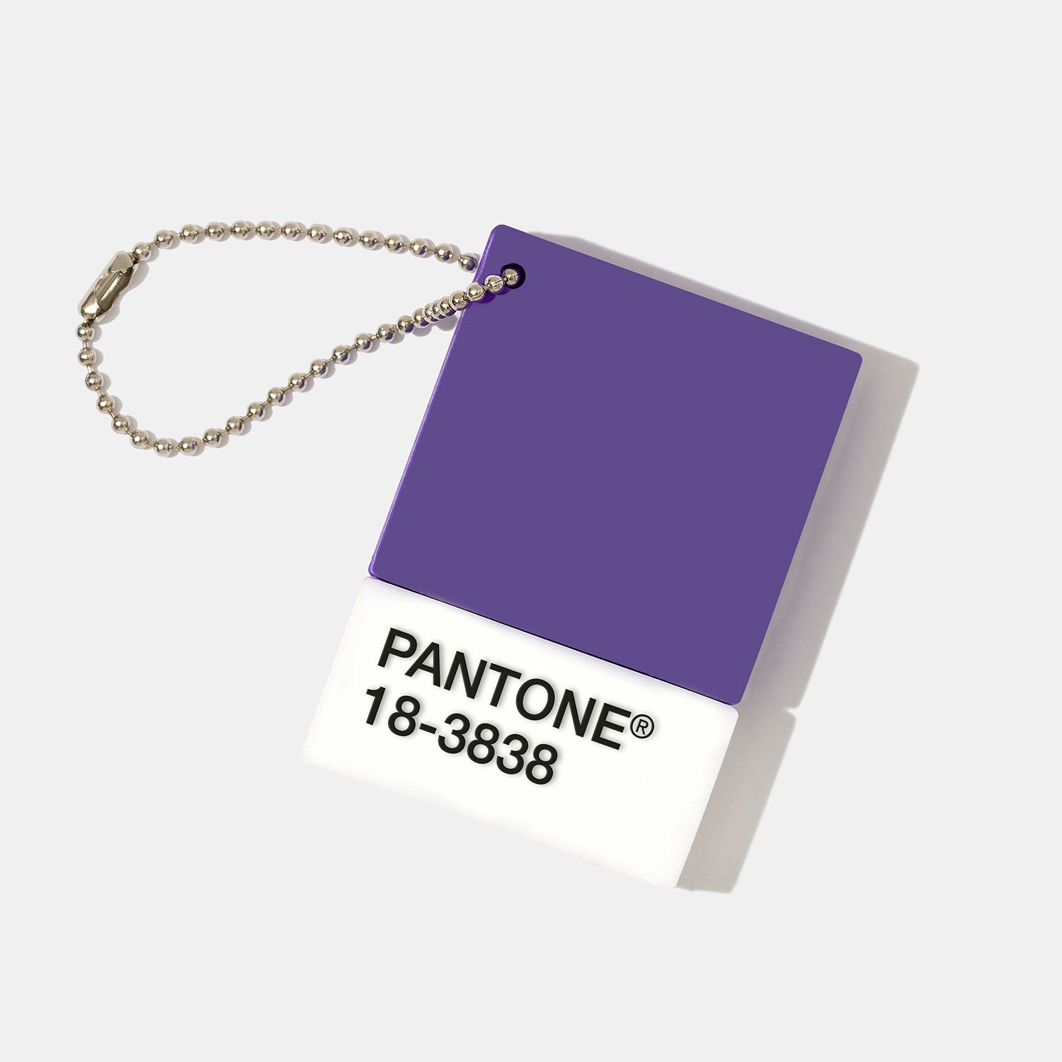
First up is Pantone's 2018 color of the year.

It's "Ultraviolet".

This shade, to be exact:

77ace110-c491-404f-bacf-9b9f02d906e1.jpg

If you ask me, it's more of a royal purple.

b579010b-c43e-47c2-9455-c4f548cb1af6.jpeg

Too much?

How about this:

edbbbab7-a99f-4e10-b381-c45fab3c5bf6.jpg

Probably better in small doses.

Benjamin Moore's Color of the Year is equally bold and saturated.

"Caliente"

28d5fa77-a750-4127-bcb6-2d0d85356c76.png
bd395553-6217-404d-824b-6220d5dd6a62.jpg

I haven't had ANY requests for red walls in years nor have I had a hankering to incorporate them anywhere, but I have to admit that this Caliente room feels about as cozy and comforting as my Dearfoams on a chilly night.

Wondering what all of this means to you?

Well, it certainly doesn't mean you should swath all of your walls in Ultraviolet and Caliente!

BUT, if you're ready to take a step away from the pallor of all of those grays that have dominated interiors over the past several years, why not consider a few touches of bold color in small but meaningful doses.

Like coating your front door in Caliente.

e304629c-e23d-4654-8589-27435b280ae3.jpg

It's such a gorgeous counterpoint to the soft white and turquoise backdrop. (PS: Note how beautiful Caliente was with the soft blue accents in the room photo above).

Caliente accents in this kitchen by Nick Olsen is en fuego. A little red goes a long way.

Whenever I see a room by Angie Hranowsky I love purple a little more. It's her signature color and she makes it work. Every. Single. Time.

a1bcbbc3-ae7b-4a3d-a01c-5b37ccf74e24.jpg

So colors of the year for 2018.

Take them or leave them.

Your house. Your call.

The Green Room Interiors is taking new clients for 2018. If you're in the Chattanooga area and ready to live in timeless beauty, call Kim at 423.653.3186 or email thegreenroominteriors@gmail.com

Why I LOVE New Traditional Interiors

Raise your hand if you think Traditional interiors are a predictable mix of Queen Anne legs and a somber color palette.

Allow me to enlighten you. (Literally!)

Walking into Ethan Allen (or any other furniture retailer) and ordering an entire "set" of living room furniture has - thankfully - become a thing of the past, and today's Traditional interiors are a little less predictable and a lot more inclusive of diverse furniture styles.

This brings with it a whole new level of casual comfort - which is just one of the reasons I love new Traditional interiors.

3a837ab8-528a-4290-9c38-b6ad80a797ab.jpg

Yes! Antiques will always have a place in Traditional interiors, but New Traditional spaces are lighter and fresher than the Traditional rooms of the past.

a0203841-247b-48b6-8b91-d53de866a1c1.jpeg

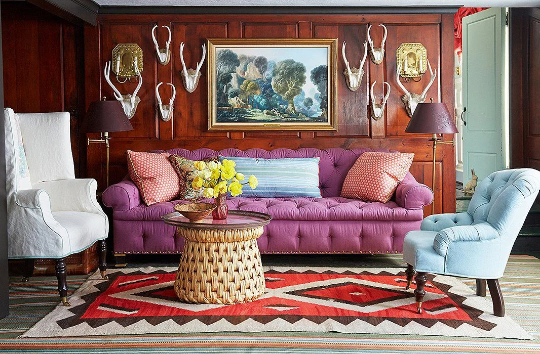
There's nothing stodgy or tired about this classic wood paneled den by Jeffrey Bilhuber. He created a youthful Traditional style by combining furniture styles (most of them quite Traditional by the way) and layering in vibrant textiles. I love this room because it has a fun, expected quality belies the classic design elements. And did you ever think you could use "Traditional" and "unexpected" in the same sentence - much less in the same room?!?

What does all of this mean to you and me?

Well, if you're investing in furnishings for your home, you can rest assured knowing that Traditional interiors have been en vogue for centuries, and this classic style of decorating will continue to stand the test of time moving forward.

Here's a perfect illustration of the timelessness of Traditional Interiors. This entryway by Nick Olsen feels comfortable, sophisticated and completely of the moment - and yet I think the same thing will be said of it 20 years from now.

114f7064-7db2-4717-9049-e2580a4fc275.jpg

Bottom line? A mix of classic pieces, antiques, and a fresh color palette just never gets old.

AND

It's the unexpected details (lacquered ceiling, modern light fixture) that keep Traditional style fresh.

27d54cda-e515-44d0-a0ce-a1eaea961d64.jpg

New Traditional - what's not to love?

If you would like to create a home that feels fresh and will stand the test of time, call Kim today to set up a consultation. 423.653.3186.

The Joy Of Moldings

There's nothing I love more than a good old fashioned decorating project - the kind where you take an existing space and create a gorgeous living environment though color, furnishings, accessories and art.

One thing that makes that job a whole lot easier and much more impactful is having a backdrop of interesting architecture.

db13e1e5-a400-45e8-b0a6-e02050bf4cd7.jpg

While subtle, this particular treatment breaks up the expansive wall area and implies attention to detail, craftsmanship and luxury. It's the most formal of the molding treatments we'll talk about today.

ccc73793-fce7-4788-8a29-6253e520c1d8.jpg

The photo above is of an entry hall we did last year. We applied moldings directly to the sheetrock and painted everything in the same white satin paint. My client favors a slight nod to coastal design, and the white walls, bleached wood, and blue accents speak to her preferred aesthetic.

More recently, we installed a wall of wainscoting as a feature in a family room - again, applied directly to the sheet rock, and then painted everything out in the same color.

55fde963-b047-434f-aa6f-ff9a09877e8b.jpg

Here is a photo I took during installation. We also added the same type of molding over the mantel.

bb1e88b4-a460-496f-b7b3-315a3f4347c1.jpg

You should also know that moldings don't have to be formal. One of my favorite wall treatments is a simple board and batten style treatment that has a casual feel to it.

Here's a bathroom renovation we completed in the spring that combines board and batten walls, a navy vanity, and aged brass and bronze hardware for a preppy cabin vibe.

43dccd63-05cd-43de-a6e2-4c56146290ea.jpg
26c467d2-05c1-4610-99bd-da3a910b644c.jpg

And while it's not technically a molding, it seems the whole world has gone crazy for shiplap walls, and I get lots of requests for this from clients.

The texture and character you get from shiplap walls is outstanding.

Excuse the poor image quality in the next few images - these are phone pictures from over a year ago.

In the dining room below, white shiplap was used on all 4 walls.

05ddc2ee-6c3d-466e-b999-c72a5d278be3.jpg
d53b6200-d5e1-4bf3-a67c-4f277431e440.jpg

On this project (photo above) we created a single accent wall in this foyer with shiplap walls.

And in this Monteagle cottage renovation, we installed whitewashed shiplap in the living room, dining room and foyer. This was perfect for a cottage in the woods!

If your carpentry skills are good, adding moldings to your walls is a cost-effective way to create interest and add architecture to your home. If you are DIY challenged, the majority of the cost of adding these types of moldings is in the labor cost for skilled finish carpentry.

I say it's worth the trouble and/or the investment. Wall moldings are a great way to add architectural interest and provide a backdrop that celebrates the details!

Call Kim today if you're ready to take your home's interiors to the next level! 423.653.3186

Graphic Floors - Trendy Or Timeless?

With the explosive popularity of cement tiles in bold patterns, you might be wondering if this look will stand the test of time, or whether it's a trend to just wait out.

The pattern of the tile above and below is called "Tulum", and it's a favorite of mine.

4b58e144-3cfd-4ded-a9ee-a74ecb7931d6.jpg

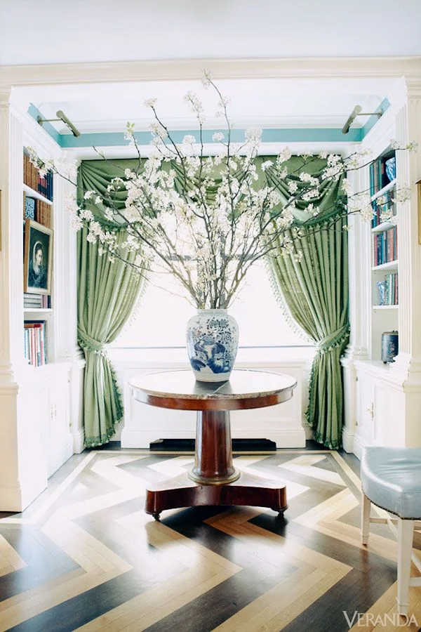
The graphic floor of this Kelly Wearstler designed foyer was achieved with different varieties of marble and is definitely the star of the show!

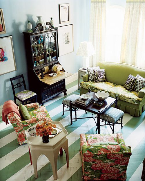
Painted floors are the most flexible way to create bold patterns, limited only by your imagination (or your skill set!)

aa962fba-4574-4b4e-a231-2a3ea15358a4.jpg

Charming kitchen above designed by Nick Olsen.

Guest room below by the brilliant Jeffrey Bilhuber.

While I don't think graphic floor patterns are necessarily trendy, I do think they are very specific, and they may be challenging to "work in" with other design elements.

Novice decorators will want to keep other design elements simplistic, allowing the graphic floor to be the main feature.

e7577722-a4af-4804-b707-2cfc2fda8639.jpg

The exception to that would be a striped floor, because stripes go with everything!

b6ba3b54-6c0c-42af-9a0c-214fc21968ad.jpg

Still worried that the graphic floor trend will pass? Check out this room (circa 197x) below by the iconic American decorator, Billy Baldwin.

45732fae-1857-49b8-99b1-c11f1807da35.jpg

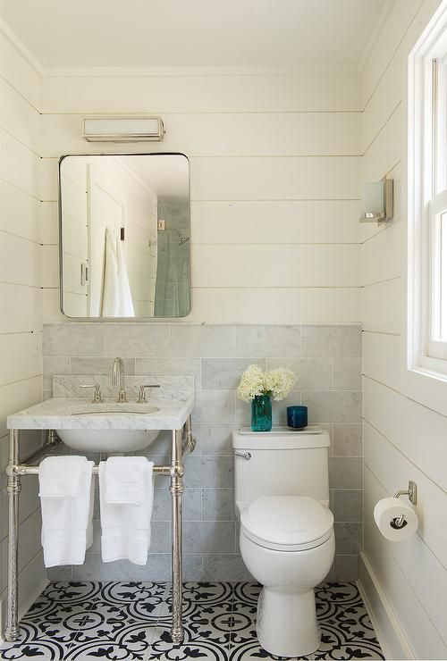
If you're considering installing a patterned floor, my best advice is to proceed with caution. Commit to a smaller area, like a powder room.

Even though you may be totally convinced that you can't live without it right now, flooring is a pretty permanent and not always inexpensive to change out if you grow tired of the look down the road.

xo Kim