How to Get the Most Out of The Designer/Client Relationship

The Green Room Interiors Family Room Design for a recent project

The Green Room Interiors Family Room Design for a recent project

I get lots of inquiries from people who have never worked with a Designer or Decorator before. I find that people can feel a little uncomfortable or intimidated when sharing their struggles with me. After all, they’re really putting themselves out there and feeling vulnerable - even a little embarrassed - by the state of their homes.

So that leads me to the topic of today’s blog post. How to get the most out of the Designer/Client relationship. Because it really is a relationship. I have to know a lot about you to begin to create a home that represents your best “self” and allows you to feel at home in your newly designed environment.

I’ll be in your home from time to time. I’ll see your home in it’s “before” state, when you’re still living with that hand me down sofa, or your husband’s bachelor pad ping pong table that’s currently standing in as your dining room table. No shame. We’ve all been there, and we’ll dig deep to find out what really excites you and exactly what your vision is for your home.

OB-dean living room.jpg


Of course the Design process is fun and exhilarating! But there are also lots of details and decisions that must be addressed along the way. It’s a process that’s like a roller coaster ride - and the more prepared you are, the more comfortable you’ll feel when those inevitable highs and lows come around.

So, if you’ve never worked with a Designer before, here are some things you might find helpful.

Dartmouth St 785_Web_3.jpg

Think first about how you want your room to function. Are you entertaining crowds regularly? Do you need a place to Home School? A quiet place to pay bills? Let’s make the space work for your needs first - once we get the functionality right, we can always make it pretty!

Pick a few adjectives that describe how you want your space to “feel” when we’re all done. Vibrant and happy? Quiet and cozy? Clean and simple? It’s really about creating a mood over picking coordinating colors (although we’ll create fabulous color palettes too!)

Stone Point Ln 1_Web_2.jpg


If you’re planning to incorporate some of your existing pieces into the new design, make those decisions before we start, and be ready to let go of the things that don’t reflect the direction you want your new space to take.

Think about a realistic investment for your space. Not everything has to be super high end, but we’ll want to invest in some good quality statement pieces. Having a budget allows me to stay in line with your expectations for the project and will save both of us time and disappointment if we’re on the same page from the very beginning. I work hard to find the very best options that suit whatever your budget allows.

Communicate how involved you wish to be. Do you want a designer to handle everything for you, or do you want to be involved in every single decision along the way? Do you need bi-weekly updates on the project, or do you just want updates on milestones as they occur? Do you want to purchase and manage delivery of your own furnishings, or do you want your designer to place orders and manage them on your behalf?

If there is a significant other decision maker, determine how conflicts will be resolved.

Gather up some images of rooms you love on Pinterest, Instagram, Houzz, and your favorite shelter magazines. You may not see a common thread, but your images will give me clues into your preferred style.

Trust me. This is a big one!! I want to get you the absolute best look I can create for you based on your style preferences and your budget. Some of things I recommend may feel a little uncomfortable for you. This is where the magic happens! Allow me to push you a little outside of your comfort zone, and trust that I have the big picture in mind. Whatever it is you were nervous about will make perfect sense on installation day.

River Gorge Dr 843_Web_1.jpg

Know that the Design process is fluid. Yes, we will create a Design Plan for your new space, but as the process moves along, be open to veering off the path a little.

Know that there can be setbacks - out of stock items, damage from shipping, and custom items all contribute to delays. Implementing your design can be frustrating at times, but keep your eye on the big picture. It’s a little like childbirth - sometimes the process is painful but when we’re done our baby will bring you more happiness than you imagined!

dining-room-design-chattanooga-dior-gray.jpg

And the most important thing is to have fun and enjoy this exciting process! A well designed room provides tremendous benefits that will be enjoyed long after your project is complete!

The Green Room Interiors is accepting new clients for late spring/summer 2019. Schedule your consultation with Kim at 423.653.3186.


When Design Styles Collide

When Design styles collide, that’s when the magic happens!

Nothing creates a more interesting, personalized and collected home like mixing Design styles. And I think that very idea intimidates most people. The thought of combining a Colonial dining table with modern chairs just comes with too much margin for error. How do you know which modern chairs will work with your classic dining table? And then what do you do about selecting a rug/light fixture/sideboard/lamps/art/mirror?

I’m not sure mixing design styles is something that can be taught. For me, mixing styles is intuitive - I “just know” what will work!

Take for instance, this Chattanooga client’s living room. We combined these ornate Rococo candle sconces from her collection with a modern drawing that we put in a clean lined glass frame. Opposites truly attract!

Take for instance, this Chattanooga client’s living room. We combined these ornate Rococo candle sconces from her collection with a modern drawing that we put in a clean lined glass frame. Opposites truly attract!

In the same room, a collection of “found” vintage pieces and contemporary works of art work perfectly over this modern sofa. Can you feel the client’s personalities here?

chattanooga-living-room-interior-design.jpg
interior-designer-chattanooga.jpg

Same client, same room - modern print curtains provide the backdrop (and fabulous tension) to the antique armchair we had reupholstered in this yummy blue velvet.

Shall we go on?

In this Chattanooga dining room, we combined traditional French Louis chairs with modern art and a contemporary light fixture. More contrast is provided between the rough texture of the bamboo shades and metallic accents on the slick white and gold …

In this Chattanooga dining room, we combined traditional French Louis chairs with modern art and a contemporary light fixture. More contrast is provided between the rough texture of the bamboo shades and metallic accents on the slick white and gold lamps. OH, and that’s a vintage carnival glass compote on the contemporary buffet!

Here’s a view into this gorgeous eclectic dining room from the kitchen. Viva the mix!

Here’s a view into this gorgeous eclectic dining room from the kitchen. Viva the mix!

dining-room-design-chattanooga-dior-gray.jpg

Here’s a recent dining room project that’s both rustic and refined. Artisan crafted table from hand-hewn planks combines with modern skirted dining chairs. Modern art and chandelier provide contrast to the antique Deco sconces and vintage Turkish rug.

This is where the magic happens!!

Yes, mixing Design styles creates memorable rooms. It also creates timeless rooms. Because so many periods and genres are represented, it’s hard to pinpoint exactly when the room was done. There’s a collected over time feel that will continue to be added to as time marches forward, and each new layer will reveal something more about the people who live there!

So what do you think? Have I convinced you that mixed trumps matched?

If you’re in the Chattanooga area and struggling with creating your own memorable interiors, call Kim at 423.653.3186 to discuss your needs!

Your Questions Answered - How Do You Work?

Would you believe me if I told you that most of the inquiries I get from potential clients have never worked with a professional designer before?

And can you guess what one of the first questions they have is? You guessed it -- "How do you work?". That's timid client speak for "How much do you charge?"

The answer to this question is not the same every single time. This is because my role is different from project to project.

757baa9a-b100-458c-9e9a-f658fb677976.jpg

Sometimes we are hired as a team to design and transform a space where construction is involved, overseeing everything from concept through demolition, construction, installation and styling. In this type of scenario there is a flat Design Fee to create a plan for the new space and then a percentage of the job to oversee the project from start to finish. This includes site visits, ordering materials, communicating with clients on progress and potential problems, coordinating and scheduling other trades that are involved, troubleshooting, and quality control oversight.

Master Bathroom Renovation in a Lookout Mountain Historic Home

Master Bathroom Renovation in a Lookout Mountain Historic Home

We recognize that your home is probably your largest investment, and we take the responsibility of your home improvement project seriously. We give it the same care and attention to detail that we would give to a project in our own home!

20c50f97-43e3-46c0-ae4f-25c4ecc9c615.jpg

At the other end of the spectrum, I offer services that are not quite as involved - such as Paint Color consultations. In this scenario, I charge a flat fee to come to your home, view your space and furnishings, and recommend paint colors that will play nicely with your existing decor and create the mood you'd like your space to convey. This type of appointment is straight-forward and at the end of our appointment you'll have clear answers to your most troubling questions. Most Design Consultations usually last about 90 minutes, and are billed via a one-time, flat fee payment that is due at the end of our consultation.

And then there's all the stuff in between. I am hired for everything from total room makeovers (my personal favorite), custom window treatments, new home construction finishes, all of the above or varying portions of the above.

Interior Decorating Project - total room makeover

Interior Decorating Project - total room makeover

So, trying to quote a design fee is a little like quoting the price of a car. In both instances, there are a number of variables that come into play and, in turn, affect the fee/price. These variables include the project scope (new pillows and curtains, or all new everything), Designer involvement (do you want me to order all of your furniture for you, do you want me to schedule and meet the painter, or do you want to handle these things yourself?), and the size and complexity of the space itself.

Here's what I can tell you. The peace of mind and enhanced quality of living you'll get in return is far greater than the Design fee, particularly if you consider that you'll be enjoying your gorgeous new space for years to come. Holidays will be more joyful, quiet evenings at home will be more nurturing, and those special times with family and friends will be even sweeter when you're surrounded in comfort and beauty!

Let's make your Chattanooga home your haven! Call Kim at 423.653.3186 today!

Chattanooga Interior Design Project - Home Office Makeover

It's been a while since I've posted anything here because I've been busy participating in an online linking event called The One Room Challenge. The premise of this event is that participants make over a room of their choice over a six week period updating their progress once a week. On the final week of the event, everyone posts photos of their completed room.

The room I decided to make over was a room in my own home - a much needed home office. A bedroom in our house became available when my oldest daughter moved out and my youngest daughter claimed her upstairs bedroom.

My biggest priority from a functionality standpoint was getting more storage. I desperately needed storage for rolls of fabric and wallpaper, samples from vendors, and a place to store materials for upcoming installations.

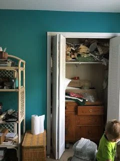
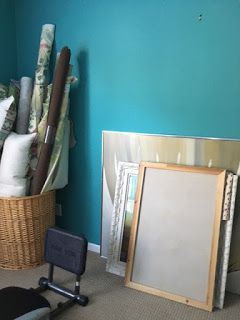
Here's a look at the space before. I wont's sugarcoat it - it's pretty bad. My intentions were good but finding the time to plan and execute the design was rather elusive.

one room before.jpg
one room before2.jpg
one room before3.jpg

Regarding space planning, I knew I wanted two workstations. One area where I could work at my computer and have easy access to client files. The second workstation needed to be a place where I could spread out materials used in the development stages of designs for my clients.

Once my needs were determined and the layout was decided that would best address those needs, it was time to focus on the aesthetics - my favorite part. Since this is an office in my own home where I will mostly be working alone or with an assistant, I felt free to really personalize the space. And that's what I did. I envisioned a space that felt fresh, feminine and full of beautiful color. The color palette I landed on was lavender and red with metallic gold accents.

one room collage.jpg

As you can see in the moodboard I created above, there are a mix of design styles - mostly traditional with a few modern accents. The paint color I used on the walls is Benjamin Moore's Touch of Gray. It's a very subtle shade of lavender that changes with the light. Somehow, this color manages to feel energetic and restful at the same time.

Want to see the finished space?

one room after.jpg

It's quite a change, isn't it? I relied heavily on vintage items - I love pieces that are a little rough around the edges and don't mind showing their age.

one room after2.jpg

To address my storage needs, I bought two metal garage shelving units from Home Depot and spray painted them with a metallic gold. The loveseat provides a nice perch for family members who want to hang out with me while I'm working. Ok, mostly it's the dog.

one room after3.jpg

In the image above, you can see how I gained more storage by removing the bifold doors from the closet and installing long shelves. It's the perfect solution for holding multiple bolts of fabric and wallpaper! Open storage below the shelves is useful for storing lamps and other accessories waiting for installation in my clients' homes. The vintage French dining table is wondeful place to lay out fabrics, trims and wallpapers as I work through the design process, particularly with the natural light from the big window.

one room after4.jpg

Here's the other workstation. My computer, printer and client files are housed here. I also had a little fun creating an inspiration board.

one room after5.jpg
one room after6.jpg

I really enjoy working with color and I find it energizes me and lifts my spirits.

one room after7.jpg

My fabric storage is seen in the background of the photo above, and a big tray on my work table keeps pencils, paint decks, notepads and supplies both tidy and close at hand.

one room after8.jpg
one room after9.jpg

The vintage elephant seen above provides a little whimsy and ups the "happy" factor. Fun touches like this can really lift your spirits!

one room after10.jpg

This little Windsor chair was my husband's chair from his grandparents house, and it now has a new purpose - holding all of my magazines and keeping inspiration within easy reach!

one room after11.jpg

If you're really paying attention you noticed the pillows on the sofa are different from the pillows in the first images. I love that my color palette gives me the flexibility to change things up like this!

one room after12.jpg
one room after13.jpg

One last note. I am a huge proponent of splurging on custom window treatments. There is simply no substitute for the beauty and sophistication of hand crafted window treatments that are made to fit your particular windows and your aesthetic. This room would not feel the same without these custom curtains. They're made of a simple cotton linen blend with velvet accents and they transformed this space into a cozy retreat. Curtains out of a bag just can't do this! (Speech over.)

I'm so thrilled with how my office turned out! It's nice to have a space that is organized, comfortable, and "me". And isn't that what it's all about?

Thanks for stopping by - and if you're in the Chattanooga area and could use some design assistance, I'd love to hear from you! Call Kim at 423.653.3186 and tell me about your interior dreams!

Junior League Showhouse Bedroom - Some Progress

Today I have a quick update on the room I'm decorating for the Junior League Showhouse here in Chattanooga.

In my last post I proclaimed that I would be true to my own aesthetic and embrace using color! Working with color is my favorite, and I love to develop interesting color palettes. I also want to stress that colorful interiors don't have to be bold or shout at you! Color is a wonderful tool that can be used to create any type of mood, and although I'm using a big dose of color, my goal is to create a bedroom that's classic and fresh and restful and quiet and pretty and sophisticated. Too many adjectives?

Here are a few rooms that demonstrate the look I'm going for.

jl inspire.jpg

I adore this bedroom by Meg Braff. I adore everything she does. It's colorful, but layering in shades of white keeps the wall color from being overwhelming. It feels vibrant and restful at the same time. The black shades add some crisp sophistication - which I love with smiley face heart eyes.

jl inspire2.jpg

Here's another dreamy bedroom that inspires me. In the bedroom above by Phoebe Howard, the strong wall and curtain color is lightened up with white bedding. Did you notice the chic black lamp shades?

So real quick, here's a before photo of my room, just to use as point of reference.

jl before.jpg

I don't know the official name of this color, but I like to refer to it as "Color least likely to be selected by me."

Here's peek at the new wall color.

jl paint.jpg

I went with "Smoke" from Benjamin Moore and I'm so pleased with it! It's a gorgeous smokey blue with green undertones. AND it's soooo much better in person than what you're seeing in my iphone photo above.

Did you notice I painted most of the trim the same color as the walls? There's a reason for that. I wanted to simplify the backdrop of the room because there are competing architectural details at play. Painting everything the same color helps to unify as well as update the space.

So not only are the walls painted, but the window treatments have been installed too! Large moments. I have to admit, two of the biggest thrills for me are 1. When the room is painted. 2. When the curtains go up.

jl curtain.jpg
jl bay window.jpg

The green taffeta curtains, although somewhat bold, are completely magical in the space! They feel so rich and luxe and I love them so!! And don't be concerned about the light fixture. It will be replaced with something far less "faux tuscan".

Finally, I'll leave you with a little glimpse of the heardboard:

jl headboard.jpg

It's custom. My awesome workroom made it up out of a textural linen blend with some pretty blue piping. The fabrics are simple but the shape is bold. And that's an approach I use over and over again. That whole opposites attract high/low, classic/modern tension that keeps things interesting.

Also - the roman (also custom made by my awesome workroom) has a Greek Key-esque motif made from scraps of the tafetta curtain fabric.

I love everything in this room SO MUCH that sometimes I go by the house and just visit with it and bask in it's goodness.

I have to leave you with these little snippets for now but trust me there is much more more to come and I'm completely head over heels with all of it.

The Junior League of Chattanooga Designer Showhouse opens to the public June 4, 2016 and will be open every weekend during the month of June.

Junior League Of Chattanooga Showhouse - "Before's" And Direction

I really should have named this post "Before's and Inner Turmoil". Think about it. I have this room to decorate and I can do absolutely anything I want with it. It's a dream! It's a nightmare! The sky's the limit (wait -the sky AND the budget are the limit!) All I have to do is pick a direction.

What's the right thing to do here? Really push the boundaries and do something completely out of my comfort zone? Show house rooms are meant to wow and inspire! Do I do something completely over the top?

These are the questions that have been keeping me up at night, and some things are still undecided. I'm having major commitment issues - and collectively decorators are the worst decision makers when it comes to their own projects. Clearly I'm not the exception to this rule!

But enough about my insecurities. You came for the pictures, so as promised, here are the "before" photos of the bedroom I'm decorating.

jl vanity bf.jpg

This is the wall directly on your right as you enter the room. Some components of this wall appear to be original, and some of it appears to have been added later in the house's life. I have decided to keep this wall as is - except maybe just changing out the hardware. I haven't settled on the hardware yet.

jl before paint.jpg

So we're basically panning around the room. This wall adjoins the previous wall of built-ins. The bed will be placed between these windows. (See, I have made some decisions).

Still panning. Bay window wall is directly opposite the wall of built-ins. High note: original hardwood floors just refinished and looking fab! They appear to be quartersawn oak.

jl bay window bf.jpg

And then there's this wall. I have restored many a historic home in my day and one thing that I've seen over and over again is that along the way, people want to "update" or put their mark on these homes. Fair enough. It's your house and we're living in the here and now.

jl before.jpg

First, I thought about removing the moldings. These's quite a bit going on here already, and not all of it is cohesive. I also considered adding more moldings to this wall. Then I considered leaving the moldings as they are, and doing some sort of fancy art arrangement. Deciding what to do with this wall has challenged me and quite possibly could be responsible for the extra 5 pounds I'm packing, but I finally decided what to do and it has been done!

As for the overall direction, for a hot second I considered doing one of those super elegant, all neutral bedrooms that are so popular right now. The bedroom below is by Susan Ferrier. Incredibly luxe, chic and understated.

jl luxe.jpg

But who am I kidding? I absolutely LOVE working with color and so I've decided not to fight the feeling. Color it is.

I'll be revealing a little more next week. Hope you'll join me!

What I'm Working On Now - Signal Mountain Bathroom Update

Today I'm sharing a Design Plan for a bathroom that we'll be starting in the next few weeks. For this project, we are handling the design of the space, as well as implementing the renovation. It's a children's/guest bathroom we'll be transforming by simply updating the finishes. The takeaway here is that if the layout of the space works and you don't need to reconfigure or expand the existing layout, you can effectively create a whole new look and feel to your bathroom on a modest budget.

Here's some background info and a few "befores". The house was built in the late 80's/early 90's and the finishes reflect that time period. Size-wise, it's a generous space, particularly since it's a guest/children's bath. The main problems we'll address are the tired finishes and the lack of adequate lighting. As I mentioned earlier, the layout works well, and there is no need to expand the bathroom's current footprint.

bath before.jpg
bath before2.jpg
bath before3.jpg

During our initial interview, my client was very clear on her vision for the new bathroom. (This is huge! It makes my job so much easier if you have a vision in mind and you have the confidence to share it!) She told me she favors classic, timeless finishes and light, neutral colors. Her career includes working within the natural world, and I got some style clues from touring her home. I noticed nature themed art - such as botanical prints and bird-themed design motifs, all set against an updated light and neutral paint color palette. My client also communicated that although this bathroom is to be primarily for her children, she wasn't after anything "kiddish".

There's one more piece to our puzzle. Once this bathroom renovation is complete, we'll move on the renovation of the master bathroom. She and her husband discussed budget before I met with them and had pre-determined the level of investment they wished to make in both spaces. Again, this is HUGE! It makes my job so much easier if I know up front what I have to work with, because I can gear the selections to fit the budget.

Functionally, the biggest change to be made is that the tub/shower combination will be removed and a large, walk-in shower will replace it (same size, same location - no plumbing to be added or relocated) Normally I don't recommend removing a tub from a guest bathroom for resale purposes, but after much thought, my clients decided it would fit their family's needs best to remove the tub. And that's good enough for me. It's my job to guide rather than dictate, and so the tub will be removed and a large shower will go in its place. We'll also be adding an overhead light fixture, adding a shower light/fan combo, and reconfiguring the lighting on the vanity wall.

Keeping my client's wishes in mind, here are my selections for this bathroom makeover:

new bath collage.jpg

I decided to run with a classic meets nature vibe. The flooring is a charcoal-colored porcelain that mimics (and quite well) the look of a natural slate. It even has a bit of glitter embedded in the design, giving it a real natural stone feel. The dark color and matte finish should make it very forgiving, and it will provide a bit of contrast to the lighter finishes. My client's favorite selection is the pebble flooring we'll use on the shower floor. It has creams, grays, and mushroom tones, which tie in perfectly to the double vanity in a weathered oak finish. I love the warmth the wood vanity brings to this space!

We also opted for polished chrome fixtures - which are timeless and never go out of style. The walls will be painted out in Benjamin Moore's Balboa Mist, a balanced true light gray that doesn't skew beige or blue.

Too add a touch of whimsy and to bring in another nod to the natural world, we'll do a simple tailored roman shade for the window in this fabric:

fabric bath.jpg

Finally, a simple white shower curtain will continue the feeling of clean, classic simplicity that my client envisions.

I'm happy to report my client has enthusiastically approved the Design, and we'll begin to transform this bathroom over the next few weeks. Check for updates and photos along the way!

The Green Room Interiors provides Interior Decorating and Design Services in Chattanooga, TN. If you'd like some help turning your house into your haven, contact Kim at 423.653.3186 or email thegreenroominteriors@gmail.com

What I'm Working On Now - New Project In Alabama

Most of the clients I work with are in the greater Chattanooga area, but a few weeks ago I got an email inquiry from a potential client that lives in a small town in Alabama - about an hour's drive from Chattanooga. My first instinct was that I probably would have to turn it down, but after a phone conversation with her I knew it was a project I very much wanted to take on. You see, during our conversation my client was so enthusiastic and excited about working with me, and the portfolio photos she saw that spoke to her the most were the ones of my own house.

green4.JPG

Naturally, photos of my own home are the truest reflection of my personal style - a classic/modern mix that is achieved by combining layers of design elements from different time periods.

green3.jpg

I'm very much drawn to the whimsy of Chinoiserie (Asian) design elements, as is my adorable client. How could I resist the opportunity to work with a perfectly lovely gal that shares a similar design style? The short answer is : I couldn't!

And so we agreed to meet. Imagine how delighted I was to see this when I pulled into the driveway:

alabama.jpg

Hello gorgeous!

And while the inside is a blank slate, it's just full of potential! We're starting in the living room, seen below.

alabama2.jpg

Another plus is that my client has really has a vision for the look and mood she wants to create in the space. Well intentioned friends have encouraged her to keep the palette light and neutral, but the heart wants what the heart wants. And her heart wants a rich, moody space with navy walls, built-in bookcases (they have a huge collection!) mid century modern accents, original art, and a little leopard.

Here's the mood board I created for her:

alabama3.jpg

And we've already made our first purchase! I spotted this Chippendale sofa while doing some local vintage shopping and it's currently getting reupholstered in a durable, neutral fabric.

alabama4.jpg

And yes, there will be leopard pillows.

I'll be excited to share our progress here on my blog (and on Instagram (thegreenroominteriors) as work moves forward.

I hope you'll check back in and watch it unfold!

If you're in the greater Chattanooga area and would like some help with the design of your home's interiors, give Kim a call at 423.653.3186 or email thegreenroominteriors@gmail.com