What Goes Into Those Design Fees? Phase 2 - Implementation

Welcome to the second installment of “What Goes Into Those Design Fees?”. It’s such a mystery, isn’t it? Today we’ll have a realistic look at Phase 2 of a Full Service Design Project, the Implementation Phase.

This is where we take the (approved by you) Design Plan we created just for you and begin the multi-layered task of making our Design Plan your new reality!

ob eftink master revised.jpg

It sounds so exciting, doesn’t it? Well, it truly is exciting, but you have to be patient because this phase takes a while. Here’ s why:

  1. Orders are placed for every piece of furniture we have selected for your room. Sounds simple enough, but since we source from a wide range of vendors, it’s a lengthy process. And all of the details for your selected pieces must be communicated to each and every vendor. In most cases, you’re looking at an 8-12 week lead time. And that’s assuming that what we selected is in stock once we place our orders.

  2. Custom soft furnishings. All of the components of your custom window treatments must be ordered. This includes fabrics, linings, trims, and hardware. Once we’ve received all materials, we’ll deliver them to our design trade only workroom where we go over all of the details of your order and they’ll be made just for you with the finest attention to detail. Allow at least 4 weeks depending on how many orders are in the queue before us.

  3. Trades - if we’re doing wallpaper, painting, changing out light fixtures, adding moldings, or anything that involves outside trades, we’ll communicate all of the details of your custom design element, order materials and get the trades scheduled to do the work. These are not jobs we hand out to just anyone. We have a tight network of trusted tradespeople who are professional and know what they’re doing. And we have ongoing working relationships with them, so we’re all on the same page and everyone is clear on the level of conduct and quality that is expected.

  4. Personal shopping - we might do a little or a lot of local shopping, depending on your particular needs and style. This could be antique mall shopping for that one of a kind vintage lamp, art gallery shopping for a unique piece of statement art, or shopping for plants and accessories for your mantel, tabletops, bookshelves and walls.

  5. Receiving and inspecting - we prefer to ship your furnishings to a local receiver who will accept delivery and inspect for damages. Truth. It happens. No one likes it, but if something arrives damaged or wrong, we personally contact the vendor and get started on a resolution. Once we inform you of our “situation”, you go about your busy life and don’t worry about it - much - because we’ll get it handled for you. Consider the alternative: You order everything yourself . They deliver it to your front porch. And leave it there. In the rain. It’s heavy. You have to get it through the door and up the stairs and unpack it. Sometimes it’s crated. You have to remove the crating yourself and clean up the packing materials yourself. Then you discover it’s damaged. Now you have to play phone tag with the vendor and jump through all the hoops to get a replacement. That they’ll leave on the front porch. In the rain.

  6. Troubleshooting. See #5.

  7. Communication - we’ll update you weekly with the status of orders, any hiccups incurred, and provide encouragement and general hand-holding.

Stone Point Ln 1_Web_1.jpg

The thing about the implementation phase is that in most cases it takes longer than expected. This is the part of the project where you’re mostly paying for stuff and waiting. It can be hard, especially if this process is all new to you and you’re looking at a new house full of empty rooms and wondering where all the furniture is.

It requires some patience and faith. But try and remember why you hired us. You wanted to curate a home that is beyond anything you could have created on your own, with a level of detail and selection that just isn’t available from Pottery Barn. And that takes time. Time for thoughtful consideration of all aspects of the project and time for the makers to make the goods exactly how we wanted them. And ship them here. Via freight. Which takes time.

Oh, and don’t forget, all of the items above, and all of the Design Planning items discussed in Phase 1 AND the Installation and Styling to be discussed in Phase 3 are covered in our all inclusive Full Service Design by the Room Fee. Yay!

Hang in there, because we’re getting to the big payoff. AKA Phase 3. Installation Day. It’s when all of our dreaming, listening, creating, planning and buying will all come together in a most magical way!!

The Role of Home - Now More Than Ever!
Hello out there!

How are you doing with your social and physical distancing? If you’re like me, the days are hard to keep track of - and if weren’t for the occasional change in weather, all of the days are pretty much the same.

Since we’re spending so much time in our homes, I’d like to talk about the importance of your home, and the role it can contribute to your state of mind and personal well being. And, promise, this isn’t going to be a “hire me” post (although if you feel inspired, please don’t hesitate to reach out :) )

I’ve said it before but it bears repeating - your surroundings have a tremendous influence on your state of mind. Creating the right mood in your home will help prepare you for whatever the day ahead throws at you. And it should be the place you look forward to coming home to! Every day!

If your work life is chaotic or stressful, you may want to create a quiet retreat that calms and soothes.

Interior Design by Phoebe Howard

Interior Design by Phoebe Howard

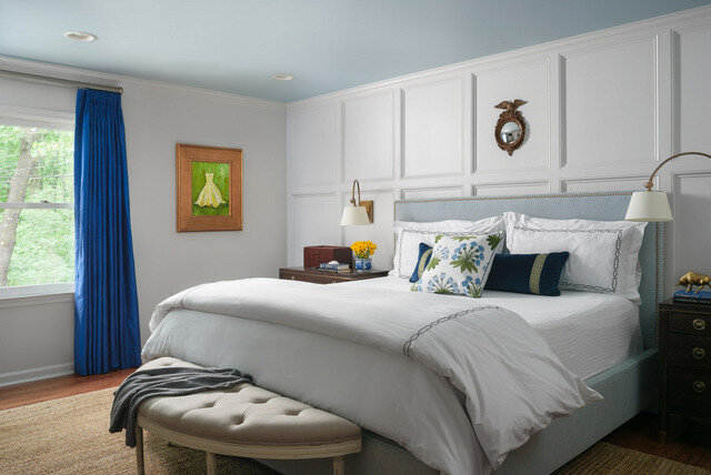
This bedroom is a stellar example of a tranquil retreat. Can you feel your blood pressure dropping?

Let’s break it down, so you can implement some of the principles that make this room successful in your own home.

  1. Color palette - to create your own restful retreat, stick with soft colors and keep your color palette limited. For my neutral lovers, this is your sweet spot! This room is mostly layered tones of beige and a few accents of dusty blue. It’s so comforting.

  2. Contrast - Every room needs some contrast, but when designing a quiet space, keep it to a minimum. The only dark accents are found in the night stand and the bedside desk. The bedside pieces don’t match, but the stain colors are very similar. Everything else is in this room is very tonal and quiet.

  3. Pattern - again, keep it to a minimum. The pattern on the damask bed pillows are the boldest pattern found in the room, but they’re kept in check because of the tone on tone color palette.

  4. Texture is your friend. Velvets, linens, floor length draperies and a tactile carpet underfoot create a soft feel and help muffle sounds.

Let’s go to the opposite end of the spectrum. Say your work life is very regimented, conservative and somber. And your bubbly personality is dying to get out. At the end of the day, you want your spirit to soar!

Interior Design by Celerie Kemble and Lindsey Herod

Interior Design by Celerie Kemble and Lindsey Herod

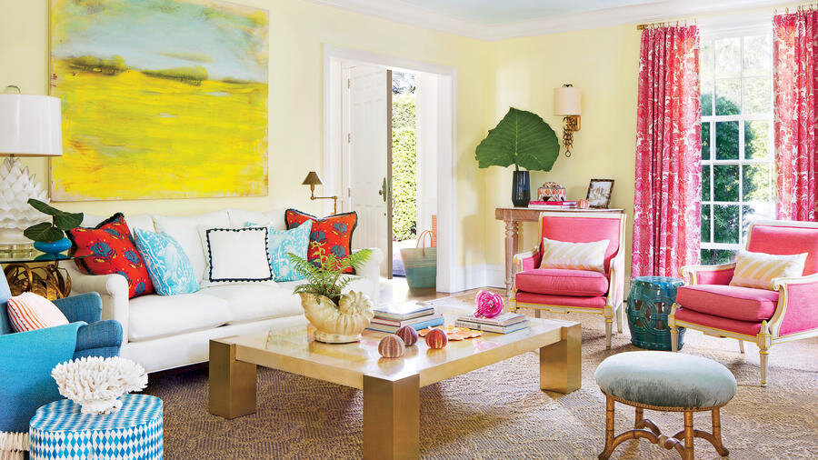
It’s hard to feel anything but happy and energized in a room like this! Shall we break it down?

  1. Color palette - happy colors create a happy mood! Notice how clean and clear the colors are. They are not grayed down or muted, but clean and crisp.

  2. Pattern - it creates movement and excitement in a room. Most people are afraid to mix patterns, but if you vary the scale of the prints you’re using and if the colors relate to other elements in the room, they will play together nicely!

  3. Texture - it may not be as important as it is in creating a restful room, but you’ll want to mix it up with a few different textures (nubby rugs, slick cocktail table, and always - plants!)

  4. Scale - a large, bold piece of art adds color, scale and importance to this fresh and fabulous room!

I hope you found these tips helpful. You can start by making small changes. Something as simple as new pillows, art, or even fresh flowers can help set you in the right direction.

If spending so much time in your home lately has made you realize that your home isn’t giving you the emotional support you need, try and see past “what is” and imagine “what can be”.

Having a home that feeds your soul crucial, now more than ever!

The Green Room Interiors is accepting new clients for early summer 2020. Let’s make the most of your home! Fill out our Contact Form and tell us about your goals for your home!

What Goes Into Those Design Fees? Phase 1 - Design Planning

decorating planning.jpg

Design Fees. They can be so confusing because there is no industry standard for designer billing. One charges hourly. One charges a percentage. One charges a Flat Fee for the project (this is my favorite because you know up front exactly what you’ll pay and can budget the fee in from the very beginning.) There can also be a combination of billing methods for different phases of your project. This means you might pay a flat fee for the Design Concept and go to hourly billing for implementation.

You also may be experiencing a bit of sticker shock after inquiring about Design Fees. Interior Design and Decoration is considered a luxury service, so one would normally to hire a professional when a certain income level is reached - much like trading up the Chevy for a Mercedes when the time is right.

Today we’ll peel back the curtain and have a look at what goes into Design Fees so you’ll feel comfortable about the whole process and what is actually happening behind the scenes.

There are three basic stages to a Full Service Design project, and each phase has a series of tasks that must be completed to keep your project moving forward as efficiently as possible.

Phase I - Design Planning

Phase 2 - Implementation

Phase 3 - Installation

Today, we’ll talk about Phase I - the Design Planning.

Successful rooms require equal parts Creativity and Planning. If you end up with a room that looks good but doesn’t function for your particular needs, your money is not well spent. On the other hand, if your room works well enough but lacks that “wow” factor, your room will fail to delight. Now add in your budget requirements and your personal preferences and we’ve got a fairly complex road to navigate!

It’s imperative to get the functionality and flow down first. We can always make it pretty once we get the space properly laid out.

So we start with measuring your room. Each wall. Each window. Each door. Ceiling height. Fireplace dimensions.

Next, we’ll need photos and measurements for any pieces you already own that you’d like to retain in the new design.

Once we have these measurements, we go about laying out the space for proper functionality.

room sketch.jpg

Once a good workable layout has been established, we begin sourcing specific furnishings for your space. Sounds like fun, right? Sure it is, but it’s also time consuming because product specifications must be researched to ensure that they’ll fit your space. And fit your personal style. And work within the budget. So yes, sometimes you have to kiss a lot of frogs before you find your prince!

tear sheet.jpg

Great - we’ve found our perfect sofa! Now we’ll just need to select things like leg style and finish (or skirt), arm style, cushion fill, whether or not we want casters, nailheads, cording and if we do want any of those things , in what finish? Oh, and we’ll need to make a fabric selection. (We’ll carefully check the specs on the fabric selection too, as we’ll need something durable and stain resistant.)

Now we’ll go through this entire process all over again for every piece of furniture for your room. Every chair. Ottomans? Cocktail and end tables.

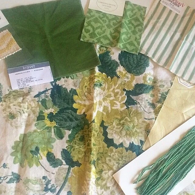
And pillows. We’ll want to go custom on a few of those. So we’ll need to research and then spec dimensions, fabrics, trims, edge finishes, and fill. But first, swatches and/or fabric memos may need to be ordered to ensure we’re going to end up with a cohesive color story.

custom pillows.jpg

Next we’ll look at window treatments. Are we doing drapes, shades, blinds or shutters? Maybe just a top treatment? Again we’ll source and edit down fabric and trim selections, window treatment styles, lining, pleat styles, drapery hardware styles and finishes. Going off of our measurements, we’ll get with our local drapery workroom to get an estimate for your window treatments that works with your budget. Again, we’ll order fabric swatches/memos before your Design Plan is presented to be sure we’ve made the best possible selection for your budget and for your style.

window treatment detail.jpg

Rinse and repeat this process for your lighting (overhead, sconces, table lamps, and floor lamps), rugs, and accessories.

While all of the above is going on, we’re developing a personalized color palette that will reflect the mood you’re trying to create in your room. So we’ll look at paint colors with our fabric selections and other design elements. And we’ll be mindful of creating a proper balance of color in your room too!

After some rethinking, trial and error, and second (third?) looks at other options, we finalize the Design Plan that was created especially for you!

Next, we’ll gather all of our materials and swatches, run the numbers, and put together a Design presentation that we will personally deliver to you so we can go over all of the fine details and answer your questions.

If you see a few items you don’t like, we provide up to 3 single item revisions at no additional cost to you!

All we’ll need is your approval and we can go on to the next phase of your project - the Implementation phase!

All of my research, creativity and planning for the Design Planning phase of the project is covered by my all inclusive Full Service Decorating by the Room flat Design Fee! The Flat Fee also covers the Implementation and Installation Phases, which we’ll go over in my next blog posts.

I hope you’ll check back to learn more about what the Implementation and then the Installation/ Styling phases of a Design project look like!

The Green Room Interiors is currently accepting new projects for Spring of 2020. Fill out our Contact form and tell us how we can best serve you!


The Design Consultation - What's It All About?

I get inquiries from people who’ve never worked with a Decorator before, and the purpose of this post is to try and take some of the mystery out of what it’s like and what to expect when working with a design professional.

I think what’s most important is to have an understanding of what your main goal is for the Consultation so you can get the most value out of our time together.

Every Consultation is different because everybody’s project is unique and not everyone needs the same level of help.

So, I might get a “Help! I just moved into this new house and I have no idea where to start!”

Exciting opportunity or completely intimidating?

Exciting opportunity or completely intimidating?

In this scenario, a Design Consultation can be helpful for off-the-cuff recommendations about where to start and getting general parameters for furniture purchases. If you’re looking for a higher level of service, the Consultation can be used to learn more about your goals and to begin the process of discovering your personal design style through an interview process.

I also get Consultation requests from people who are pretty confident with their design chops, but just want a second opinion on a few ideas they’re kicking around. In these cases, I can wholeheartedly approve and encourage them to stay the course, or I can offer up suggestions that they haven’t considered that would elevate their project to the next level. How fun is that?

Looks good to me!

Looks good to me!

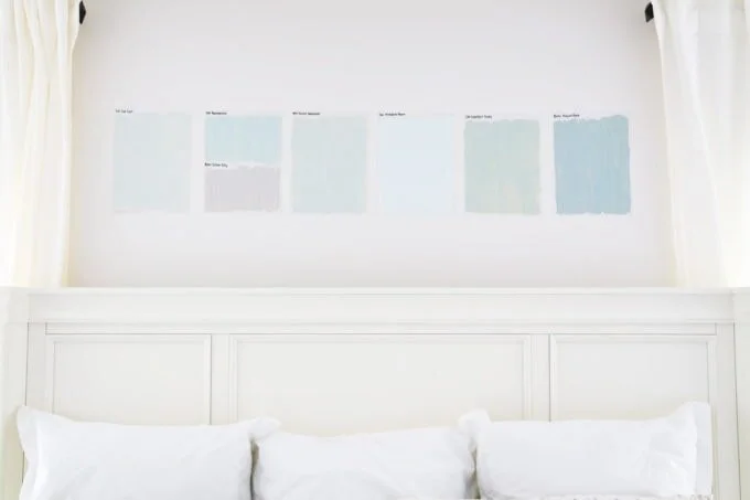
But, far and away, the most prolific struggles involve paint color selection.

paint swatch testing.jpg

The right paint color is so hard - and so important. Those pesky undertones can be tricky! And as a card carrying member of the color lover’s club, there’s nothing I love more than selecting that just-right shade of ____________ that will set the mood and bring out the very best in your furniture and art.

I have to say, we hit it out of the park with this color selection!

I have to say, we hit it out of the park with this color selection!

So, what I’m saying here is that the Design Consultation can be used in a number of different ways. My advice before booking the appointment is to give some thought to what you’d like to accomplish during our time together. Make a list of questions. Gather up any materials you’re considering, show me photos that inspire the direction you’d like to take in your space, and be open to suggestions that may be a little out of your comfort zone.

The Green Room Interiors is accepting new clients for late winter 2020. Fill out our contact page and tell me about your project!


The Other Side of "Nature Inspired"

When you think of a home that’s described as “Nature Inspired”, what do you expect to see?

I think in most cases people envision a room filled with texture, earthy browns and grays and perhaps a smattering of green.

I think the former retail shop of Lauren Liess is a good example of what most people would describe as “Nature Inspired”. Sepia colors, textural contrast and muted greens. It’s very well done!

I think the former retail shop of Lauren Liess is a good example of what most people would describe as “Nature Inspired”. Sepia colors, textural contrast and muted greens. It’s very well done!

But what about the brighter side of nature? Daffodil yellows, peony pinks and clear sky blues are also found in nature.

Here’s to the more colorful side of nature.

Here’s to the more colorful side of nature.

tropical bird.jpg
Designer Suzanne Kasler is known for her sophisticated, feminine interiors and I adore all shades of pink. The furniture is part of her Paris Apartment collection for Hickory Chair. And you know how I feel about stripes, right?

Designer Suzanne Kasler is known for her sophisticated, feminine interiors and I adore all shades of pink. The furniture is part of her Paris Apartment collection for Hickory Chair. And you know how I feel about stripes, right?

I’m loving all things yellow these days. It’s such a happy color and really makes a statement in a neutral room.

Does anyone remember this Jenny Lyons room that launched a million or so pins on Pinterest?

This room was featured in the original Domino magazine and the world fell in love with gray and yellow. There’s so much to love and to be learned from this room. It’s a masterful mix of old with new, modern with traditional, rough with refined, and …

This room was featured in the original Domino magazine and the world fell in love with gray and yellow. There’s so much to love and to be learned from this room. It’s a masterful mix of old with new, modern with traditional, rough with refined, and just a wonderful blend of design styles. And it still looks fresh!

Gorgeous bedroom from Veere Grenney Instagram. Love the yellow accents against all the white.

Gorgeous bedroom from Veere Grenney Instagram. Love the yellow accents against all the white.

This is about as bold as it gets in this Chicago living room by Summer Thornton. Primary colors can look surprisingly sophisticated, but it’s hard to achieve. I think it’s the ultra luxurious furnishings make this color palette successful.

This is about as bold as it gets in this Chicago living room by Summer Thornton. Primary colors can look surprisingly sophisticated, but it’s hard to achieve. I think it’s the ultra luxurious furnishings make this color palette successful.

Here is nature’s most perfect neutral and my personal favorite. Green. I love every shade of it. Room by Meg Braff.

Here is nature’s most perfect neutral and my personal favorite. Green. I love every shade of it. Room by Meg Braff.

This photo is Tobi Fairley’s living room a few years ago but I wanted to use it because it perfectly illustrates how well all shades of green work together in the same space.

This photo is Tobi Fairley’s living room a few years ago but I wanted to use it because it perfectly illustrates how well all shades of green work together in the same space.

sam allen.jpg

Nothing invigorates a room quite like orange. Room above by designer Same Allen. In the image below we added vibrant orange lamps to a tranquil master bedroom and I love how they read in the room!

Dartmouth St 785_Web_11.jpg

To summarize, Nature provides some amazing color inspiration that goes well beyond muddy and earthy tones.
Nature is and always will be the greatest source of inspiration for our surroundings, and that includes colors that are clean and bright!

How do you incorporate nature in your decor?

The Green Room Interiors is accepting new clients for late fall and winter 2019. Contact us to tell us how we can help you make the most of your home!

Speaking of the Holidays...

Image from Maria Killam

Image from Maria Killam

Ok you probably weren’t really speaking of the holidays - much less planning for them at this point. But if a room refresh is something you want to consider before your guests arrive, it actually IS the right time to be speaking of the Holidays.

Decorating takes time people! There’s all the measuring, the creative development (my favorite part), the planning, the ordering, and the installation.

Custom sofa? Of course it’s a great idea, but custom upholstery can take 6-12 weeks from time of order to delivery. You might have to order fabrics and trimmings before you can even place the order. And you won’t get in the manufacturer’s production queue until they receive all of your materials. Tick. Tock.

Custom velvet sofa with tape trim on the back cushions from a recent project. The gorgeous backdrop is custom gold leaf framed wallpaper panels.

Custom velvet sofa with tape trim on the back cushions from a recent project. The gorgeous backdrop is custom gold leaf framed wallpaper panels.

And how about wallpaper? If you’re considering using wallpaper somewhere (and if you are please call me!), there’s a lead time on getting the paper, prepping the walls and scheduling the installation. It is not uncommon these things to be out of stock, so you really have to plan ahead.

How gorgeous is this dining room? It’s a project from about 8 years ago that’s just as beautiful today as the day it was completed. Wouldn’t you be proud to host a holiday dinner for friends and family in a space like this? Total disclosure: the wal…

How gorgeous is this dining room? It’s a project from about 8 years ago that’s just as beautiful today as the day it was completed. Wouldn’t you be proud to host a holiday dinner for friends and family in a space like this? Total disclosure: the walls are actually hand stenciled - over several weeks’ time.

Also in this dining room a set of 10 antique chairs were sourced online. We had them lacquered in white and the seats reupholstered in a faux ostrich vinyl for chic durability. Bringing a room together is a multi-step process, so the more time you l…

Also in this dining room a set of 10 antique chairs were sourced online. We had them lacquered in white and the seats reupholstered in a faux ostrich vinyl for chic durability. Bringing a room together is a multi-step process, so the more time you leave yourself the more choices and less stress you’ll have. Just sayin.

Maybe you have a guest bathroom that’s due for an upgrade before welcoming your guests for the holidays? We can help with that!

Here’s an amazing makeover we completed a few years ago. What was once a totally 80’s bathroom is now a fresh and charming bathroom for overnight guests. We kept the original footprint of the space and changed out all of the finishes. I don’t mind s…

Here’s an amazing makeover we completed a few years ago. What was once a totally 80’s bathroom is now a fresh and charming bathroom for overnight guests. We kept the original footprint of the space and changed out all of the finishes. I don’t mind saying that the results are incredible! I do wish we had waited to take this photo until after the the door handle got changed out though. In any case, this project took 2-3 weeks to plan, another few weeks to receive materials, and about 4 weeks to implement.

A word to the wise - (that’s you) - if you have guests coming for the holidays and you’d like to wow them with your gorgeous cozy home, give me a call. Soon!

The Green Room Interiors is accepting new clients for mid fall 2019. Contact us at thegreenroominteriors@gmail.com and tell us about your project!


Where has all the Personality Gone?

I realize this post may be polarizing, but I'm going to forge ahead with it because I got somethin to say about it.

Like most of you, I use platforms such as Pinterest and Instagram to find inspiration for projects or examples of ideas I'm considering. What I'm finding  are basically the same rooms with the same design elements that are just reshuffled over and over again.  It's disheartening to see such a lack of personality in interiors these days. I find it’s getting harder to find creativity and an original point of view when it comes to decorating our homes.

Take the "Farmhouse" style that is so prevalent right now.

Oh, it's all here from the painted distressed furniture to the galvanized accents and inspirational quotes. And I'm pretty sure that's a burlap pillow on that bench.

Oh, it's all here from the painted distressed furniture to the galvanized accents and inspirational quotes. And I'm pretty sure that's a burlap pillow on that bench.

I can’t be the only one who is ready to move past all of this.

Industrial is another look that has been done to death.

Black warehouse lights? Check. Metal stool? Check. Old metal locker? Check.Just between us, I never quite got the appeal of this look . There’s nothing comforting about it.Last one - "Coastal" - seen below

Black warehouse lights? Check. Metal stool? Check. Old metal locker? Check.

Just between us, I never quite got the appeal of this look . There’s nothing comforting about it.

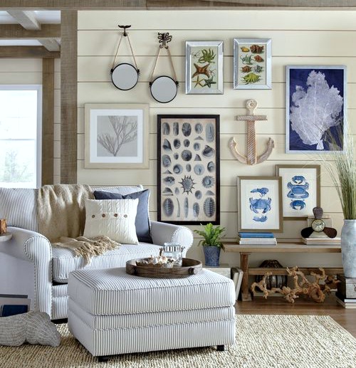
Last one - "Coastal" - seen below

coastal decor.jpg

Blue and white color palette.  Aquatic prints.  Driftwood.  An anchor.

I'm not saying it's wrong to use all of this or any of this.  It's just that these styles have become so formulaic that there's really no "design" or creative point of view that comes into play.  It's a "just add water and stir" kind of room.

For my money, I prefer to go with something that incorporates a range of design styles and furnishings that creative a bigger sum than their individual parts.

Compare the above images to this room by the legendary Bunny Williams


bunny williams collected.jpg

Most definitely not a paint by numbers approach here.  This is the difference between curating an interior and following the herd.  Just try and guess when this room was designed.  It's nearly impossible because it's layered and inclusive of different design styles.  And it’s timelessly beautiful.

mark d sikes bedroom.jpg

This is coastal done right.  Mark D Sikes kept it simple with a mix of blue and white fabrics, a natural fiber rug and clean, minimal accessories.  Do you think this room will look dated in 10 years? I say “Not a chance.” It's so very gorgeous and timeless.

What makes a room magical is it’s mood. And mood is achieved in a subtle, nuanced sort of way.

Did you see this room in Southern Living Magazine recently? This is the stuff I’m talking about. It feels relaxed yet sophisticated. It has just the right amount of color and layers of accessories. No one “formula” was used to create this space - it…

Did you see this room in Southern Living Magazine recently? This is the stuff I’m talking about. It feels relaxed yet sophisticated. It has just the right amount of color and layers of accessories. No one “formula” was used to create this space - it’s a collection of beautiful design elements from all different styles and eras that come together as a beautiful whole. Also loving the hits of texture here. #winner

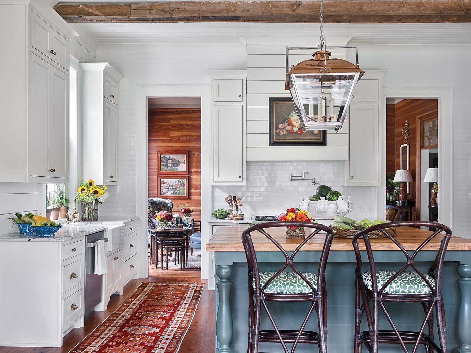
Don’t be discouraged if Farmhouse style floats your boat. It can be perfectly charming and timeless if restraint is used.

How about this kitchen as Farmhouse inspiration . There’s a little shiplap, a simple vase of sunflowers, and a framed vintage still life to suggest farmhouse style without being trite or kitschy.

How about this kitchen as Farmhouse inspiration . There’s a little shiplap, a simple vase of sunflowers, and a framed vintage still life to suggest farmhouse style without being trite or kitschy.

When it comes to designing your space, particularly if you have a theme in mind, restraint is your friend! Keep it simple and it will age beautifully!


Art in the Kitchen

Kitchens sure have come a long way over the past few decades.

What was once a strictly utilitarian area for no-frills cooking has now become command central in today’s homes. Kitchens are now living spaces that accommodate many different activities - and look beautiful while doing so.

Selecting art for the kitchen is sometimes overlooked, but I think it’s a wonderful opportunity to add some personality and color to the kitchen - after all, it’s usually the place where everyone ends up!

As you will see in the images below, you don’t have to resort to giant forks or “EAT” signs to adorn the walls of your kitchen. Original and/or collected art always adds so much to a space, and the kitchen is no exception!

Notice that each of these kitchens has a different feel, and how they have their own distinct personalities!

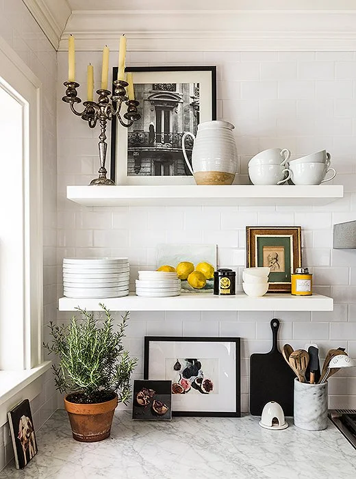
An eclectic mix of framed art was tucked into these open shelves and mixed with more utilitarian elements - including a big pot of rosemary! Image from OneKingsLane.

An eclectic mix of framed art was tucked into these open shelves and mixed with more utilitarian elements - including a big pot of rosemary! Image from OneKingsLane.

Have you seen the kitchen by Lauren Liess below? In this kitchen, the art takes center stage, creating a moody and collected vibe.

The art makes for an interesting view at the sink - which, in many cases, is normally provided by a window.

The art makes for an interesting view at the sink - which, in many cases, is normally provided by a window.

I love this quaint kitchen. . The collection of landscapes makes this space feel homey and welcoming. This kitchen exudes personality and warmth. There’s nothing slick about it!

I love this quaint kitchen. . The collection of landscapes makes this space feel homey and welcoming. This kitchen exudes personality and warmth. There’s nothing slick about it!

Oversize modern art combines with a rustic table and chairs, creating a moment of the unexpected!

Oversize modern art combines with a rustic table and chairs, creating a moment of the unexpected!

Here’s one for my color lovers (me included). The painting - which I adore - was surely the jumping off point for this unapologetically pretty kitchen. The kitchen is humble and definitely not “new” , and they certainly made the most if it!

Here’s one for my color lovers (me included). The painting - which I adore - was surely the jumping off point for this unapologetically pretty kitchen. The kitchen is humble and definitely not “new” , and they certainly made the most if it!

If order is your thing, consider adding a grid style art installation to your kitchen. Related subject matter and matching frames create order and calm in what is typically a busy space in your home.

If order is your thing, consider adding a grid style art installation to your kitchen. Related subject matter and matching frames create order and calm in what is typically a busy space in your home.

Who knew there were so many options when it comes to placing art in your kitchen? It’s a great opportunity to add some beauty in such a hard working space!

The Green Room Interiors is currently accepting new clients for early fall of 2019. If you’re ready to discover the joy of living in easy elegance, contact Kim at 423.653.3186 to schedule your consultation!