What I'm Working on Now - Lake House Living Room

Right now I’m working on a project I’m pretty excited about. It’s complete design project for a wonderful couple I’ve worked with on multiple occasions in their primary home on Signal Mountain. A few years ago they built a house on Watts Bar Lake for a weekend getaway for their active family and friends. I had the pleasure of working with them to select all of the finishes in the lake house during the construction phase, and now that the dust has settled on construction, we’re moving forward with getting the living room decorated.

Here is a list of priorities they gave me that guided our selections.

  1. Since my clients will be hosting multiple families with children, easy-care selections were imperative. After all, they didn’t want to be slaves to cleaning the upholstery nor did they want to be stressed out when kids with ice cream cones were in the house.

  2. My clients will host multiple families at the same throughout the warmer months, so they wanted to incorporate as much seating as would comfortably fit in the living room and dining areas.

  3. Since the house is surrounded by nature and gorgeous lake views, they wanted to keep the decor simple to allow the lake and the property to be the main focus.

  4. Their primary home is a brick Georgian style traditional home with very classic furnishings, and the lake house has a cottage vibe, so we decided that clean lines and natural elements would dominate the interiors. We also plan to mix in some classic design elements to give the room some longevity. #timelessovertrendy

In all projects I work on, form follows function, so I wanted to get the layout right before sourcing furniture pieces. The living room is a nice size, but not oversized, so it was important to pay attention to the scale of the furniture so we could incorporate as much seating as possible.

For the aesthetic, it’s natural/neutral with plenty of texture and high contrast.

df anz lake house textiles.jpg

Yum. Leather, wood, stone, and nubby textiles provide plenty of interest. Dark and light bring the contrast to keep the look crisp rather than frumpy. Fresh green stuff adds softness and life.

I love this direction!!!


Okay, here is our sofa selection. YES we’re going with the caramel leather!!! No, we’re not adding the nail heads. This sofa has such simple lines we decided to keep it pure and leave off the additional ornamentation.

mhirving.jpg

Proposed additional seating in the images below - all smallish in scale but comfy and so so handsome. PLUS - easy to maintain!!

This chic rocker definitely fits the direction we’re taking, no?. Natural wood finish and that fabulous woven seat and back remind me I’m in a very special place and it puts me in a very mellow frame of mind.

This chic rocker definitely fits the direction we’re taking, no?. Natural wood finish and that fabulous woven seat and back remind me I’m in a very special place and it puts me in a very mellow frame of mind.

ALSO

Leather woven occasional chairs. Easy care + comfy + so good looking!

Leather woven occasional chairs. Easy care + comfy + so good looking!

We’re going to add in some metallic finishes, baskets, greenery and place it all on a fabulous vintage persian rug.

Here’s where we hope to end up:

df anz lake house living room.jpg

Easy care finishes: Check

Seating for a crowd: Check

Simple,organic style with some contrast: Check

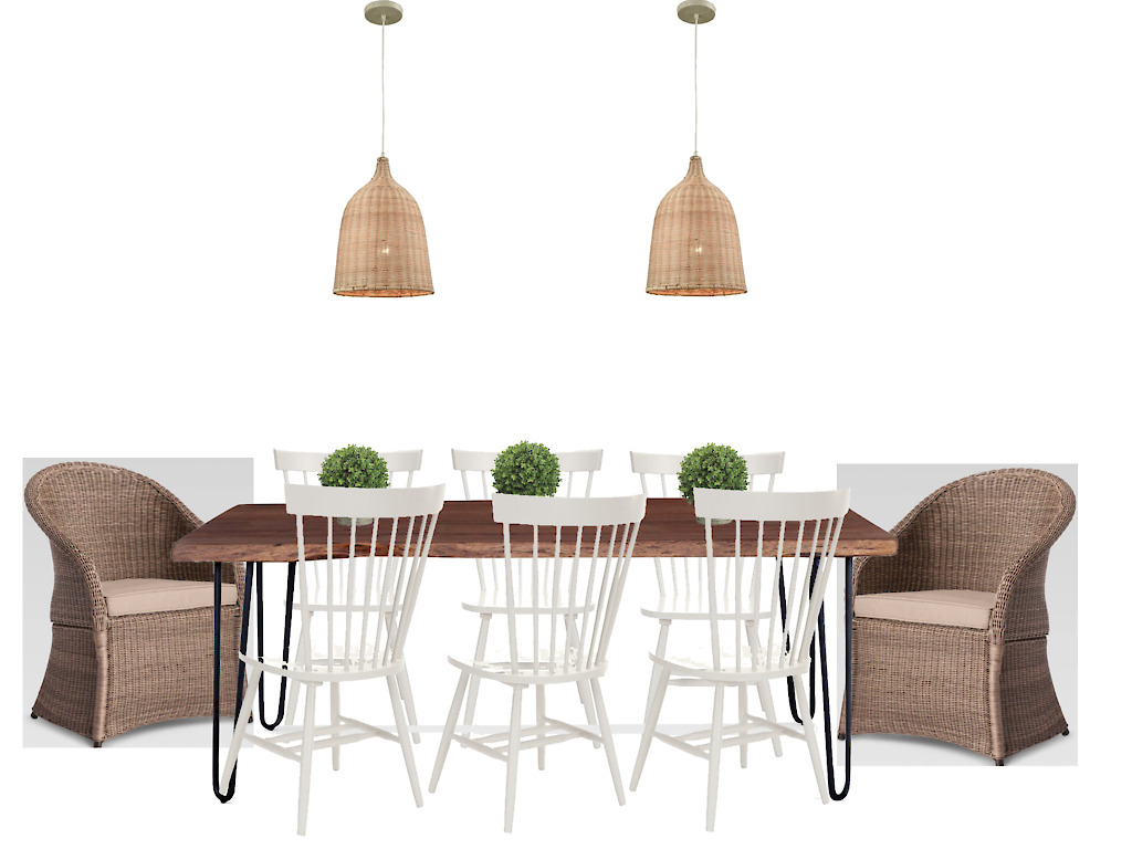
Almost forgot - the dining area of this open floor plan will tie in with the living room perfectly. They’ll share the clean lines, natural finishes, high contrast, and a touch of nature. Added bonus - the host chairs in the dining room can easily be transported to the living room and used for comfy seating as needed for super large crowds.

Do you see how important it is to plan your room’s design?

df anz lake house dining area.jpg

Currently we’re sourcing and ordering all of the pieces. Once we receive everything and I get it photographed I’ll post pictures.

Super excited to see this one come to life!

If you’re in the Chattanooga area and ready to live each day in easy elegance, call Kim at 423.653.3186 to discuss your project! We’re currently taking new projects for late summer 2019.





Five Little Tricks to Elevating Your Decor

How about today I give you some simple hacks for giving your space a more custom, expensive look without breaking the budget?

I’m going to share my five favorite tips with you that I’ve used time and time again to make any room feel a little bit “extra”.

Here goes:

Grosgrain ribbon - I can’t tell you how many times I’ve used Grosgrain ribbon to add some punch to very simple design elements.

Bonus: Grosgrain ribbon can be found at craft stores - even Walmart has it. The cost is minimal, usually about $3 per roll.

Here’s what grosgrain ribbon can do for you!

See that little green stripe on the drapes that separates the blue velvet from the white linen? Well, that’s the just a band of grosgrain ribbon in the freshest shade of green that makes those curtains extra fabulous.

See that little green stripe on the drapes that separates the blue velvet from the white linen? Well, that’s the just a band of grosgrain ribbon in the freshest shade of green that makes those curtains extra fabulous.

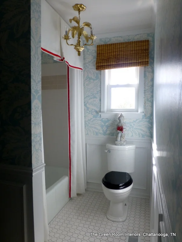
Yep, that’s more grosgrain ribbon , this time in red, to add a little extra detail and color to this custom shower curtain and valance.

Yep, that’s more grosgrain ribbon , this time in red, to add a little extra detail and color to this custom shower curtain and valance.

Here’s a plain cotton pillow that’s been accented with white ribbon trim. I love that it’s so simple in design but it stands out as a bold accent.

Here’s a plain cotton pillow that’s been accented with white ribbon trim. I love that it’s so simple in design but it stands out as a bold accent.

ribbon shade.jpg

The image above is from Pottery Barn, but there’s no reason you can’t add simple grosgrain ribbon to a plain lampshade yourself. All it takes is a roll of your favorite color grosgrain ribbon and a hot glue gun. Tip: Ribbon is easiest to apply on a drum shade. Tapered shades are a little more challenging.

And speaking of lampshades, that’s my next tip.

Update your lampshades. Lampshades are becoming important design elements unto themselves, and I’m loving the unexpected hit of color and pattern a fun shade like the one below brings to a space.

Here’s a lampshade I had custom made for a recent project. I loooove it paired with the vintage alabaster lamp. And it brings a little life to an understated corner. Side note: I cannot wait to share this project with you! Lots more to come on this …

Here’s a lampshade I had custom made for a recent project. I loooove it paired with the vintage alabaster lamp. And it brings a little life to an understated corner. Side note: I cannot wait to share this project with you! Lots more to come on this one!

Honestly - just a clean, updated lampshade will do wonders for your lamps and your room in general - and it’s an absolute must when incorporating vintage lamps! Black shades are particularly chic!

Kim L. - 526 S. Crest Road -7.jpg
Images above from a room I decorated for The Junior League of Chattanooga Showhouse a few years ago called “Young Lady’s Retreat” featuring a vintage pineapple lamp updated with a tailored black lampshade.

Images above from a room I decorated for The Junior League of Chattanooga Showhouse a few years ago called “Young Lady’s Retreat” featuring a vintage pineapple lamp updated with a tailored black lampshade.


Paint your trim the same color as your walls. I have to admit - this is a tough one for some people because trim is supposed to some shade of white, right?!?!? Wrong! It’s perfectly acceptable and so so lovely to paint out your trim in a color! Paint the walls in flat or eggshell finish and paint the trim in satin or semi-gloss (in the same color as your walls - or a shade or two darker or lighter). Not only does this method make your room look more expensive, but those baseboards will be much easier to maintain!

Stonepoint Ln 1_Web_6.jpg
River Gorge Dr 843_Web_1.jpg

Art - step away from the mass produced stuff!! If purchasing an original piece from a favorite artist is outside of your budget, you can always frame children’s art. I just did this in a client’s house and it turned out so great- even better than expected! Children’s art adds lots of color and it offers a true emotional connection to the art.

Or you could have a favorite photograph framed. A photo from a favorite vacation would be perfect - every time you see it, you would be transported that time and place again - even if just for a moment!

My absolute favorite way to source original or unique art on a budget is to visit local antique malls. You just never know what will turn up!

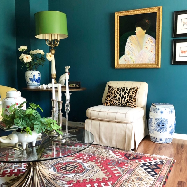
I found this fine art original portrait at a local antique mall for a song - the gorgeous custom frame included! All I had to do was decide on which wall to place it!

I found this fine art original portrait at a local antique mall for a song - the gorgeous custom frame included! All I had to do was decide on which wall to place it!

Something old. It’s no secret that I’m a big fan of recycling vintage decor. Not only does it add character, it makes your home feel more personal and collected. And isn’t interesting far better than just “coordinated”?

In my living room above, nearly everything is vintage, including some of the furniture! The beauty of this is that I’ll never walk into someone else’s home and see the same pieces.

If you’re interested in adding vintage design elements, you can start with something as small as a vase, planter, candlesticks or even vintage books. Before you know it, you’ll be addicted to the thrill of the hunt!

What do you think? Would you try any of these simple tips in your own home?

The Green Room Interiors is accepting new clients for late summer/fall of 2019. Call Kim today to set up your consultation at 423.653.3186 or email thegreenroominteriors@gmail.com


My Favorite Window Treatment Styles

This topic could go on for quite a while, because there are so many options available for window treatments in your home.

I’m going to keep it simple and just talk about my go-to window treatments that I use over and over again.

  1. Curtain panels. My all time favorite because they add softness, drama - and they’re just cozy and wonderful. They can be real statement pieces, or they can be be understated and quiet. It depends on the fabric selection and color.


In this Chattanooga master bedroom, we opted for creamy white linen panels to evoke a quiet and restful mood. Note the woven shades here. They provide light control, privacy and some fabulous texture.

In this Chattanooga master bedroom, we opted for creamy white linen panels to evoke a quiet and restful mood. Note the woven shades here. They provide light control, privacy and some fabulous texture.

Below is another room in the same home. This is the media room, and we went with a fabric in a vibrant orange print. The color selection definitely helps create a more energetic space. We used the same woven shades under layered under the panels for privacy, light control and added texture.

One thing to note here is that since the blinds provide light control and privacy, the curtain panels are strictly decorative. That said, we had them made with extra fullness to work aesthetically with the width of the triple window. Wide windows an…

One thing to note here is that since the blinds provide light control and privacy, the curtain panels are strictly decorative. That said, we had them made with extra fullness to work aesthetically with the width of the triple window. Wide windows and skimpy curtains are a no-no.

Here’s another example of curtain panels (these drapes are functional because they provide light control and privacy to the sunny back veranda). Did you notice these “windows” aren’t windows at all? They’re French doors, and the window treatments frame them so beautifully! We topped these panels with a simple, box pleated valance to create a more finished look.

interior-designer-chattanooga.jpg
chattanooga-tn-interior-design.jpg

Do you see how important fabric selection is? These curtain panels feel so fresh and modern because of the graphic black and white print . This is one of my favorite fabrics of all time, and I love how we punched it up with the orange trim.

2. Roman Shades. Oh, how I love a Roman Shade! They’re so handsome and smart looking. Not to mention super functional!

Here’s where a bold, colorful fabric could have been too much if we had used curtain panels on all of the windows. Roman shades were the perfect solution to providing light control over the existing shutters, and their tailored style keeps the bold …

Here’s where a bold, colorful fabric could have been too much if we had used curtain panels on all of the windows. Roman shades were the perfect solution to providing light control over the existing shutters, and their tailored style keeps the bold print in check. I think having a fabric window treatment in this space really helps soften the hard edges of the brick and wood, and they provide a welcome shot of color!

Here’s a sneak peek of a dining room project that’s complete but not yet professionally photographed. Simple linen roman shades with neutral trim play a supporting role to a yet to be revealed superstar design element that is just out of camera rang…

Here’s a sneak peek of a dining room project that’s complete but not yet professionally photographed. Simple linen roman shades with neutral trim play a supporting role to a yet to be revealed superstar design element that is just out of camera range in this shot. Stay tuned to see more of this gorgeous home soon!

Did you know you can combine window treatment styles in the same room? Here we used curtain panels on a traverse rod that spans the entire width of this wall of windows in combination with Roman shades on the French doors. These window treatments sh…

Did you know you can combine window treatment styles in the same room? Here we used curtain panels on a traverse rod that spans the entire width of this wall of windows in combination with Roman shades on the French doors. These window treatments share the same fabrics for continuity. I love how crisp these treatments feel.

3. Woven shades. I absolutely adore the texture and casual feel of woven shades. I’ve shown examples of them above layered under drapes, but they’re just as gorgeous on their own, and they lend an easy breezy vibe to a room.

Dartmouth St 785_Web_7.jpg

So there you have it! My 3 favorite window treatments that I incorporate time and time again. Usually I like to keep them simple and tailored but have a little fun with fabric selections and trim details.

I’d love to help you find your perfect window treatment style too! Call Kim at 423.653.3186 to set up a consultation.

How to Get the Most Out of The Designer/Client Relationship

The Green Room Interiors Family Room Design for a recent project

The Green Room Interiors Family Room Design for a recent project

I get lots of inquiries from people who have never worked with a Designer or Decorator before. I find that people can feel a little uncomfortable or intimidated when sharing their struggles with me. After all, they’re really putting themselves out there and feeling vulnerable - even a little embarrassed - by the state of their homes.

So that leads me to the topic of today’s blog post. How to get the most out of the Designer/Client relationship. Because it really is a relationship. I have to know a lot about you to begin to create a home that represents your best “self” and allows you to feel at home in your newly designed environment.

I’ll be in your home from time to time. I’ll see your home in it’s “before” state, when you’re still living with that hand me down sofa, or your husband’s bachelor pad ping pong table that’s currently standing in as your dining room table. No shame. We’ve all been there, and we’ll dig deep to find out what really excites you and exactly what your vision is for your home.

OB-dean living room.jpg


Of course the Design process is fun and exhilarating! But there are also lots of details and decisions that must be addressed along the way. It’s a process that’s like a roller coaster ride - and the more prepared you are, the more comfortable you’ll feel when those inevitable highs and lows come around.

So, if you’ve never worked with a Designer before, here are some things you might find helpful.

Dartmouth St 785_Web_3.jpg

Think first about how you want your room to function. Are you entertaining crowds regularly? Do you need a place to Home School? A quiet place to pay bills? Let’s make the space work for your needs first - once we get the functionality right, we can always make it pretty!

Pick a few adjectives that describe how you want your space to “feel” when we’re all done. Vibrant and happy? Quiet and cozy? Clean and simple? It’s really about creating a mood over picking coordinating colors (although we’ll create fabulous color palettes too!)

Stone Point Ln 1_Web_2.jpg


If you’re planning to incorporate some of your existing pieces into the new design, make those decisions before we start, and be ready to let go of the things that don’t reflect the direction you want your new space to take.

Think about a realistic investment for your space. Not everything has to be super high end, but we’ll want to invest in some good quality statement pieces. Having a budget allows me to stay in line with your expectations for the project and will save both of us time and disappointment if we’re on the same page from the very beginning. I work hard to find the very best options that suit whatever your budget allows.

Communicate how involved you wish to be. Do you want a designer to handle everything for you, or do you want to be involved in every single decision along the way? Do you need bi-weekly updates on the project, or do you just want updates on milestones as they occur? Do you want to purchase and manage delivery of your own furnishings, or do you want your designer to place orders and manage them on your behalf?

If there is a significant other decision maker, determine how conflicts will be resolved.

Gather up some images of rooms you love on Pinterest, Instagram, Houzz, and your favorite shelter magazines. You may not see a common thread, but your images will give me clues into your preferred style.

Trust me. This is a big one!! I want to get you the absolute best look I can create for you based on your style preferences and your budget. Some of things I recommend may feel a little uncomfortable for you. This is where the magic happens! Allow me to push you a little outside of your comfort zone, and trust that I have the big picture in mind. Whatever it is you were nervous about will make perfect sense on installation day.

River Gorge Dr 843_Web_1.jpg

Know that the Design process is fluid. Yes, we will create a Design Plan for your new space, but as the process moves along, be open to veering off the path a little.

Know that there can be setbacks - out of stock items, damage from shipping, and custom items all contribute to delays. Implementing your design can be frustrating at times, but keep your eye on the big picture. It’s a little like childbirth - sometimes the process is painful but when we’re done our baby will bring you more happiness than you imagined!

dining-room-design-chattanooga-dior-gray.jpg

And the most important thing is to have fun and enjoy this exciting process! A well designed room provides tremendous benefits that will be enjoyed long after your project is complete!

The Green Room Interiors is accepting new clients for late spring/summer 2019. Schedule your consultation with Kim at 423.653.3186.


Chattanooga Interior Design Project Reveal - The Upper Level

HI again!

In my last post I shared the reveal of a new home Decorating project for a wonderful family in Chattanooga. Today we’ll go upstairs and have a look at those spaces!

In case you missed it, the aesthetic for this home is light, bright, and simple. The clients’ previous home was very traditional and was decorated with an Old Word/French Country twist - which worked perfectly for that home’s architecture. However, my clients were ready to embrace a more pared down style in their new home.

At the top of the steps is a loft area. We decided to utilize that space as a media/game room.

Chattanooga interiors

A cozy sectional is perfect for lounging and watching movies, especially in an area mostly used by family. My clients love color, and the blue and orange color palette is a great counterpoint to the light and neutral wall color.

Dartmouth St 785_Web_2.jpg

My clients wanted to incorporate a game table into the loft area, and I was lucky enough to source this mid century modern game table and chairs from a trusted local antiques dealer. The chairs are fantastic quality pieces and we had them recovered in a sturdy fabric to work within our color palette.

Right off of the loft area is a bedroom that is used by my clients’ daughter when she is in town. Our selections in this bedroom were guided by her style preferences.


Dartmouth St 785_Web_4.jpg

We tucked a little workspace into this area under the eaves to make it as functional as possible. The floral print on the drapes adds some movement and interest to the room without dominating the space. I love this understated feminine print!

chattanooga decorator teen bedroom

All of the art was selected by my clients’ daughter, and she can add to this gallery wall as she collects more pieces.

The last space we’ll look it is very special. It’s a home office for the lady of the house, and I’m pretty in love with this room.

chattanooga interior design home office

This space represents everything my client wanted in her home office. It’s colorful, light hearted, a little whimsical, and eclectic. This room gets the most beautiful natural daylight and it’s a such a happy space to work in!

That rounds out the tour of this beautiful home! I hope you enjoyed seeing it as much as I enjoyed working on it!

The Green Room Interiors is accepting new clients for Spring/Summer 2019. Contact Kim at 423.653.3186 to set up a consultation.

Chattanooga Interior Design Project Reveal - Main Level

Welcome!

Today I want to share a recently completed project that I’m sure you will enjoy seeing.

How about a little background info first?

I have had the pleasure of working with these clients on their previous home, and they’re great to work with. Not only are they trusting and decisive, but (added bonus) they had a pretty clear vision of the direction they wanted this new home to take! And speaking of the new home, it’s a downsize from their previous home and it’s a gorgeous newly constructed home that they bought upon it’s completion.

All of the finishes ( paint colors, cabinets, countertops, tile, stain colors, etc) were already selected when the clients made the purchase, and they provided a wonderful light and neutral backdrop for the furnishings.

The clients’ former home had an Old World French style of architecture, and although it was a beautiful home and a good fit for them previously, they were ready to embrace a lighter, cleaner aesthetic in the new digs.

Ready to tour?

Dartmouth St 785_Web_9.jpg

Like many of today’s new homes, the main level is quite open! We decided to work with the existing paint color (a light, warm greige,) and add color through furnishings and accessories. All of the furnishings you see here are new, with the exception of the nesting table set to the right of the sofa. The clean lined legs made these tables a perfect fit for our new direction!

Although there is no dedicated foyer, we created an area to drop keys and mail by adding a small chest near the front door.

Dartmouth St 785_Web_8.jpg

And here’s the opposite side of the room. We added a little drama by painting the backs of the bookcases off-black, which provides a stronger silhouette for the items on the shelves.

Newer homes that are very open don’t offer a lot of wall space to hang art, and we loved these prints from the clients’ previous home. Our solution? We placed them on the front of their built-in bookcases. I love a little of the unexpected!

The ceilings are very high in this area, and the topiary urns act as finials to each bookcase.

Dartmouth St 785_Web_6.jpg

This is the view from the front door, looking through the living room and kitchen into the dining room. The vaulted ceiling created a great opportunity for some design drama, so we capitalized on that opportunity and swapped out the builder’s fixture for this stunning gold showstopper. Yes, it’s large, but since it’s simple in form it doesn’t feel too heavy.

The Louis dining chairs are from my clients’ previous dining room, and they work perfectly in their new home.

Dartmouth St 785_Web_7.jpg

Here’s closer look at the dining room . The table and buffet have a slightly weathered finish, which contrasts beautifully with the modern art and contemporary chandelier. The overall aesthetic is very clean and simple, which makes a perfect backdrop for family dinners and casual entertaining!

The master bedroom is also located on the main level and it came with some wonderful architectural details. My clients opted to change the paint color to a restful blue. They had used this very color in their previous home, and it’s such a lovely color we were eager to incorporate it into their new home.

This room gets some beautiful natural light. We also love the coffered ceiling, hardwood floors, and tall doors. The chairs, bedding and pillows were brought over from the clients’ previous home. Everything else was selected to work with these desig…

This room gets some beautiful natural light. We also love the coffered ceiling, hardwood floors, and tall doors. The chairs, bedding and pillows were brought over from the clients’ previous home. Everything else was selected to work with these design elements.

I think the takeaway here is that with some careful selections, you can create a feeling of calm and enjoy some color at the same time!

Dartmouth St 785_Web_11.jpg

We opted to create a fun, bohemian look on a main floor bedroom that is used by the client’s adult son when he is in town.

Dartmouth St 785_Web_12.jpg

A clean-lined low brass bed is flanked by vintage mid century modern end tables topped with smoked glass. The charcoal velvet quilt is accented with mud cloth and bohemian inspired pillows. The end result is completely appropriate for guests while pushing the envelope a little.

I hope you enjoyed touring the main level of this lovely home today. In my next blog post we’ll tour the upstairs rooms. Hope you’ll stop by again for a look!

The Green Room Interiors is accepting new clients for Spring and Summer 2019. Contact Kim today to schedule your consultation. Email thegreenroominteriors@gmail.com


When Design Styles Collide

When Design styles collide, that’s when the magic happens!

Nothing creates a more interesting, personalized and collected home like mixing Design styles. And I think that very idea intimidates most people. The thought of combining a Colonial dining table with modern chairs just comes with too much margin for error. How do you know which modern chairs will work with your classic dining table? And then what do you do about selecting a rug/light fixture/sideboard/lamps/art/mirror?

I’m not sure mixing design styles is something that can be taught. For me, mixing styles is intuitive - I “just know” what will work!

Take for instance, this Chattanooga client’s living room. We combined these ornate Rococo candle sconces from her collection with a modern drawing that we put in a clean lined glass frame. Opposites truly attract!

Take for instance, this Chattanooga client’s living room. We combined these ornate Rococo candle sconces from her collection with a modern drawing that we put in a clean lined glass frame. Opposites truly attract!

In the same room, a collection of “found” vintage pieces and contemporary works of art work perfectly over this modern sofa. Can you feel the client’s personalities here?

chattanooga-living-room-interior-design.jpg
interior-designer-chattanooga.jpg

Same client, same room - modern print curtains provide the backdrop (and fabulous tension) to the antique armchair we had reupholstered in this yummy blue velvet.

Shall we go on?

In this Chattanooga dining room, we combined traditional French Louis chairs with modern art and a contemporary light fixture. More contrast is provided between the rough texture of the bamboo shades and metallic accents on the slick white and gold …

In this Chattanooga dining room, we combined traditional French Louis chairs with modern art and a contemporary light fixture. More contrast is provided between the rough texture of the bamboo shades and metallic accents on the slick white and gold lamps. OH, and that’s a vintage carnival glass compote on the contemporary buffet!

Here’s a view into this gorgeous eclectic dining room from the kitchen. Viva the mix!

Here’s a view into this gorgeous eclectic dining room from the kitchen. Viva the mix!

dining-room-design-chattanooga-dior-gray.jpg

Here’s a recent dining room project that’s both rustic and refined. Artisan crafted table from hand-hewn planks combines with modern skirted dining chairs. Modern art and chandelier provide contrast to the antique Deco sconces and vintage Turkish rug.

This is where the magic happens!!

Yes, mixing Design styles creates memorable rooms. It also creates timeless rooms. Because so many periods and genres are represented, it’s hard to pinpoint exactly when the room was done. There’s a collected over time feel that will continue to be added to as time marches forward, and each new layer will reveal something more about the people who live there!

So what do you think? Have I convinced you that mixed trumps matched?

If you’re in the Chattanooga area and struggling with creating your own memorable interiors, call Kim at 423.653.3186 to discuss your needs!

Here's Why I Think Chinoiserie is Timeless 2.0

Here is a blog post I wrote 4 years ago about the timelessness of Chinoiserie design elements. My feelings on the subject haven’t changed a bit, so I thought I would share it again today.

No doubt you've noticed the resurgence in popularity for all things Chinoiserie over the past few years, probably (sadly) to the point of oversaturation.  I remain undeterred.  I've loved Chinoiserie design elements for decades (seriously) and even though I'm disheartened to see it become so mainstream, I'm not ready to jump ship yet .

Here's why I think Chinoiserie has staying power.

1.  Chinoiserie prints are nature inspired.


chinoiserie bedroom.jpg


Mother Nature has always been and always will be the greatest source of design inspiration.  Period. So it stands to reason that if we continue to look to nature for design inspiration, then Chinoiserie prints and wallpapers will always be relevant.


chinoiserie dining room black and white.jpeg

2. Chinoiserie is Whimsical


chinoiserie cabinet.jpg

And couldn’t we all use a little humor in our lives?

Can you even look at this without smiling?

Can you even look at this without smiling?

3. Chinoiserie plays well with others. (design styles)

chinoiserie modern.jpg

Here (above) Chinoiserie blends perfectly with the modern console and lighting.

And below, Chinoiserie will always work perfectly with Classic furnishings and antiques!

chinoiserie traditional okl.jpg

Chinoiserie mixed with Louis chairs below - and put together in a most modern way.


chinoiserie and french.jpg

4. Chinoiserie is bold.

Pagoda bed is not for the faint of heart!

Pagoda bed is not for the faint of heart!

The legendary Alex Papachristidis throws caution to the wind with an exuberant textile mix that is accented with whimsical Chinoiserie design elements.

The legendary Alex Papachristidis throws caution to the wind with an exuberant textile mix that is accented with whimsical Chinoiserie design elements.

5. Chinoiserie is timeless. We have been charmed by Chinoiserie for centuries and will continue to be for centuries to come.

The bedroom belong belonged to Oscar de la Renta in 1983.

chinoiser oscar dlr 83.jpg

Excuse the poor image quality below, but this Billy Baldwin room done sometime in the 1970’s demonstrates Chinoiserie’s staying power!

chinoiserie billy baldwin.jpg

I rest my case!

If you’re in the Chattanooga and would like to live in timeless comfort and beauty, give Kim a call at 423.653.3186 . I’d love to hear about your project!