Today I’m going to share a master bathroom makeover we completed in a 1990’s home.
First, let me share why I adore a renovation project :
It requires a little more creativity because of the limitations that are already in place. It’s a little different when designing a brand new space from scratch because in those instances the sky’s the limit. You can put pen to paper to create exactly what you want! With a renovation project, there are usually obstacles to work around as well as spatial constraints.
It’s very exciting to see what has been created from what was already there. Especially for homeowners who have looked at and lived in their less than ideal spaces for years. In most cases, clients are only able to see the space for what it is rather than what it could be. So the payoff is big and dramatic upon completion!
We get to re-use and repurpose existing items where it makes sense and that always helps the budget and makes homeowners happy! I also love the process of highlighting the best a room has to offer while downplaying the less than ideal characteristics.
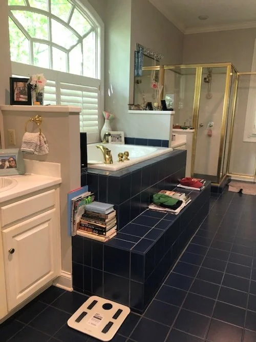
Okay, here come the “Before” photos:
As you can see, we had plenty of square footage to work with in this bathroom, but the navy tile was feeling tired and the steps up to the raised tub felt outdated and awkward.
However, that big gorgeous window is a feature we definitely wanted to highlight!
Other finishes were definitely due for a fresh new look!
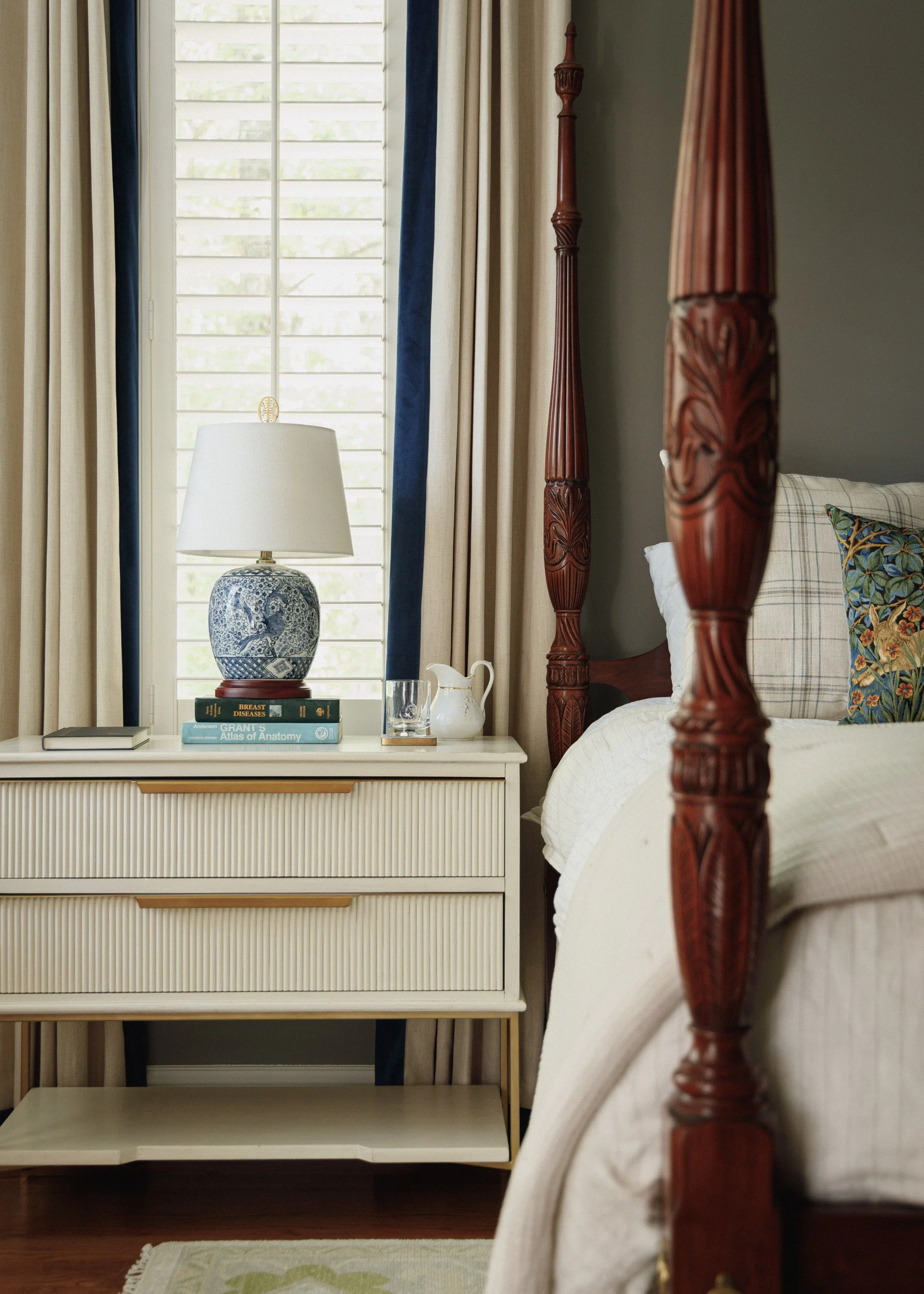
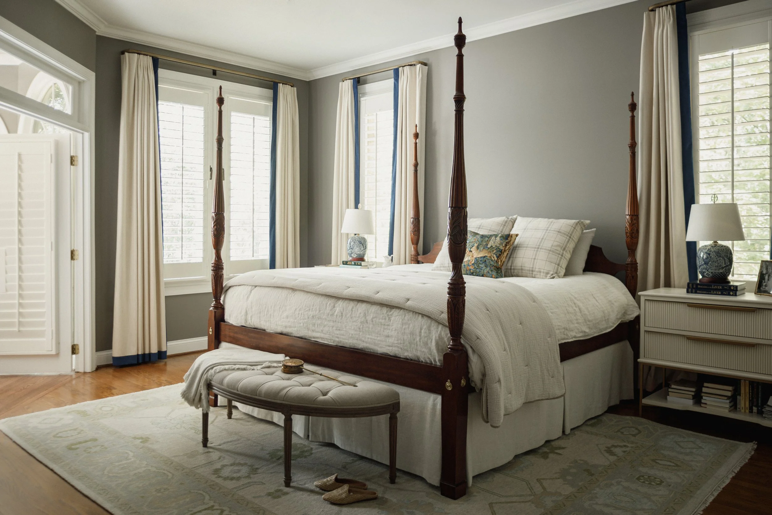
For reference, I’m adding a few shots of the completed master bedroom renovation that was part of this project. It will give you some context of how the bathroom fits within the entire master suite (we always keep the big picture in mind to ensure that all spaces within a home “Speak” the same language.)
Our clients requested a quiet and neutral space with classic and textural elements doing the heavy lifting.
So after weeks of renovation by Lindsay and our team, we turned this new and much improved bathroom over to our wonderful clients!
Hello amazing white marble, gorgeous window and timeless finishes! With a thoughtfully curated mix of textural, traditional and modern elements, we created a fresh new look for this bathroom that is completely timeless.
The softest shade of sage green found on the shower wall tiles adds a reference to the wooded surroundings of the home while feeling right at home among the neutrals.
I believe with all my heart that where there is contrast there is interest! Don’t we love the juxtaposition of the simple bleached jute rug with the gilt and marble antique bench? This is a family piece that adds a bit of luxe to this comfortable bathroom.
We are so grateful to have had the opportunity to transform the master suite for such wonderful people!
If you would like to utilize our creativity, attention to detail and experience for your home project, we’d love to hear from you! Fill our contact form or email Kim at thegreenroominteriors@gmail.com and tell us about your project!


