I have so much good to share with you over the next several posts! The Green Room Interiors was selected to design and implement a 4000 sf lake house renovation and furnishings project. The home is located on the lake just a bit north of the city of Chattanooga. Whew! And to make things even more interesting, the project was done mostly remotely. You see, the owners purchased the property as a second home they would share with grown children and their families who live in different cities in the southeast. The homeowners/clients live in the southwestern United States, so communication was done through mainly via email and text messages.
I knew this would be a good fit for us because we share a similar design aesthetic (we like color, antiques, and classic furnishings with a touch of modern to keep things fresh and “now”). They were also incredibly trusting, quick to respond to communications, and willing to take design risks from time to time.
Since we would be implementing and renovating the first spaces while designing remaining spaces, it made the most sense to start on the upper level. This approach means we wouldn’t be tracking through new completed spaces on the main level while renovating the upper level, and would allow us to run the Design Planning and Implementation concurrently.
We started with designing the upper level (there are 2 guest bedrooms and a guest bathroom. There is also a big upper level loft area with a fabulous waterfront view through tall windows. Dreamy!
Shall we start with the bathroom? Here’s the obligatory before photo:
This upper level bathroom is located in the hallway that separates the 2 guest bedrooms. In order to keep costs down, we kept all plumbing elements in their original locations and worked with the existing footprint of the bathroom, as there was no available space to capture in order to enlarge it.
Obviously, we wanted a space that felt fresher - and is there anything fresher than a crisp blue and white color scheme? Here’s the direction and selections I presented. Once the plan was approved Lindsay led our team through the renovation with the most amazing results!
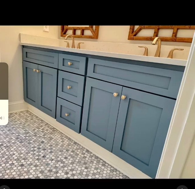
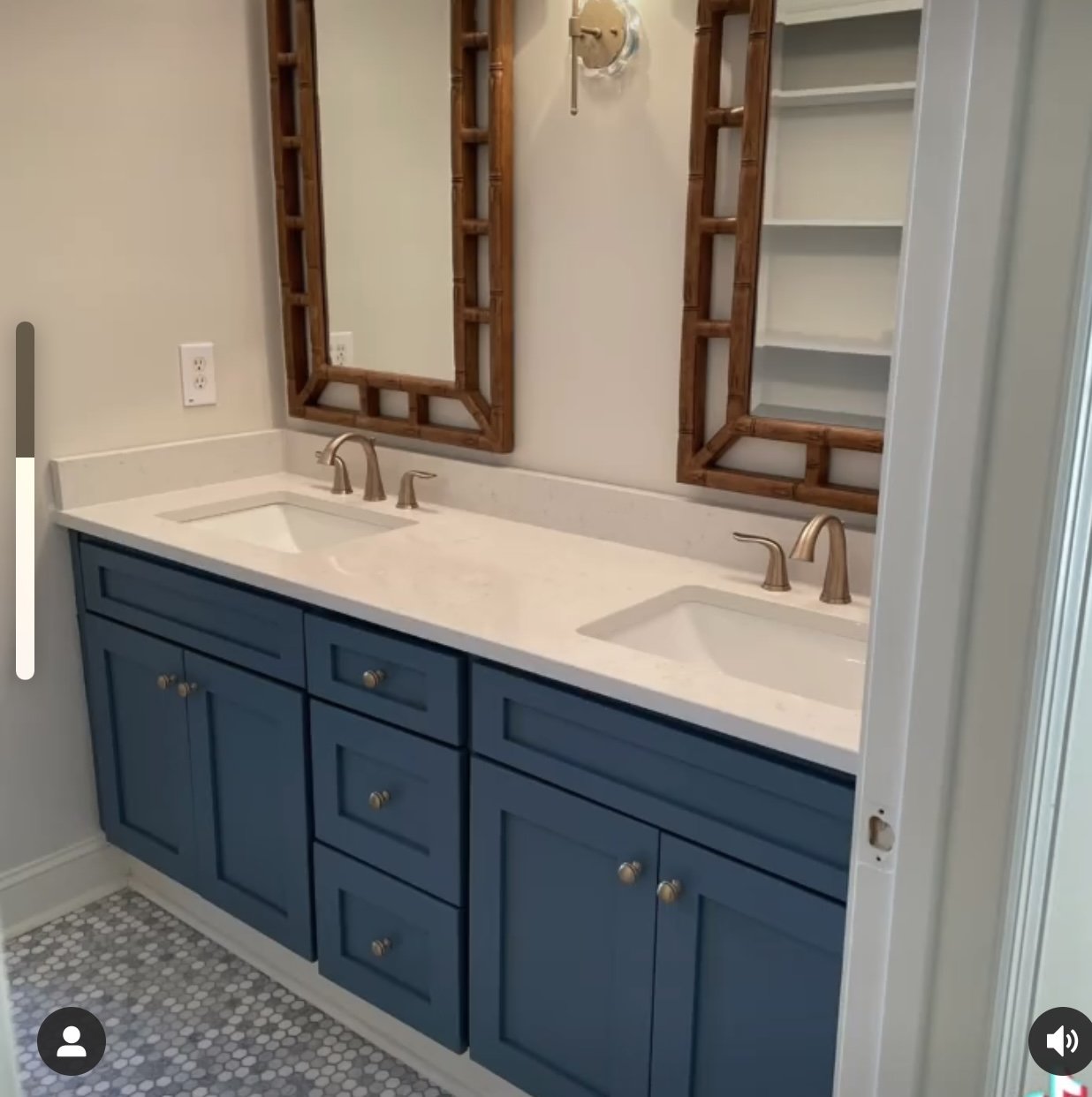
We started with the fun mosaic floor in a mix of hexagonal tiles in blues and whites. We would keep the original vanity but reface with it with new doors and hardware in a wonderful shade of blue. White subway tile in the shower always feels clean, and we selected whimsical mirrors and light fixtures to keep the mood light.
Here are a few iphone photos of the finished bathroom. I did not have this area professionally photographed because in a space of this size and layout, it’s hard to get good shots!
Feels so much cleaner!
We went with a simple white quartz for the countertops - I like simplicity in a bathroom to create a clean look. Rectangular sinks further update the vanity.
On to the bedrooms! Both upstairs bedrooms were painted the same shade of bubble gum. The carpets were tired and didn’t offer the casual, lake house lifestyle feel we were going for. Here are the before photos of the upstairs bedrooms (actually both bedrooms had the same paint and carpet, so a single shot tells the story for both rooms:
Time for a glow up!
The client requested queen beds for both rooms. I suggested doing one room with a masculine feel and one room with a feminine feel. Something for everyone!
Here’s the design board for each room followed by finished images for each room.
Can you imagine coming into this room after a hot day on the lake? The dark walls feel shady and cool, and the natural fiber rug adds casual contrast to the more traditional furnishings.
Here’s the finished space. As you can see, some of the individual elements changed as we worked our way through the process, and this is typical . Overall we captured the spirit of the inspiration room and were able to repurpose some of our clients’ family pieces. Here are the after photos:
What a beautiful retreat to enjoy at the end of a fun day on the water!
Is there anywhere an English mahogany chest doesn’t look good? I think not. That wonderful old wing chair was part of our clients’ collection and we updated it with this classic blue windowpane plaid fabric. A smattering of vintage finds finishes off the room.
Want to see the other guest bedroom? This one is brighter and more feminine. We did not shy away from joyful colors - after all, the spirit of the house is meant to be a fun getaway from life’s daily grind.
Here’s the direction. That orange Chinese Chippendale headboard was the jumping off point of this room. Whimsical Chinoiserie fabric provided the rest of the color scheme. A vintage dresser would be reinvented to fit our color scheme and a leopard carpet is just fun!
I adore this fresh and fabulous room. Color? Absolutely - but it doesn’t overwhelm the space or shout at you. Side note: Orange is not a color I normally gravitate to, but every time I use it I love it and wonder why I don’t use it more!
And there is our amazing vintage dresser we had custom lacquered in that just right shade of green! I love it so… The Chinoiserie lamps were a lucky find as was the fabulous vintage gilt mirror. A touch of glam at the lake? Yes please.
The last space left on the upper level is the amazing open loft space. The clients envisioned this area as a space to hang out apart from the main living area downstairs. A mid century settee belonging to the wife’s mother was reinvented with a fresh textured performance fabric while swivel chairs in their original green stripe upholstery were called in to provide the seating pieces. We finished off the space with new pillows, end tables, lighting and accessories.
Here’ s the direction:
Another natural fiber rug anchors the space in a casual, outdoors-y way. We also incorporated a desk for the husband as requested and added a sleek brass and glass etagere to hold a tv and family photos. I love the modern lines of the etagere in this space.
And here is the finished loft area! What an amazing view!
Again, a few of the design elements morphed into slightly different variations of the original plan but this is part of the process. Although we create a big picture plan to follow, we are open to varying the path along the way if it feels right.
I hope you’ve enjoyed our tour so far. It was an amazing project and we’re incredibly grateful that our entire team got to work our magic together. This is how we like to do it and the results you can expect for your own project if we decide to work together!
If you’d like to improve your day to day living, we have the ability to create and implement a design project that is life changing! Fill out our contact form or email Kim at thegreenroominteriors@gmail.com and tell us about your project. We’d love to help!


